About face: Ratio Display

For this installment of About Face, I chose a typeface that depends a bit more on situational use: Ratio Display by psType. The regular Ratio is a wonderfully warm sans serif with humanist leanings (meaning, it has a slightly more organic feeling, as though you can see the presence of the hand that made it), plus a touch of a geometric sans serif. The display end of the Ratio family is slightly more condensed, making for a space-saving headline font.
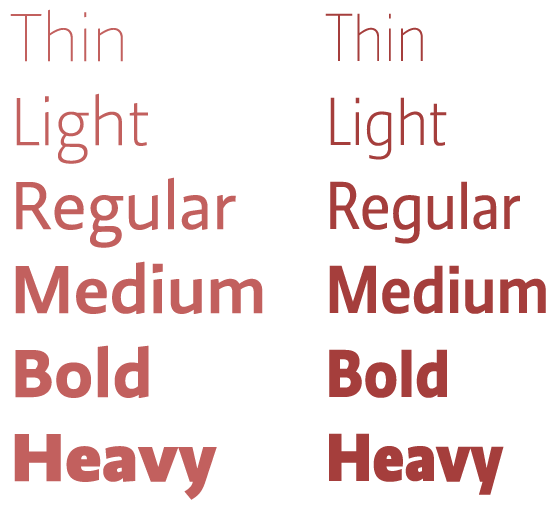
The non-display Ratio family on the left and Ratio Display on the right.
The regular Ratio is a robust family, great for providing a little touch of personality without overwhelming your content. But Ratio Display poses some interesting possibilities. It appears in five weights, from light to heavy, and, as the name implies, is intended for display use. “Display” is one of many terms sometimes used to communicate that a font should only be used big.
Why do we even need displays weights? Most typefaces that were designed for paragraph sizes work best at those sizes. But when you size these fonts up to use as a large headline, all of the design considerations that make it such a good text face become less appealing. Odd contrast in the strokes, larger spaces between letters, and more, can make a font readable and pleasant in running copy, but prove distracting when enlarged.
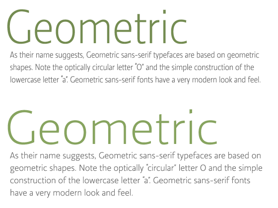
Compare Ratio Display as both headline and text on top, and normal Ratio as headline and text on the bottom. (source text)
On the other hand, display faces are intended for large use, so they can have more decorative features, higher contrast, tighter spacing, and shorter descenders (to pack those lines together for some nice density). As you can see above, normal Ratio looks good for body copy, but feels a bit horsey for headlines. Inversely, Ratio Display looks great large, but you’d never want to use it at text sizes.
Ratio Display is particularly lovely because we have several options for display use. The heavier weights are very thick and can create nice dense headlines to really grab attention, while the lighter weights can be used for a softer, more austere feeling. For my money, I think bold is a no-brainer for headlines, but soft can really make a design sing. I love the way a light headline used large can provide an alluring contrast to body text. And because it’s a little more condensed than the normal Ratio, we can make it a little larger for some added impact.

Ratio Display, livin’ large.
Since we’re looking to use this large, we have some leeway for text faces. It can be difficult to successfully pair two sans serifs together without creating something visually jarring, so let’s look at some serif parings.
Look at the wonderful contrast between the bulkiness of the heavy display weight and the jutting angles of Anatoletype’s Acuta.
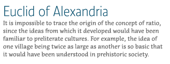
Ratio Display Light and Acuta. (source text)
Playing off the softer association with the light display weight, we can pair Ratio with Jan Fromm’s friendly rounded serif, Rooney.
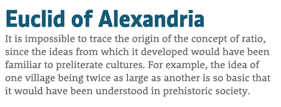
Ratio Display Heavy and Rooney.
There are many fonts that have display variants. Knowing the right kind of typeface to use for a given situation allows you to fit the content to the context — making your designs better as a result.
2 Responses
Comments are closed.
Great article. Thanks for the writeup Jason.
Really loving this column.