About face: Omnes

Welcome to our new column, About Face, where we’ll look at the details behind a typeface and try to crack what makes it special. In this installment, let’s talk about Joshua Darden’s rounded wonder, Omnes. When I say rounded, I’m specifically talking about the way the strokes of the typeface end in rounded edges rather than angled.

Notice Omnes (left) has rounded edges at the end of its strokes, compared to Proxima Nova (right) which has angular edges.
Omnes comes packed to the gills with weights, ranging from tender lights to beefy blacks. At first blush, it may look like a fairly average family, but that’s its greatest trick. Omnes has a special way of working in a variety of contexts. While most rounded typefaces powerlessly fall into the realm of camp — forever destined for your kid sister’s birthday party invitations — Omnes manages to rise above.
It’s inexplicably versatile in a way rounded faces usually only aspire to, able to be both playful and sophisticated, while never overpowering. The key to this is in its restraint: Omnes’ personality doesn’t explode from the letterforms or shout for attention, but rather hides in plain sight as subtle accents and unexpected curves. Notice how the little details give it just an extra nudge toward something greater than its parts: The way the ear on the lowercase “g” (that little nub coming off the top right) stands at attention. Or the way the italics add a subtle curve to the ends of some strokes, like someone flipping their hair away from their face in a shampoo commercial. Darden is a master of the italic letterform.
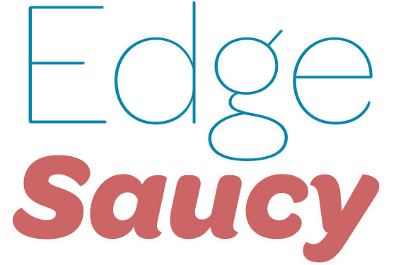
Hints of personality, but never overpowering.
It’s that selective rounding and not-quite-geometric letterforms that aid in Omnes’ usefulness. The middle weights are great for text, while the lighter and heavier weights can provide great contrast as headers or supplementary content.
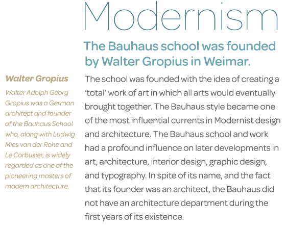
Omnes provides lots of versatility, from text weights to thicks and thins for headlines. Text from the Wikipedia entries for The Bauhaus and Walter Gropius.
Additionally, changing up the styling can yield some exciting results. The lighter weights look great for a restrained or refined look, even more so with caps or italics thrown in. And the heavier weights can appear youthful and urgent.
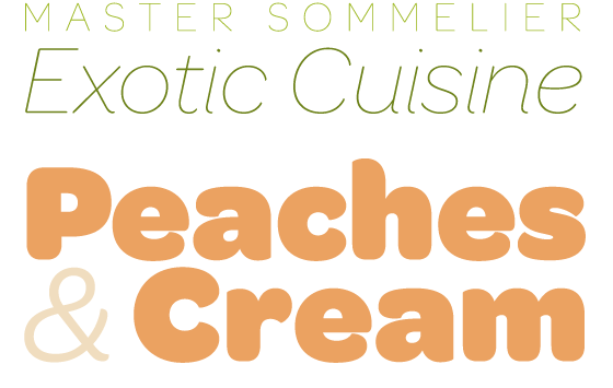
Dress it up or dress it down, Omnes can hang with the best of ‘em.
Omnes easily pairs well with other typefaces because its personality won’t overpower. It’s not quite geometric, but it does have lots of geometric cues, so I look for typefaces that can either pick up on those cues, or else offer strong contrast. I often find it’s easiest to think of font pairings like a Venn diagram: either look for typefaces that share a little in common (but still have their own voice to add), or else look for those that are very different, but provide a good amount of counterpoint to each other. Obviously, this is not a hard and fast rule, but it’s a good starting point.
In the case of Omnes, we might try pairing it with a typeface like Museo Slab, which shares some of the same basic letterform structures and italic cues as Omnes, but whose blunt serifs give it a feel all its own.
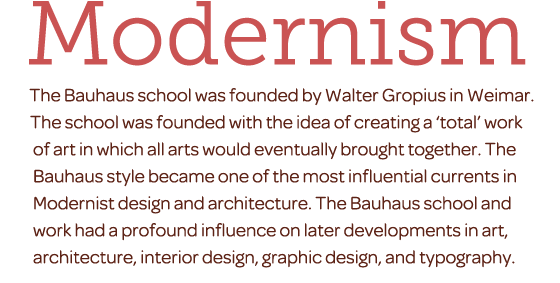
Omnes paired with Museo Slab.
For a contrasting pairing, we might try something angular and sharp like Minion to give us a bit of a friendly typographic tug of war.
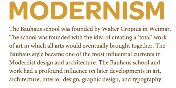
Omnes paired with Minion.
Lastly, way back in the early days of Typekit, I mocked up our logo using Omnes Regular because I liked how the shapes embodied what we wanted Typekit to be: simple and approachable. The structure of those letterforms is friendly without being too playful, and reserved without feeling stuffy. Everyone agreed, and it stuck.
I hope you’ve enjoyed this little glimpse at our good friend, Omnes. There’s more About Face to come!
10 Responses
Comments are closed.
In Apple “Mail” on my intel iMac (17-inch screen) most of the smaller type in your examples has rendered really badly.
I am aware of problems with IE and Firefox, which often render ‘body-size’ or even larger type much worse than Chrome or Safari, but if I was new to Typekit and had seen what I saw in the email I got, I would have though “Gee, Typekit is not very good!”
Is Apple “Mail” especially bad at subpixel antialiasing, which I take to be what is needed, or what am I misunderstanding.
Not complaining — just trying to give you helpful feedback.
The examples are images, not actual text. It has nothing to do with type rendering by OS X.
Jason, I love that you’re going to be doing this column regularly.
It is a very friendly font. I really love the differences in the edges, how they aren’t all rounded. It gives it personality. The squared off rounded edges are a nice touch too, definitely add to that personality. 🙂
very helpful–look forward to reading more of these!
It’s really unfortunate that every time I see this typeface I think of the AT&T advertisements. They’ve been using Omnes for a while. Otherwise, it’s an absolutely beautiful typeface.
Sounds like it’s a telecoms typeface of choice: VirginMobile in Australia use it extensively, also.
I’m glad to see you mention this post is the first of a new column. More like this please. And as often as you can write them.
Great idea for a column. Looking forward to more. And a nice font to start out with.
Lovely column idea, looking into details always makes a huge difference between raw content and quality content.
About Omnes, it looks quite good, but I’m not sure if it works on small sizes. At first sight looks OK but i don’t know about big chunks of text. Anyway, it’s great for headlines though, I thought Gotham Rounded would be my top choice but now Omnes over-throned it 🙂