Sites we like: Cargo, The Obvious Corporation, and Metamarkets
A publishing platform, making a difference on the web, and beautiful numbers in this week’s sites we like.

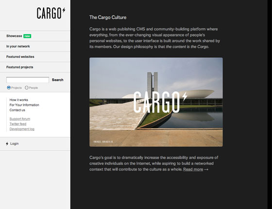
Cargo is a publishing and community-building platform, beautifully set in FF Dagny. FF Dagny’s classic grotesque form and range of weights make it flexible and easy to use; but it has just enough personality to feel human rather than generic — the perfect fit for Cargo’s culture-focused branding. (Added bonus: Cargo is completely compatible with Typekit, and simple to customize, so users can benefit from their network and ease-of-use, while also making their own typography shine.)

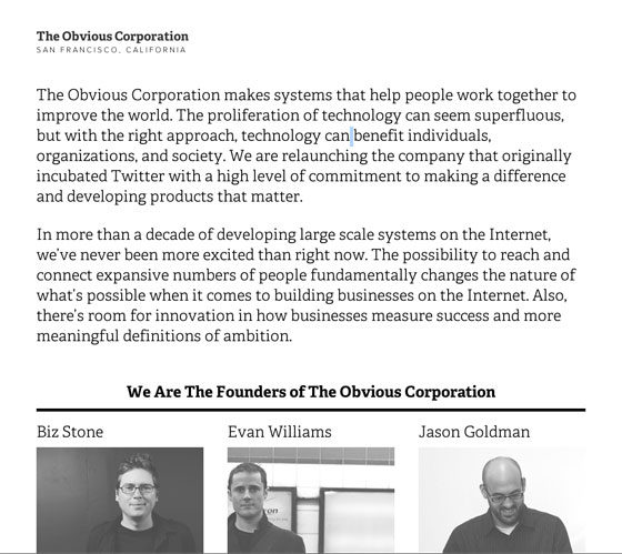
The Obvious Corporation comes from Twitter co-founders Biz Stone and Evan Williams, along with former VP of Product at Twitter, Jason Goldman. TypeTogether’s Adelle feels newsy but accessible in the all black-and-white design. Adelle’s large x-height works especially well for the generously-sized introductory copy.

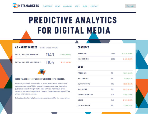
Metamarkets provides predictive analytics for digital media, using Gesta and FF DIN Condensed. The pairing (along with the vivid color palette) makes for a professional (but hip) design. Plus, Gesta’s excellent rendering quality (even at small sizes, and even on Windows XP), makes for lovely and readable statistics.
That’s all for this week; share sites that you like in the comments.
4 Responses
Comments are closed.
So much love for Cargo. Gesta on Metamarkets does render incredibly well, it looks great.
We just launched a site for an animated short (www.plusminusmovie.com) that’s using Trajan via Typekit but had to use an image for the smaller sizes. Looks great otherwise!
I have been fond of the layout and fonts on the CargoCollective site for as long as I can remember. Gesta renders well on the Metamarkets landing page, and many other pages of the site. The starkness of the background is a bit of a shock, but very clean.
However, I was rather shocked by how nearly unreadable Gesta was on the Metamarkets blog, at least for me. Font size was tiny and actually reminded me of pre-WOFF supported fonts. The choice of colors for links didn’t help. I do have low vision problems, but generally find that websites that are attentive to typography (or good sense with fonts and color choices) are always more readable than other sites for me.
On a more positive note, and since you asked that we share sites that we liked, I was surprised and pleased with the fonts used on several German web development sites. Java, dot Net and Erlang developers are not known for their use of harmonious design or beautiful fonts! Yet some do a nice job of it!.
Sorry, I’m back again.
HappyCog http://www.happycog.com/ is a website that is not about typography per se but uses it to fine effect. Ditto for their company blog, Cognition http://cognition.happycog.com/
I like Cargo. Simple but I like such kind of designs.