More great Adobe fonts, including optical styles for Chaparral Pro

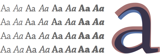
Top to bottom: Chaparral Pro Display, Subhead, normal, and Caption. Overlay: Display (blue) and Caption (red).
Today we’re excited that four new Adobe typefaces – Utopia, Poetica, OCR-A, and OCR-B – and many more styles of Chaparral Pro have been added to Typekit’s library. The new Chaparral fonts round out its four optical styles: Display, Subhead, normal, and Caption.

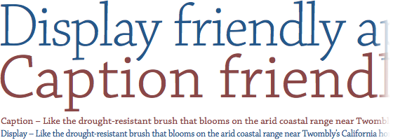
Chaparral Display (blue) and Caption (red), at 90px and 14px.
Optical styles are each designed for a different range of sizes. Pound for pound, Chaparral Pro Caption is bigger, thicker, and more loosely spaced than Chaparral Pro Display because it is meant to be used at small sizes; its features are designed to look balanced and perform well at low resolution. The Display and Subhead styles, on the other hand, look great large, where their narrow, elegant forms have more pixels to breathe. Compare these specimens: Display Regular, Caption Regular.

Above: OCR-A. Below: OCR-B.
OCR-A Std and OCR-B Std are two takes on machine-readable typeface standardization. OCR stands for Optical Character Recognition (a very different kind of “optical” typeface than the optical styles of Chaparral!). These typefaces were designed to be read by a machine. OCR-B, originally designed by Adrian Frutiger, pushes the limits of the optical reader but is easier for people to read.

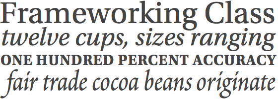
Top to bottom: Utopia Regular, Italic, Bold, and Poetica.
Utopia Std and Poetica Std, both designed by Robert Slimbach, are contemporary takes on traditional letterforms. Utopia’s sturdy and high-waisted take on neoclassical forms is available in three weights, each with a matching italic; Poetica, a modern reflection of chancery writing, comes in a single, elegant, calligraphic style.
Upgrade to a paid Typekit account to use these and other great typefaces from Adobe. Chaparral optical styles are available on the Portfolio plan and higher.
3 Responses
Comments are closed.
Curious if there’s any plans to expand optical styles for Adobe Jenson Pro as well in the near future!
Good thing there are such good blogs with great information makes the good work.
Nice!
We implemented Utopia on http://jaarverslag.aidsfonds.nl/ and it looks awesome imho.