Type study: United Pixelworkers
Today’s post was written by Jay Fanelli and Nathan Peretic of Full Stop, creators of United Pixelworkers, a t-shirt storefront for a fictitious union of web designers and developers.
When you look at United Pixelworkers, most of you probably think: that’s a terrible site.
OK, maybe you don’t. But if you look closely, there are in fact criteria by which it is a terrible site, or at least a site that flouts some of the basic tenets of progressive, standards-based web design. The one megabyte CSS file challenges even the fastest connections. The locked layout exceeds the widely accepted 960-pixel boundary. Disable JavaScript and the Typekit font is lost, the live countdown vanishes, the page no longer glides gracefully at the navigation’s behest, and, oh yeah, there is no way to actually buy a shirt.
And yet, we think it’s perfect for our users (or damn close). Notice we didn’t say all users. You see, we knew two things before we moved a pixel on this project: One, our audience is comprised almost exclusively of web designers and developers using late-model computers with big screens, the latest browsers, and fast connections. Two, United Pixelworkers is a side project for us, a labor of love to which we can devote limited time. We knew our users and we knew our limitations. Each visual and functional decision we made had to be based on those factors.
Let’s talk about some of those decisions.
Union made
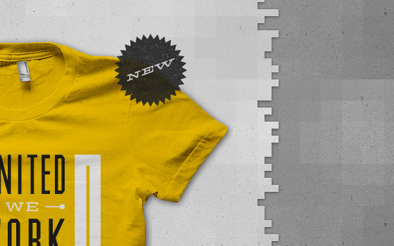
With its cement-colored pixelbricks and distressed red and blue banners, United Pixelworkers’ aesthetic is an homage to the “Made in the USA” gritty union heritage of Pittsburgh, our hometown. We needed a typeface that fit that visual vocabulary. Enter Hellenic Wide, a 19th-century western font experiencing a surge of popularity (to say the least). Super-extended with enormous slabs, Hellenic Wide is surprisingly suited to a staggering variety of styles, including: mid-century modern, concert posters, vintage letterhead, Seventies electronic components, its actual intended use as a western font, or, how we’re using it, as an industrial workhorse.
The previous iteration of the site paired the quirkiness of Hellenic with the austerity of all-caps Futura Bold. This time, we redesigned our logo using a modified version of Hellenic’s inline variant, flipping the script and making it the dominant font on the site. Typekit made that a convenient choice.

Fig. 2: Hellenic Wide in the wild
About those tassels
For years, HTML websites had little choice but to appear cold, sterile, and lifeless with their curt image swaps and abrupt color changes — particularly compared to decadent Flash sites of the time. Advances in CSS, however, have entrenched delight at the same foundational level as balance, proportion, color, and typography in standards-based web design.
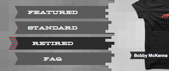
Designing delightful interactions for an audience of designers is petrifying. We knew we needed to come up with something novel, over and above the experience of the first Pixelworkers site, and navigation is a convenient place to introduce novel interactions. We’ve all seen navigation that changes color, moves, fades, or grows, but we’ve never seen anything quite like our “tassels.” Truth be told, they were an accidental discovery. A love child of the multi-colored inline logo and the repeated ribbon device used throughout the site, the tassels were too visually busy for use as a background for text, but when combined with a graceful color fade, were perfect as an added bit of navigational flair.
That fade-and-move interaction would have involved JavaScript only a few months ago. Now, transitioning any CSS property in Safari, Chrome, Opera, or Firefox is merely a few lines of CSS — except, unfortunately, for background images like we were using. The simple solution was to nest another element within each navigation item. As you hover, the inside element gradually appears, moving from zero to 100 percent opacity.
The flyout tassels were comparatively simple to implement. Each link receives a background image that is almost completely obscured by the elements it contains. On hover, the background image is translated left, again relying on CSS Transitions for the easing. That’s it.
Here’s the relevant CSS for the position change (the full source can be seen at this demo):
a {
  background:url("tassles-red-blue.png") no-repeat 20px top;
  -moz-transition-property: background-position;
  -moz-transition-duration: 0.5s;
  -webkit-transition-property: background-position;
  -webkit-transition-duration: 0.5s;
  transition-property: background-position;
  transition-duration: 0.5s;
}

a:hover {
  background-position: left top;
}
And for the fade:
a .nav-background {
  background: url("ribbon-lined.png") no-repeat left top;
}

a .nav-background .background-hover {
  background: url("ribbon-lined-hover.png") no-repeat left top;
  opacity: 0;
  -moz-transition-property: opacity;
  -moz-transition-duration: 0.5s;
  -o-transition-property: opacity;
  -o-transition-duration: 0.5s;
  -webkit-transition-property: opacity;
  -webkit-transition-duration: 0.5s;
  transition-property: opacity;
  transition-duration: 0.5s;
}

a:hover .background-hover {
  opacity:1;
}
Navigation that stays with you
The original United Pixelworkers site featured a lot of content on a long scrolling homepage. To assist the user in moving around, we included a simple fixed position menu that followed the user down the page. For the redesign, we wanted to retain a piece of that heritage. We devised a double-layer model, where a light grey content layer floats above a static dark grey navigation layer. The top layer scrolls independently, and the navigation dynamically updates depending on which part of the page is displayed. The jagged pixel edges add some textural interest and reference the blocky junctions dividing the page sections in our previous design.

Fig. 4: Double-layer for quality
Locking the navigation layer in place was easy, but dynamically updating the navigation involved more effort. In the end, we set a timer to check the page location every 100ms (based on John Resig’s advice that attaching behavior to the window scroll event is a “very, very bad idea”). We then compare that to a few page zones automatically calculated based on the visible page sections. Once at least two-thirds of the viewable area is inside a zone, we update the navigation.
Finally, because the active state of the navigation is determined by your position on the page, clicking to view a new section updates the navigation automatically as the page scrolls.
It’s worth pointing out here that fixed navigation is problematic on mobile devices and small windows. With that in mind, we feature test for fixed position support and reset the navigation position to static when appropriate. Similarly, an @media query verifies that a minimum browser height is met before enabling the fixed position navigation. A little responsive web design goes a long way.
Standards-based design rightly advocates diligent effort toward accessibility, performance, usability, beauty, mobile-friendliness, and more — but each project also demands unequal emphasis on certain criteria, sometimes to the point of ignoring one or more facets. For United Pixelworkers, we needed to build a website that would capture the attention of jaded web designers without completely forsaking our client responsibilities. Our decisions, therefore, skewed dramatically in the direction of the new and shiny with little attention paid to the flexibility or portability of the experience, or browsers well past their expiration dates.
Thanks for reading. Now go buy some t-shirts.

Jay Fanelli and Nathan Peretic are the co-founders of Full Stop, a web design and development shop in the City of Champions: Pittsburgh, Pennsylvania. They blog at http://www.fullstopinteractive.com/blog.
2 Responses
Comments are closed.


Great article, thanks for the detailed process information!
Yeah, this is great stuff. I love good use of small patterns in design and the tassels were a nice touch. Thanks for the information, Typekit and Full Stop!