Type study: An all CSS button
This is part of a series of guest posts covering tips and tricks for working with fonts on the web. Today’s post was written by Dan Cederholm of SimpleBits.
A few years ago I gave a talk about why a button made a great place to bring in type from a branding element (such as a logo). My point was that if the type in your logo was an image, and stylish buttons were also often images, then why not align the fonts in both to bring some cohesiveness to the typography. This was probably four years ago, and we’ve come a long way since. Now, in certain situations, CSS can replace the inflexible image buttons we used in the past. Add on top of that the advances made in @font-face and you have yourself a powerful combination for creating a wide variety of interface elements that are reusable and will degrade well in older browsers.
The button is also a great place to showcase many of the new CSS3 properties in one place, which is another reason I’m particularly taken with buttons at the moment. Through the use of box-shadow, text-shadow, border-radius, and CSS gradients, we can create highly polished interface components that don’t require images. Check out the demos from Rogie King and Mark Otto to get a sense of how CSS3 can be used to add dimension to otherwise flat objects.
Let’s build a button, friends.
The markup
I’m going to use a hyperlink in this example, but the styles we’re going to add could just as easily be applied to a or element as well.
Press this!
Notice the extra element here. Don’t panic; we’ll use that to create an animated effect when pressing the button (more on that later). Trust me, this harmless extra element is worth it.
Adding the styles
Our first step is to add basic styles for background, color, and rounded corners to make this simple little link look more like a button.
.btn span {
  display: inline-block;
  padding: 10px  20px;
  background: #3194c6;
  -webkit-border-radius: 8px;
  -moz-border-radius: 8px;
  border-radius: 8px;
}
I’m adding the vendor-prefixed border-radius properties for WebKit and Mozilla browsers, followed by the real, non-prefixed version for future-proofing. I’m also setting display: inline-block; on the link so that we can animate the clicking of the button later on.

Next, let’s hop on over to Typekit and choose a typeface for the button. As I mentioned earlier, buttons are a great place to reintroduce brand type, and with Typekit we can quickly and easily add a custom font here without using an image.
With the classic Cooper Black font chosen, and the simple Typekit scripts in place, I’ll now apply that font to the button style.
.btn span {
  display: inline-block;
  padding: 10px  20px;
  font-family: "cooper-black-std-1", "cooper-black-std-2";
  background: #3194c6;
  -webkit-border-radius: 8px;
  -moz-border-radius: 8px;
  border-radius: 8px;
}


This button is starting to become far more interesting.
For browsers that currently support it (WebKit and Mozilla), I’m going to override the background color with a CSS gradient that runs from the original blue to a slightly lighter blue. This will make the surface of the button appear slightly concave.
.btn span {
  display: inline-block;
  padding: 10px  20px;
  font-family: "cooper-black-std-1", "cooper-black-std-2";
  background: #3194c6;
  background: -webkit-gradient(linear, 0% 0%, 0% 100%, from(#3194c6), to(#5bacd6));
  background: -moz-linear-gradient(#3194c6, #5bacd6);
  -webkit-border-radius: 8px;
  -moz-border-radius: 8px;
  border-radius: 8px;
}
(I recommend this handy tool to construct your gradient rules.)
Notice that we’ll keep the original solid background color prior to the gradient rules; browsers that don’t yet support CSS gradients will degrade to this solid color.

To make the wonderfully-chunky Cooper Black text look as though it’s sunken into the button a bit, we’ll add a subtle text-shadow with a negative vertical value. That will create a darker shadow just above the text.
.btn span {
  display: inline-block;
  padding: 10px  20px;
  font-family: "cooper-black-std-1", "cooper-black-std-2";
  text-shadow: 0 -1px 1px rgba(19,65,88,.8);
  background: #3194c6;
  background: -webkit-gradient(linear, 0% 0%, 0% 100%, from(#3194c6), to(#5bacd6));
  background: -moz-linear-gradient(#3194c6, #5bacd6);
  -webkit-border-radius: 8px;
  -moz-border-radius: 8px;
  border-radius: 8px;
}

So far, we’ve been adding styles to that inner inside the hyperlink, but to finish off the styles that will make the button look three-dimensional, we’ll tack on a few rules to the outer element itself.
.btn {
  display: inline-block;
  -webkit-border-radius: 8px;
  -moz-border-radius: 8px;
  border-radius: 8px;
  -webkit-box-shadow:
    0 8px 0 #1a74a1,
    0 15px 20px rgba(0,0,0,.35);
  -moz-box-shadow:
    0 8px 0 #1a74a1,
    0 15px 20px rgba(0,0,0,.35);
  box-shadow:
    0 8px 0 #1a74a1,
    0 15px 20px rgba(0,0,0,.35);
}
I’m repeating the inline-block and border-radius rules here to match the . To add dimension, I’m adding two box-shadows: one for the darker blue that creates the bottom portion of the button, and one for the shadow that the button casts on the white background. Multiple box-shadows can be strung together and delimited with commas in a single rule. Notice I’m adding the vendor-prefixed rules for WebKit and Mozilla, followed by the non-prefixed box-shadow property at the end.
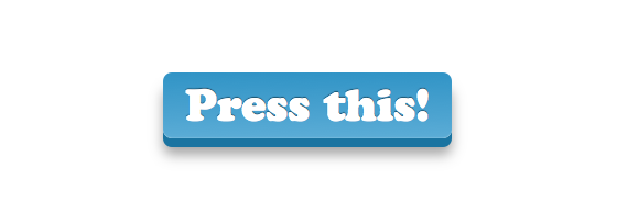
And voilà. A three-dimensional button using CSS3, a custom embedded font via Typekit, and zero images. I think a tasty beverage is in order.
But wait, let’s make things even more interesting and enrich the experience here a bit by animating the button when it’s clicked. Again, we’ll lean on CSS3 to do the animating in browsers that support it, while safely degrading in browsers that don’t.
If we add two new declarations for the :active state (as the button is clicked), we can give the illusion that the button has been depressed.
.btn:active {
  -webkit-box-shadow:
    0 8px 0 #1a74a1,
    0 12px 10px rgba(0,0,0,.3);
  -moz-box-shadow:
    0 8px 0 #1a74a1,
    0 12px 10px rgba(0,0,0,.3);
  box-shadow:
    0 8px 0 #1a74a1,
    0 12px 10px rgba(0,0,0,.3);
}

.btn:active span {
  -webkit-transform: translate(0, 4px);
  -moz-transform: translate(0, 4px);
  -o-transform: translate(0, 4px);
  transform: translate(0, 4px);
}
The first declaration adjusts the box-shadow on the element: dimming it slightly and making it less pronounced (since when depressed, the button is shorter and will cast a smaller shadow).
The second declaration applies a translate transition on the inside the . Translate moves an element from its initial position on the page using x and y coordinates. Here, we’re simply moving the surface portion of the button down 4 pixels. The reason we’re using a transform — rather than say position or adjusting margins — is that we can also apply a transition to that transform, smoothing out the move with a bit of animation. Moving the 4 pixels down hides 4 pixels of the darker box shadow on the element and the effect is complete.
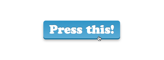
Our last step is to add CSS transitions to smooth out both the shadow-dimming and the translate move. We’ll again use the appropriate vendor prefixes for all the capable browsers (WebKit, Mozilla, and Opera), plus the real properties for the future.
.btn {
  display: inline-block;
  -webkit-border-radius: 8px;
  -moz-border-radius: 8px;
  border-radius: 8px;
  -webkit-box-shadow:
    0 8px 0 #1a74a1,
    0 15px 20px rgba(0,0,0,.35);
  -moz-box-shadow:
    0 8px 0 #1a74a1,
    0 15px 20px rgba(0,0,0,.35);
  box-shadow:
    0 8px 0 #1a74a1,
    0 15px 20px rgba(0,0,0,.35);
  -webkit-transition: -webkit-box-shadow .2s ease-in-out;
  -moz-transition: -moz-box-shadow .2s ease-in-out;
  -o-transition: -o-box-shadow .2s ease-in-out;
  transition: box-shadow .2s ease-in-out;
}

.btn span {
  display: inline-block;
  padding: 10px  20px;
  font-family: "cooper-black-std-1", "cooper-black-std-2", Helvetica, Arial, sans-serif;
  line-height: 1;
  text-shadow: 0 -1px 1px rgba(19,65,88,.8);
  background: #3194c6;
  background: -webkit-gradient(linear, 0% 0%, 0% 100%, from(#3194c6), to(#5bacd6));
  background: -moz-linear-gradient(#3194c6, #5bacd6);
  -webkit-border-radius: 8px;
  -moz-border-radius: 8px;
  border-radius: 8px;
  -webkit-box-shadow: inset 0 -1px 1px rgba(255,255,255,.15);
  -moz-box-shadow: inset 0 -1px 1px rgba(255,255,255,.15);
  box-shadow: inset 0 -1px 1px rgba(255,255,255,.15);
  -webkit-transition: -webkit-transform .2s ease-in-out;
  -moz-transition: -moz-transform .2s ease-in-out;
  -o-transition: -o-transform .2s ease-in-out;
  transition: transform .2s ease-in-out;
}
Notice I’ve added two transition stacks here: one on the element, which transitions the subtle shadow change, and one on the element which smooths out the translate transform, making the button push a bit more realistic.
Check out the demo to see it in action! And next time you need to make a button, remember that it’s a great place to use CSS3 and web fonts. Go make a button that can’t wait to be pushed.

Dan Cederholm is the author of CSS3 for Web Designers, founder of SimpleBits (a tiny design studio), and co-founder and designer of Dribbble.com. He plays a mean ukelele.
56 Responses
Comments are closed.
Love the effect Dan. Best part is that it doesn’t “break” the button if a browser doesn’t support CSS3. Clean work.
Nice article Dan 🙂
I have played around with the same style of button but altered the position and box-shadow size on click rather than the webkit transform property.
Lovely! I’ve got to digest the transform: translate part a bit. Haven’t tried animating with translate.
Thanks!
This is most excellent, Dan. Your work is flawless and inspiring.
Was just working on a button similar to this the other day, but nowhere NEAR as slick, but I didn’t have the internal span inside the a. Was trying to keep it as clean as possible in html. Was actually tinkering with some of this outside of the a in an list item.
PLUS: COOPER BLACK, baby.
Luke: depending on the browser support you’re going for, you can keep the markup just as clean by styling the
:beforeand:afterpseudo-elements.This is a wickedly awesome button, and it’s really amazing what you can do with just CSS3 these days. Great work!
In case anyone’s wondering, all the button features work great in Chrome and Safari (WebKit-based). Firefox doesn’t have the smooth transition effect. Opera (9.8, I should upgrade) shows the visual styles, but doesn’t have an alternate (pressed) state at all. IE 7/8 show a flat, square box with the custom font–usable and gracefully degraded (at least IMO).
I have tried to use all-CSS buttons before, but most of my clients have complained about how they degrade in IE. With square buttons, I can usually get away with it, but with rounded ones I usually end up using a CSS sprite method. Life will be good when CSS3 support is a little more universal.
nice share dan 🙂
Is there a reason there is no hover or focus treatment?
That’s a good question, but I’d imagine that :hover states are going to become less and less important based on the fact that touchscreen devices don’t render them (or dont’ render them the same).
That’s my guess, but I might be reading a lot into it!
—
Great writeup, though. Thanks!
Michael, that’s what the focus state covers. It activates on the first tap.
Just to keep the article shortish 😉
Wow this is great! I love the power of css3 just not the support keep the good work up!
Simply great, it makes a lot of fun to click that button, once again, great!
I don’t follow why you’ve used translate rather than a position offset. Position transitions work fine – http://jsfiddle.net/necolas/WRWBY/
In theory, this effect should be possible without a nested span. I had a quick play with it but unfortunately, in Chrome at least, the transitions on things like padding/margin/box-shadow don’t execute quite right and the button appears to “jump” by a pixel during the transition.
It’s probably possible to get it working with positioning rather than translate, but I wanted to mention the transform route here as an alternative. Especially if you run into problems using positioning for reasons not associated with the button itself.
WebKit have switched the gradient syntax in the latest versions of the browser, so you’ll need to use three properties:
Hi Peter, would the unprefixed declaration cover the latest version of webkit?
background:linear-gradient (#3194c6, #5bacd6);
Great point, Peter! Thanks for clarifying here.
And thankfully the new syntax is infintely simpler 🙂
@inkpixelspaper – No, the unprefixed declaration isn’t implemented in any browser yet.
Beautiful work and you made it VERY easy to follow along and understand. Thanks!
Modern day techniques to a create retro style button. I haven’t seen a button like that since the days of Frogger : )
Nice concept Dan, but I’m not sure that Cooper Black did it justice.
hi..!typekit
i use google alert find out u blog.
Thank you for your service.
Very nice Dan, but you didn’t used Pseudoelements like :before and :after instead of an additional span element?
Had a little play around with this to see what other ways there might be. I see why you opted for the translate(); should have checked in Firefox 4 before commenting because it doesn’t appear to transition positional offsets other than “left”. Shame.
There’s this alternative method using pseudo-elements (so the HTML doesn’t need the extra span). Works best in Firefox 4, which supports transitions on pseudo-elements, but looks ok in Chrome too.
http://jsfiddle.net/necolas/qBxAc/
[@Dan Mall, @CSS Webstandard-Blog Once you actually try to recreate this with pseudo-elements, you’ll see it’s actually not that easy to do.]
Another alternative (no pseudo-elements necessary) is to transition the other box-shadow and apply the transform to the link itself. Works perfectly in Firefox 4, but Chrome’s transitions look a bit buggy so the effect is a little ugly. Something like this:
http://jsfiddle.net/necolas/RWXkn/
Thanks for the great work; using an extra span still provides the most consistent experience across existing modern browsers.
Nice work, Nicolas!
Thanks for exploring the other options. In the end, I came to the same conclusion: it’s just a little simpler and more consistent with a span.
Nice work Dan!
The softness of the click bothered me a bit though, and at first I thought it pointed to an inherent weakness of CSS3 transitions: that they are applied the same in both directions.
So when you click the button, it doesn’t feel as responsive as you’d like a UI element like a button to feel.
However, I saved the page and fiddled a bit, and found that if I zeroed out the transitions on the :active state like so:
.btn:active span {

	-webkit-transform: translate(0, 4px);

	-moz-transform: translate(0, 4px);

	-o-transform: translate(0, 4px);

	transform: translate(0, 4px);

	-webkit-transition: -webkit-transform 0s ease-in-out;

	-moz-transition: -moz-transform 0s ease-in-out;

	-o-transition: -o-transform 0s ease-in-out;

	transition: transform 0s ease-in-out;

}
it feels much more clicky. (I don’t know if that syntax is optimal, but it’s a quick hack.)
Thanks for the demo!
I like it, Mike. Nicely done!
Like the time I spilled an RC Cola on my Atari joystick. A little slow coming back up 🙂
I like the stickiness for sure.
How do you handle the shadow on the white having .2S delay on the click and return. you need 0s on the initial click down state but .2s delay in returning in order to synchronize the shadow to the button span animation.
Early in the article you mention that these styles can also be used on or tags as well. Placing an , , and tags side by side using the styles renders different results. Namely, it appears the widths will behave differently and the border on the and elements affect the height differently. Maybe I’m just doing something wrong?
Thanks for the demo!
Whoops….sorry. That last post should have read:
Early in the article you mention that these styles can also be used on “button” or “input” tags as well. Placing an “a”, “button”, and “input” tags side by side using the styles renders different results. Namely, it appears the widths will behave differently and the border on the “button” and “input” elements affect the height differently. Maybe I’m just doing something wrong?
Nicely done, Dan. For another example of CSS buttons, check out a site we launched last August, Bandwagon Sports. Here’s a demo page of just the buttons in an almost final state.
@Nicolas Funny story. I tried pseudo-elements for the new United Pixelworkers navigation, but the inability of any browser except Firefox 4 beta to handle the transitions was a deal-breaker. Support for CSS transitions on background images would have been heavenly.
You don’t need pseudo-elements, or all that extra markup, to create those buttons. It can be done with a single element and simpler, more flexible CSS.
Demo here: http://jsfiddle.net/necolas/znCrL/
@Necolas You’re absolutely right. I think we decided we wanted to keep the gradient appearance in browsers that didn’t support CSS gradients. Thanks for the demo.
Wow, very impressive! I’ll have to find a way to implement it somewhere 🙂
Current “shipping” version of Opera (ver. 11.01) on Mac doesn’t render in Cooper Black. No down state. Button looks good, though. Here’s a screenshot:
http://cl.ly/0M1f2F1V3y0t050A3u3R
This is great. Subtle animations without the need of flash or javascript! Thank you.
Nice article. It amazes me to think back to all the kludges and hacks that were necessary to make this sort of thing work in the dark ages (last decade…). How far we’ve come!
It’s worth pointing out that the Internet Explorer 9 RC renders the button the same as Firefox, with the box shadow, borders, and font face. It does not have the text shadow or gradient. Those aside, it’s pretty good. However, it doesn’t respond to a click – there’s no “push” action.
I can’t believe the amount of wastefulness in this article. Why not use the
Click Me! instead of all that crappy markup? It works in all browsers and all versions of IE (with type=submit)
It’s so much quicker to stylize a button in css3 only:
http://jsfiddle.net/kizer/FBKaL/
What crappy markup? You mean the extra
tag? Dan explains why that’s the best method in the comments above.I love using fontface but it still has pixelation issues in browsers especially w/o anti aliasing.. cufon looks much nicer but fontface is so easier to use.. and selectable
You may want to check out our type rendering series, which goes into detail about cross-browser and operating system rendering issues. Also, all of the fonts tagged “paragraph” on Typekit have been manually hinted to render well, even in Win XP (where ClearType is disabled by default).
Mandy:
Dan’s wrong about the reasons for using it. Period. It works in all browsers, renders the same…
Court,
If you read all the comments, this one from Nicolas in particular, you’ll see that the only reason that a span is used is for the button press transition effect.
The example you cite as cleaner only swapped the normal and depressed states without any transition effect at all. Your example provides slightly cleaner HTML by throwing out a feature.
Furthermore, your “quicker” example has at least as many, if not more, lines of CSS as Dan’s.
I challenge you to come up with the same effect and appearance as Dan has without the span. If you can, we’d all love to see it. If you can’t, then you’d better be careful before you get back on your high horse or you’ll slip off again.
Great post, thanks.
As usual there is always more than one way to boil a cat, so the comments are a good read too!
Very nice Dan – I couldn’t stop pressing it 🙂
It would be good if you used a submit button.
Looks surprisingly similar to http://inspectelement.com/demos/css3/buttons/
ooh, me likes. Thanks for this.
Here’s one thing I’ve found really useful: every browser that supports gradients also supports RGBA colors and multiple backgrounds, so instead of specifying your gradients with solid hex colors, place a translucent black or white gradient “mask” over a single solid background color. This makes for nice reusable code where you can swap out just one isolated color value at the end and get a different color buttona. So, instead of this:
background: -webkit-gradient(linear, 0% 0%, 0% 100%, from(#3194c6), to(#5bacd6));Try this:
background: -webkit-gradient(linear, 0% 0%, 0% 100%, from(rgba( 255, 255, 255, .4 )), to( rgba( 255, 255, 255, 0)), #3194c6;Dan the man! Thanks for bringing this to light. You do so much for the design community. We love you bro!
This is why I love typekit! Usable knowledge and great community.
Keep going! 🙂
SO COOL, I love the button, you could do something cool on hover like maybe get rid of the drop shadow to make it look like it’s being pressed too… maybe even use css transforms to make it a little smaller, not sure if that’d look cheesy or not but there’s lots of possibilities.
in the last code bit for .btn span you introduce:
-webkit-box-shadow: inset 0 -1px 1px rgba(255,255,255,.15);
-moz-box-shadow: inset 0 -1px 1px rgba(255,255,255,.15);
box-shadow: inset 0 -1px 1px rgba(255,255,255,.15);
In the demo this code add light colored square corenrs at the bottom of the span taking away from the rounded corner feel. If you remove the code you get the nice round corners sans the light colored square corners.
Is it possible to unsubscribe from these comments?
Great post Dan very useful. Thanks. Always have trouble smoothing out the translate transform.