Turning On ClearType On Windows XP
When you see text displayed on a modern computer screen or on a handheld device’s display, you are likely to be looking at a font that has been rasterized, i.e. converted, from vector outlines to pixels. There are currently three main ways of accomplishing this rasterization. The most basic one is aliased rendering, where the letters are drawn in black and white pixels only. The next one is anti-aliased rendering, where the pixels can assume shades of gray, in addition to black and white. And the third one is sub-pixel rendering, where the intermediate degrees of pixel opacity between black and white are displayed in color rather than grayscale. Microsoft’s sub-pixel rendering technology is called ClearType.

From left to right: aliased, anti-aliased and sub-pixel renditions of the letter o (enlarged to show detail).
If you are reading this blog on a computer with Microsoft Windows XP, you are likely to be looking at aliased text, since that’s the system’s default rasterization mode. It is also possible, but less likely, for ClearType to be turned off manually in later versions of Windows. How can you tell for sure? Well, if the text on this page looks similar to the image below, then you’re definitely looking at aliased text rendering.
You can improve the way the text looks on this blog by turning on ClearType. To accomplish it, follow the steps below.
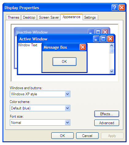
- Right-click on the Desktop and select Properties. This will open the “Display Properties” window.
- Select the pane named Appearance.

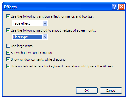
- Click on the button labeled “Effects…”, which will open a window with the same name.
- Check the box labeled “Use the following method to smooth edges of screen fonts”,

- and select ClearType from the drop-down list below it.
- Click on the two OK buttons.
That’s it! You’ve just enabled sub-pixel rendering on your Windows XP system, and now that same paragraph of text looks like this:
Be advised that this is a system-wide setting and you’re likely to see the changes take effect in other parts of the system and in applications other than the browser.
Also, keep in mind that ClearType rendering is not unique to XP. If you are on Windows Vista or Windows 7 and the text looks aliased, you can and should turn on ClearType. The instructions for doing so are somewhat different but the results will be the same.
10 Responses
Comments are closed.


Bravo!
By now, doesn’t everybody know how to turn on Cleartype and why they should?
Answer: No!
Thanks for the simple tip.
Perhaps it’s worth adding that the benefit of sub-pixel rendering, like ClearType, only comes on certain display screens which show colour in a particular way. Colour LCD screens, including many flat-panel displays, typically form a single square pixel of display out of three single-colour elements: red, green, and blue. Sub-pixel rendering relies on this to deliver its magic. On a display with a different layout (like some LCD screens), or with a completely different technology (colour CRTs, if you still have them), sup-pixel rendering makes things worse instead of better. For more information, see the Wikipedia article http://en.wikipedia.org/wiki/Subpixel_rendering .
You make some good points, Jim. People who still have CRT monitors should indeed use anti-aliasing rendering instead. That can be done by selecting the option “Standard” in step 5, instead of “ClearType”.
Regarding screens that have sub-pixel geometries other than the common RGB it’s true that ClearType might not yield the same results. I gather that the majority of desktop LCD and LED flat screens have RGB sub-pixel geometry though. I don’t have much experience with other types of screens, but I wonder if the ClearType Tuner can help in those cases. Do you know?
I just found the official article from Microsoft on how to enable and customize ClearType in Windows XP at http://support.microsoft.com/kb/306527
Perhaps also worth noting, ClearType is enabled by default at the application level in Internet Explorer 8 (but can be disabled in Internet Options>Advanced). So you could have a situation where ClearType is disabled at the system level, causing Firefox to render text aliased, but enabled as an app preference in IE8.
Thanks for bringing that up, Brook. I believe that’s also true for IE 7, which, as far as I know, was the first version to get a ClearType setting independent from the system setting. On the other hand, IE 6 and Firefox rely on the system setting.
Good stuff, Miguel.
Now we can use this detection:
http://www.useragentman.com/blog/2009/11/29/how-to-detect-font-smoothing-using-javascript/
to link people to this page when they fail to have smoothing on.
Easy peasy.
Paul, thanks for the link! I wasn’t aware of that tip. It’s too bad detection isn’t more straightforward, but it’s better than nothing.
Firefox 4 forces on ClearType on XP for downloaded fonts and use system defaults on Vista/Win7. This means that unless a user explicitly turns this off in configuration settings (XP) or via system settings (Vista/Win7), users should always see Cleartype rendering of downloadable fonts.