Font metrics and vertical space in CSS
We put a lot of effort into the quality of the fonts in the Typekit library. As part of that work, we’ve been researching the relationship between font math and CSS, and would like to share what we’ve found. If you’ve ever wondered why some fonts look smaller than others at the same typeset size, or why the vertical space between lines of text is such a guessing game, this post is for you.
Font math
Font files contain more than just glyphs, the designed characters and symbols that are the essence of a typeface. They also contain mathematic instructions for spacing those characters, such as the actual amount of room a glyph should consume relative to its CSS-specified size and the amount of horizontal space on either side of a glyph.
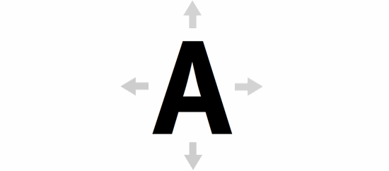
FF Meta Web Pro on an infinite canvas.
Some of the most interesting, critical font math for web designers is related to the visible and invisible vertical space at play when we typeset web text. When type was made out of wood, lead, or film, designers had to adhere to physical constraints when typesetting. Now, we typeset using CSS — setting font-size, line-height, margins and padding. Our letterforms live on an infinite canvas; they are mathematic points and curves, independent of resolution. Let us imagine a glyph on this infinite canvas, stretching in any direction as far as it pleases.
Font files provide structure for glyphs by establishing the invisible bounds that will govern them. A font’s em square and baseline determine its relative size and placement when typeset. Vertical metrics influence the height of ascenders and depth of descenders.
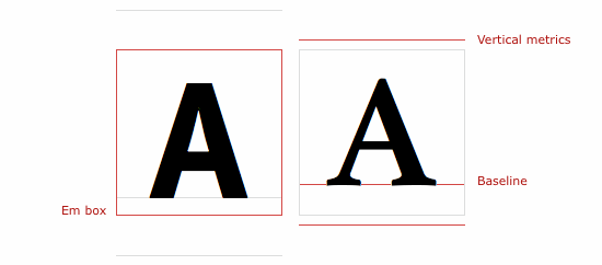
FF Meta Web Pro (left), Athelas Web (right)
Font math and CSS
Even when fonts’ em squares are sized to the specification of our CSS, the positioning of fonts’ baselines, the size of letterforms relative to their em squares, and fonts’ vertical metrics will vary from typeface to typeface. So the size and spacing of text we see in web browsers will also vary.

14px FF Meta Web Pro (above), 14px Athelas Web (below)
If letterform heights or depths exceed the values set by ascender/descender vertical metrics, glyphs can appear clipped. Not helping here is the fact that type designers must juggle three sets of vertical metrics values that (surprise!) are each used by a different array of web browsers. For example, while most web browsers use hhea metrics, Internet Explorer instead uses OS/2 metrics.
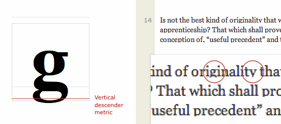
Example of a vertical descender metric that clips some characters in web browsers.
Vertical metrics can be confounding for web designers. These measurements seem not to influence type size or line height, as they overlap (rather than push against) vertically adjacent lines of text. However, when two typefaces are combined on the same line of text, vertical metrics can influence the vertical space consumed by that line. An explanation of how this works deserves its own post, so we’ll save that for later.
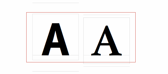
Two fonts’ combined math can affect spacing. More about this in a dedicated post.
These complexities can be a drag. There’s nothing like hacking on font math when you could otherwise be finished with a project. That’s why we’re studying this stuff here at Typekit — to give web designers more control and a deeper understanding of font math and CSS, and to make things easier in cases where we want the math to “just work.”
Partner Tools
We also want to help our foundry partners better understand how CSS works with their typefaces, so we’ve developed a suite of Partner Tools that help double check for missing glyphs, inconsistent metrics, and metrics values that might clip glyphs. With this information, type designers can review and adjust their fonts for better translation in CSS.
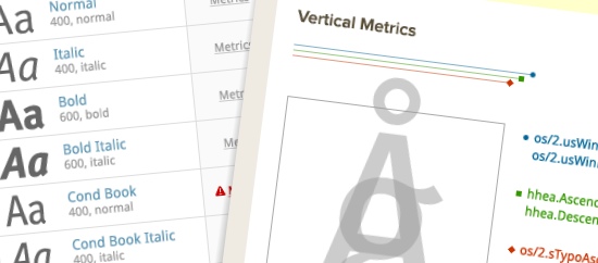
Font review tools for Typekit partners.
Control and peace of mind
Type designers need to know how font math translates to CSS typesetting, and Typekit users should never have to worry that type will be spaced unpredictably in any browser. We’re looking forward to growing Typekit and continuing to share what we learn.
19 Responses
Comments are closed.
Do you people every stop hitting it out of the park? Seriously. Today’s post is a great little insight into something that I hope most designers never have to worry about. Thank you so much for all of your hard work!
Wow, complicated! I think this explains why my site’s elements in headers were clipped in IE. My solution was to serve up Plain Jane CSS to IE and maintain the font love in good browsers.
Lovely! It does drive me a little mad when the baselines are out (such is the case for Katarine Web), so anything to help type designers prepare this stuff for the web is a god-send. Great work.
Right. Baseline position is a unique aspect of a typeface’s design, and no one position is “right.” But we can all work together on translating these natural qualities of type design into web fonts that are easy to use with CSS.
For instance, if baseline normalization is ideal for you (the web designer), we could provide Kit Editor settings to normalize your fonts in this way. Working on our Partner Tools, with our hands and heads in this font math, has generated lots of ideas for Typekit features…
Wow.. great work guys – keep it up!
I really like how you guys are helping me to learn more about fonts, how they work and what makes them different versus just providing them.
Good stuff.
excellent post – always nice to learn more about type! keep the great posts coming!
.mike
To be perfectly honest, this sort of research and tool implementation is why I come to TypeKit rather than trying to figure out how to load fonts myself. I’m an art nerd, not a math nerd. Thank you and keep up the fine work!
In the first paragraph you ask if we “ever wondered why,” but the rest of the post doesn’t offer much more than “because it’s complex and implemented inconsistently.”
It seems like the meat of it is contained in the red, green, and blue lines on the screenshots of the Partner Tools. Any chance we can see a bit more of that?
It was an interesting post, I just wanted more.
Regardless, thanks for the heavy lifting behind the scenes and you continue to make the web a better place.
Thanks,
Nate
Hey, great! The really “nice” part of all this is that you get different baseline positions (for the same font!) with different browsers (and browser versions) and operating systems, and combined with differing behavior related to font-size and line-height, this is really a big mess. Let’s see if you can make some sense out of it …
Hopefully, Christian
A handy feature that I could imagine coming out of this is a “recommended point size / line-height” note in the font preview (maybe in the “Weights & Styles” tab), so users like me, who use WordPress but haven’t upgraded for full CSS control, can firebug the CSS to compare the line-height defined (if any) and pick fonts that match that. I think it could cut down on trial and error of choosing the best font for a particular application for inexperienced users. It’s great to read a bit more about the mechanics that go into Typekit! Thanks,
-Z
Very cool idea, Zandy.
We’re definitely looking forward to typesetting recommendations (we started with some very general stuff—fonts tagged paragraph and headline that work well in those contexts), and the consistency that will come as a result of our Partner Tools will be a solid foundation for font math manipulation, including normalization by baseline/x-height/whatever.
Tim – great to hear.
Keep up the awesome work!
-Z
I ran into this very issue yesterday when de-bugging a Heading 1 font for IE6/7. The quick fix, since the font style was uniform throughout the H1 class, was to increase the line-height to about 1.5em in the IE stylesheet.
Looking forward to the next article that shows how to manage multiple sizes and vertical spacing in different browsers.
Thanks
I really enjoyed reading your article, and it passed some time at the end of my shift 🙂
Thanks
Moddish
Website Design Firm
This is what i found the difference between how tools that we designers use like Photoshop, InDesign or Illustrator and HTML/CSS duo:
http://www.kutlux.co.uk/images/type_discrepency/html-inDesign_discrepency_v2.pdf
I hope you find it useful, and I would appreciate any feedback.
Thanks
Your conclusions here seem very interesting at a glance, Kutlu. Thank you for sharing this research!
Important research, Tim.
Somebody, dang it, has to understand how browsers use the internal font data and the platform rasterizers so, hopefully, we can all be clued in and know what the heck to do.
Keep at it and thanks.
Rich
Your conclusions here seem very interesting at a glance, Kutlu. Thank you for sharing this research!