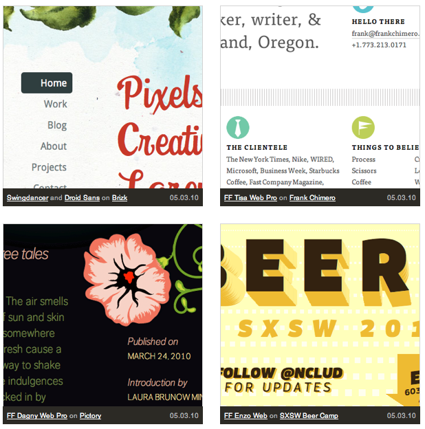
Collected Inspiration: The Typekit Design Gallery

When we talk to new Typekit users, they consistently describe what we now refer to as the Four Stages of Web Typography:
- Amazement “Wow, I can actually use real fonts on my website now? That’s incredible!”
- Anticipation “Look at all these fonts! Just think of all the great things I can do now.”
- Paralysis “Wait a minute, I’ve only ever used Verdana and Georgia in my work. Now I’ve got to worry about font-size and line-height based on font metrics I’ve never considered before. And which faces pair well with each other? And how do I add personality to my site and still maintain legibility? OMG!”
- Inspiration “If only there was a place to see some great examples of what everyone else was doing…”
We’re here to help. Over the last few months, thousands of amazing designers have started using Typekit fonts in their work. We’ve been keeping an eye on them, and have collected some of the best examples of web typography — from personal blogs and portfolios, to corporate websites and large publications. Check them out now in our brand new Typekit Design Gallery.
We’re going to be adding a lot more examples soon. If you’d like us to have a look at your site, you can send us an email, or even better, add a screenshot to our Flickr group. We’re looking forward to even more amazing design work from all of you.
3 Responses
Comments are closed.
Wow that wa a fantadtic gallery
Great! I’ve added this to Gallery Galleria http://tinyurl.com/28vakw9
This is a great piece of advice in my opinion.
I’ve felt the exact same stages myself. Specially #3 😉