Using Bickham Script
Although the English round hand style was originally a running hand used in writing letters and business documents, we would not be likely today to use it for more than a very short passage of text. Instead, we would think of it as a display typeface, although it will also perform well at larger text sizes. “Its optical size,” Robert Slimbach points out, “falls somewhere between text and display, providing a decent amount of flexibility of usage.”
The font is designed to be used with contextual alternates enabled, though it works well even in programs that don’t support contextual substitution. The basic style can give an antique elegance to a title or a label, or perhaps a restaurant menu, even without using anything but the default character forms. When contextual substitution is turned on, in a program that supports this OpenType layout feature, the complex software built into the font decides which form of the letter to use based on the context of the letters around it.
The effect is much like a handwritten passage where the writer chooses a slightly different form of some letters as he or she writes. If you don’t like the alternate form that appears in a particular position, you can select that letter alone and turn off the contextual alternates feature; this will affect only what you’ve selected.

The effect of turning on Bickham Script’s contextual alternates, shown in the lower line: less repetition, more natural variation.
You can go a step farther by selecting individual letters and choosing the OpenType Stylistic Alternate feature, or Swash, or Stylistic Set 1; each has a different effect on how the letterforms appear. (Not every character has alternate forms, of course, so not every choice will have any visible effect.) To get more adventurous, you can use InDesign’s glyph panel, or a similar tool in another program, to pick directly from among the font’s other alternate letterforms.
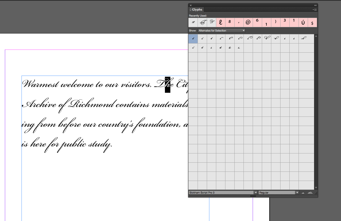
The InDesign glyph panel shows a quick overview of the alternate glyphs available for a selected character.
Because Bickham Script is a typeface with a small body and sometimes very large swash forms, it looks much smaller than many other typefaces in the glyph panel. Unfortunately, there’s a limit to how large you can make the glyphs appear in this panel; even at the largest size, you may have to peer closely to distinguish, say, an r with a short leading stroke from an r with a longer one. The glyph display in this specimen may make it easier to use these extensive alternate forms.
In lowercase letters, it’s useful to look closely and see which alternates are meant for the beginning of a word (with a swash extending to the left), which are meant for the end (with a swash extending to the right), and which are intended for use in the middle of the word (no swash, but a form that’s different in some way from the default). In addition, there are many complex ligatures included in Bickham Script Pro, including three-letter ligatures; the more exotic of these also have to be selected directly from the Glyphs panel or otherwise chosen manually.

Examples of the many forms of the lowercase y in Bickham Script, designed for use at the beginning, in the middle, and at the end of a word. See the full glyph set.
Swash capitals are always intended to be used alongside lowercase letters. Even the default capital letters in Bickham Script Pro are rather fancy; they can be combined for an acronym, but it might be more effective to use a different but complementary font for cases like that. In The Universal Penman, the writers often used a form of sturdy roman caps for contrast with the round-hand style; in digital typesetting, you may find that a roman with roots in the same period works well alongside Bickham Script. The small caps of Adobe’s Kepler Std, with the size and tracking suitably adjusted, can look right at home in a passage of Bickham Script Pro.

Kepler small caps used along with Bickham Script.
Swashes & flourishes
Bickham Script contains a very large selection of swashes, alternates, and independent calligraphic flourishes, which can be artfully combined to create some of the effects seen in 18th-century handwriting. Some of these characters can be called by turning on various OpenType layout features; others need to be individually chosen and put into place. It’s always possible to overuse decorative effects; no doubt it was done in the 18th century, too, by less experienced penmen. But the possibilities for inventively accentuating a title or a label or a passage of prose in Bickham Script are very wide indeed.
A simple example is adjusting the spacing of an initial swash capital letter. The horizontal space allotted to the glyph takes into account the full width of the swash, but that may mean that, to a reader’s eye, the letter seems pushed to the right, away from the left-hand margin. To correct for this, you could insert a small blank space before the initial letter and kern back over it, until the position of the swash letter looks right. (This also works in InDesign’s Drop Cap feature — though since the blank space counts as a character, you’ll have to adjust the number of characters affected accordingly.) Or you could place the swash letter separately in the layout, and move it by hand to wherever you like. In that case, it would not be part of the text flow, so this is probably something you’d want to do only after the text was final.
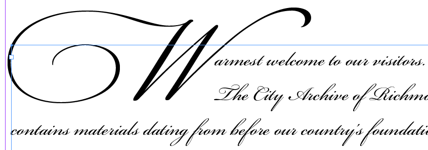
Using the Drop Cap feature in InDesign may require more manual spacing tweaks — but the beautiful swashes are worth it.
Within a line of text, you may need to adjust the spacing between particular pairs of words, to make the extended strokes and flourishes look the way one might have written them. Although the default spacing of Bickham Script Pro will make any normal passage of text flow evenly and comfortably, once you start adding special effects it’s always a good idea to look closely at the spacing and adjust it where needed.
With a flourished script like this, you might decide to let some of the longer and more decorative strokes overlap surrounding letters. This is an accurate reflection of what an 18th-century writing master would sometimes do — although a writing master might also find ingenious ways to link the flourishes in ways beyond what can be built into a digital font.

My family all the time say that I am killing my time here
at net, but I know I am getting knowledge all the time by reading
thes nice articles or reviews. http://www.indiatips.in/article.php?id=151