Sites We Like: From the Front, Design Philadelphia, & Vancouver Type Brigade
There is no shortage of great conferences and meetups out there to learn from and enjoy — and this week we’ve rounded up a few whose websites especially impressed us with their superb typographic choices.
From the Front
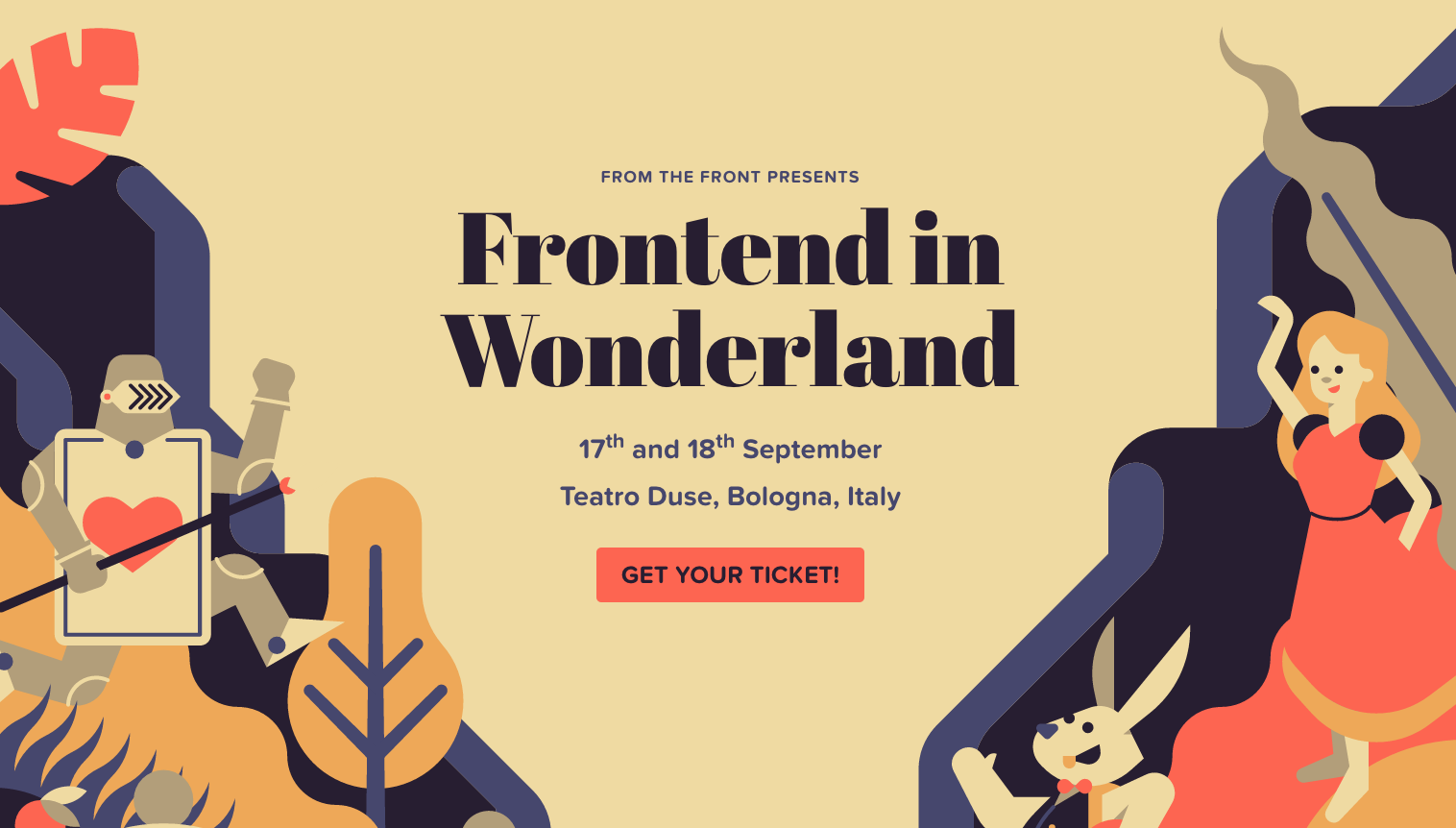
Abril Display makes for gorgeous headings in the website for this year’s From the Front conference on front-end design and development, and looks great on top of the design flourishes on the page itself. Body content appears in a mix of warm Proxima Nova Soft and Effra, a subtle contrast.
Design Philadelphia

A solid geometric sans is rarely out of place in the design world these days, which makes Futura PT a fitting choice for the text on the website for Design Philadelphia. Slight variations to weight, size, and color establish a functional sense of hierarchy on the neatly-designed page.
Vancouver Type Brigade
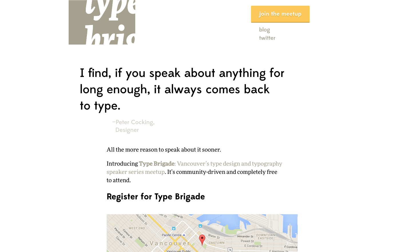
We’re always ready to learn more about typography, and the Vancouver Type Brigade is here to make that a regular part of our lives with their recurring meetups. Body text here is set in the lovely serif FF More, which performs especially nicely on the blog. The big geometric-flavored headings are in Edmondsans.
That’s it for this week; share sites you like in the comments!