New Fira Sans fonts on Typekit
Mozilla has long been a leader in the open source software community. With the 2012 development of Firefox OS, an open source operating system for mobile and home electronics devices, came a new open source type system for its identity: Fira Sans.
Type designer Erik Spiekermann, alongside Ralph du Carrois and his Carrois Type Design studio, were commissioned by Mozilla to create an original type family tailored to mobile user interfaces, while maintaining the approachable humanist design aesthetic integral to Mozilla’s image. Spiekermann’s landmark typeface FF Meta is at the core of Mozilla’s identity, used for the wordmarks of its various divisions and products (including Firefox), and was used as a starting point for the design of Fira Sans.
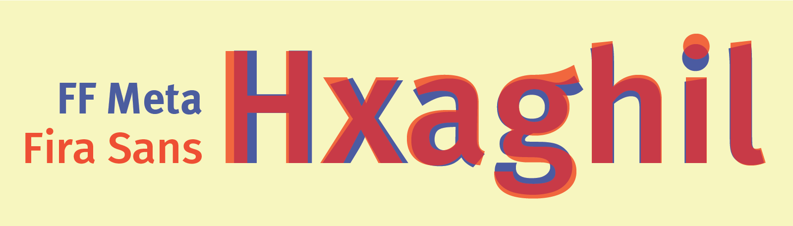
While it is clearly kin to FF Meta, Fira Sans is optimized for a different experience. It has a higher x-height, wider frame, and looser letter spacing, all in support of rendering on small screens. A few of FF Meta’s characteristic bendy and diagonally sliced terminals occur naturally in Fira Sans, but the latter is generally straighter laced and sturdier than its cousin.
You may already be using Fira Sans through Typekit, as the initial four weights have been available for some time. This week we filled out the family with a whole slew of new weights — 16 in all, and too many to fit into a single CSS weight-defined group. (See Fira Sans and Fira Sans 2 for the whole set.) If you’ve been looking for a new super light-weight sans serif, look no further, as Fira Sans has a huge range of them, all the way down to a two-em stem width.
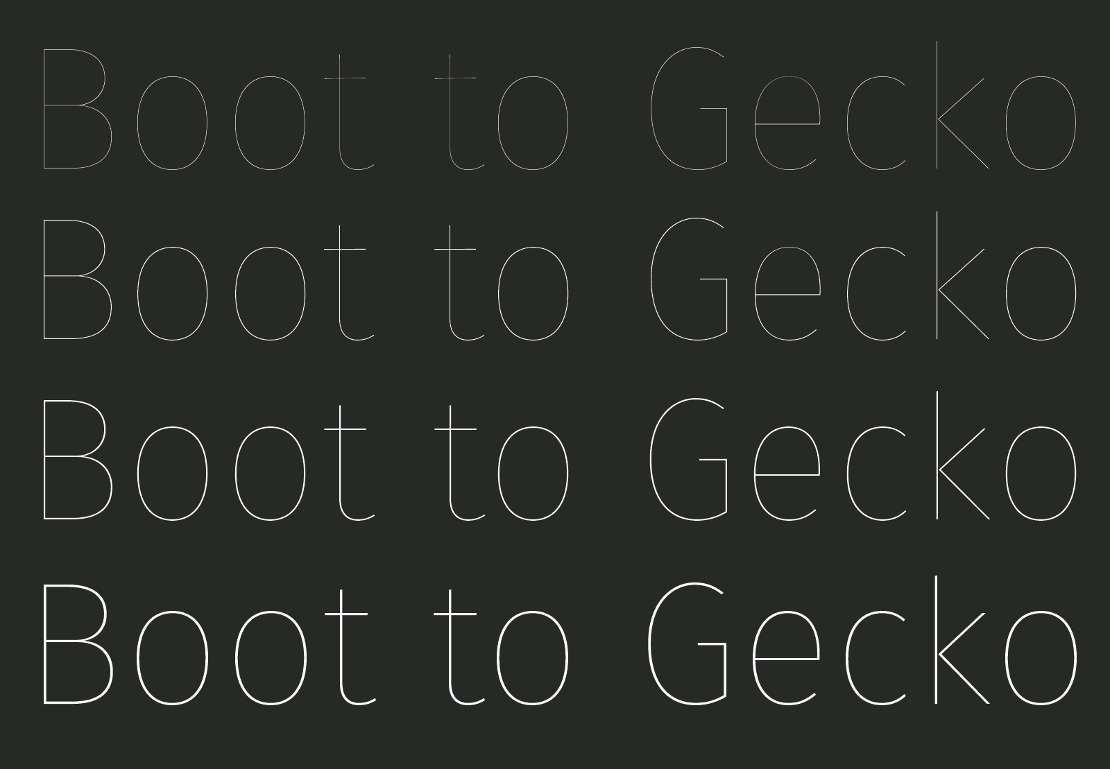
The lightest of weights are considered experimental, and will continue to evolve. As an open source project, these fonts are subject to change; Carrois and his team of designers continue to tweak and optimize Fira as they go. Extensive language additions are in the works, as well as varying widths, and perhaps a serifed version down the road. There is a monospaced version currently available, which you can also find at Typekit.
All Fira Sans and Fira Mono fonts are available at all levels of Typekit plan, for web and desktop. If you’ve never tried Typekit, sign up and start working with Fira today. You can upgrade to a paid plan when you’re ready.
One Response
Comments are closed.
One of the most good looking and easily recognisable fonts.