Introducing our newest foundry partner: Positype
Housing Neil Summerour’s typefaces since its establishment in 2000, Positype covers the spectrum from tasteful restraint to cheerfully outrageous, and shows a clear affection for handmade pen-and-ink lettering. Among the brands and publications that have used Positype fonts are Communication Arts, HOW Magazine, ABC, MTV, and Victoria’s Secret. Available on Typekit for both web and desktop, Positype faces can be dynamic components for almost any kind of creative project.
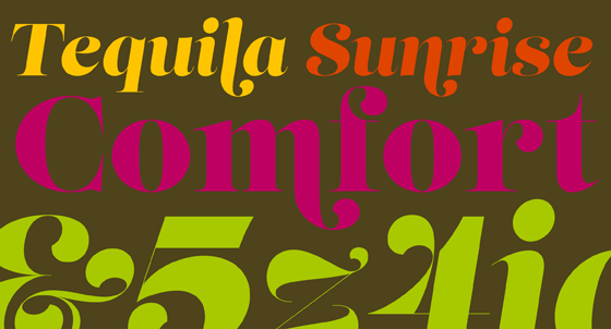
Lust is reminiscent of the more flamboyant designs from International Typeface Corporation in the ’70s, which were often inspired by classic text faces but infused with a heightened personality and begged for use with advertising and branding. Lust’s strong and distinctive appearance is attention-grabbing in almost any setting, particularly in a medium which can fully support its extensive ligatures and alternates. Even in more restricted settings, such as web browsers lacking OpenType layout support, Summerour has ensured it will make an immediate impression. Check out Lust’s Didone style for more vertical stress and unbracketed serifs, and its display styles for larger settings.
Halogen sports generous width and a hint of reverse stress—that is, horizontal strokes thicker than vertical strokes—putting it somewhere between mid-century advertising faces like Estro and commercial workhorses like Copperplate Gothic. This varying stroke weight often evokes pen writing, but it is more sculptural in the case of Halogen, giving the letterforms a satisfying substance at display sizes. It performs well at smaller subhead sizes too.
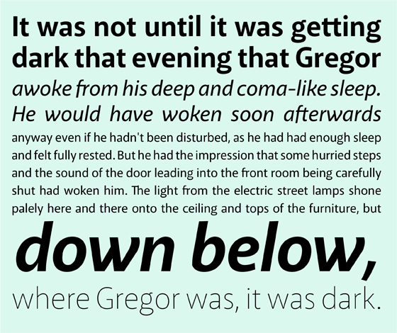
Akagi Pro is a comprehensive, humanist sans serif family which serves more quietly but just as deftly. It’s not without some distinctive design quirks—see the italic’s kinky y and curvy v, w and k—which clearly reflect a handwritten influence more than a mechanical one. Still, its overall character is modern in the best sense of the word. Nine weights, ranging from thin to fat, will provide plenty of options for any typographic environment.

Muscle Wide Italic, Narrow, and Narrow Italic.
Muscle works best when your goal is to coat the page or screen with as much (actual or virtual) ink as possible. Strangely legible if you set it large enough, Muscle adds heft to word marks and short headlines, and works particularly well in designs where color plays a leading role. Check out both the Narrow and Wide variations—and their italic companions, which seem quite comfortable leaning to the right.
All of the font families from Positype on Typekit are available for desktop sync. If you haven’t already, sign up for access today!


