Setting subheads with CSS
Subheads are typographic devices that establish content structure for the reader, providing a short overview of the content that follows. We can use them as points of visual interest or as simple navigational aids that gradually disclose the content. However, default subhead styles rendered by the browser can be too generic. If you’re looking for some variety, you can achieve some interesting effects with a pinch of CSS.
To start, we will bring together a few basic methods that can be combined and expanded upon:
- sizing to a typographic scale
- variations in style
- hanging subheads
- running-in subheads
- non-alphabet symbols
- crossbars
As we look at each of the methods, you can follow along on this demo page to see these—and even more—variations in action.
Sizing to a typographic scale
When designing a hierarchy for the web, a safe approach is to size subheads using a typographic scale—either a custom scale or a more established scale, such as the traditional Typographic Scale (16, 18, 21, 24, 36, 48, 60, 72) developed by Renaissance typographers back in the 16th century.
Start with setting the font size for the body, and then order the subhead sizes from least to most important. In my experience, h5 and h6 are rarely needed on the Web, so we shall start with h4 and move up to h1, applying the default Typographic Scale (16, 18, 21, 24, 36, 48, 60, 72).[1]
 p { font-size: 100%; } /* 16px */
h4 { font-size: 1.125em; } /* 18px */
h3 { font-size: 1.3125em; } /* 21px */
h2 { font-size: 1.5em; } /* 24px */
As you can see, the subhead values are too close to one another to be able to clearly distinguish between them, especially if the page is scanned quickly. This is where a different scale might be preferable, such as one based on the ratio 2:3 (perfect fifth), which we can use to increase subhead sizes in 50% increments.[2]
 p { font-size: 100%; } /* 16px */
h4 { font-size: 1.5em; } /* 24px */
h3 { font-size: 2.25em; } /* 36px */
h2 { font-size: 3.375em; } /* 54px */
The result is a much bolder design that’s also easier for readers to interpret.
Different styles at the same letter size
Web designers are accustomed to using the default bold weight for subheads, but now that we have much better screens and more capable fonts, we don’t necessarily need to use bolding to increase the importance of an element. Instead, we can experiment with different styles—such as all caps, small caps, and italics.
We will require a family with many styles for these tests, and I’ve picked Proxima Nova because an accompanying small caps style is available, as well as a range of widths. Whether you use Proxima Nova or another favorite font of your choice, be sure to keep versatility in mind here—especially since not all fonts feature small caps.
As with everything else in web design with CSS, there are a few methods you can use to style with small caps. One option is to apply the CSS3 OpenType feature rule.
h3 {
  font-family: proxima-nova, sans-serif;
  -moz-font-feature-settings: "smcp";
  -ms-font-feature-settings: "smcp";
  -webkit-font-feature-settings: "smcp";
  -o-font-feature-settings: "smcp";
  font-feature-settings: "smcp";
  text-transform: lowercase;
}
Another option is to load a separate small caps font. This has the added benefit of ensuring that small caps are present even in browsers that don’t support CSS OpenType features via the font-feature-settings property.
h3 {
  font-family: proxima-nova-sc-osf, sans-serif;
  text-transform: lowercase;
}
Hanging subheads
To expand the previous method even further, especially when we need to put emphasis on a document’s structure, we can use hanging subheads. This was a no-brainer when we were designing fixed layouts, but with the advent of responsive web design, relative units such as percentages can be challenging.[3]
We can use the following formula to calculate the width of a hanging subhead:
- x = article’s left padding in %
- subhead’s width in % = (x / (100 – x)) * 100
article {
  padding-left: 33.33333333%;
}

h2 {
  float: left;
  margin-left: -50%;
  width: 50%;
}
For more flare, a simple horizontal line can be just as elegant. Pseudo-elements :before and :after are perfect for such progressive enhancements to the basic design. We can style them either by applying borders or by applying backgrounds (or both).
Keep in mind that the inherited width of the pseudo-element equals the width of the subhead. In order to extend the pseudo-element to span the full article width, we must increase the pseudo-element’s width. Calculate the percentage of this extension by starting with the percent-based value of the article element’s padding. (As a formula, this looks like: (100 / padding of article in %) * 100 = pseudo element width in %)
h2:before {
  content: " ";
  float: none;
  display: block;
  width: 300%;
  height: .7em;
  border-top: .0625em solid #ccc;
}
Or, we could just apply a border to the paragraph that follows the subhead with CSS adjacent selectors:
article {
  padding-left: 33.33333333%;
}

h2 {
  float: left;
  margin-left: -50%;
  margin-top: 1.5em;
  width: 50%;
  text-align: right;
}

h2 + p {
  border-top: .0625em solid #ccc;
  padding-top: 1.4375em;
}
Finally, a hanging first letter is easy to achieve, and adds a touch of elegance. Try to match the hanging letter to a baseline to create visual unity—for instance, set it to span two lines of the adjacent text.
h2 {
  margin: 0;
  font-weight: bold;
}

h2:first-letter {
  float: left;
  width: 1em;
  margin-left: -1.1em;
  font-size: 3.4em;
  line-height: .9em;
  text-align: right;
}
Running-in subheads
Running-in subheads can be achieved by simple floats. An important consideration for this method is to match and preserve the x- and line-height for both the subheading and the adjacent paragraph.
h2 {
  float: left;
  font-size: 1em;
  line-height: 1.5;
  padding-right: .5em;
  margin: 0;
}
Again, this option can be expanded with variations in size and with accompanying bars. Use a light touch with these effects, however, to avoid overwhelming or distracting your readers.
Non-alphabet symbols
Pseudo-elements :before and :after can be very useful in a situation when decorative details are needed, because the markup can remain semantic. For example, to surround text with curly brackets, we’d simply add the following rule:
h2:before {
  content: "{";
}

h2:after {
  content: "}";
}
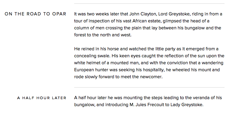
We can add a series of asterisks or just a simple dash under the heading, too. Simply set a display: block rule to an :after pseudo-element and increase its font size, thus bringing the finer details into focus. Even some common glyphs found in almost every font can look quite interesting when increased in size.[4]
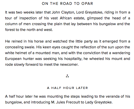
The code is quite simple:
h2:after {
  content: "—";
  display: block;
  font-size: 2em;
}
Pseudo-elements are positioned inside the element, but precede and follow the string of text or child elements. That’s why it’s easy to position them relative to the element itself.
Crossbars
If you play with the paragraph alignment of your subheads, do so with consideration for how it affects the overall grid on the page. On their own, subheads flushed right are easily overlooked, and don’t serve as adequate document landmarks. The combination of paragraphs flushed left and subheads aligned centrally or to the right can result in a muddled-looking page.
Crossbars help to preserve the underlying grid of your page, particularly when the subheads are right- or center-aligned. To add a crossbar, we can use our old friend the :after pseudo element.
h2 {
  display: table;
  width: auto;
  padding: 0 .5em 0 0;
  position: relative;
}

h2:after {
  content: " ";
  display: block;
  height: .5em;
  width: 9999%;
  overflow: hidden;
  position: absolute;
  top: .6em;
  background: #ccc;
}
Go wild!
Feel free to use these examples as a starting point, and experiment by adding different styles and hues, combining typefaces, and modulating contrast. Combined with a carefully-selected body copy typeface, subheads can establish a clear, solid hierarchy that guides your readers to the finish line.
Notes and resources
- Be sure to reset any line spacing defaults in your CSS, or you might see some unexpected results here. This code will do the trick:
* { margin: 0; padding: 0; font-weight: normal; } html { font-size: 100%; line-height: 1.5; } - For more inspiration and to quickly test a few different scales, bookmark Tim Brown’s Modular Scale calculator.
- The trick to maintaining flexible hanging subheads is quite simple, and is described in detail in my article, Offsetting an HTML element in a flexible container.
- If you need more ideas for glyphs you can use, just check out the table of UTF characters.
10 Responses
Comments are closed.
Funny that you mention resetting line-height, but when viewing this article on an iPhone 4, the body is so narrow that the subhead “Different styles at the same letter size” wraps to two lines and the line height looks pretty off. (2ems?)
super good stuff!
Great article !
For the “Running-in subheads” section, you could have simply use the property “display: run-in”
Reblogged this on ilumindy and commented:
เทคนิค CSS ที่เอามาเล่นกับ Header
This is good stuff. Thanks for sharing!
Beautiful. I’m inspired to try these, thank you.
A very good article ! We are learning every day more funny things to apply on typography. I’ll test all what you had show. Thanks !
Great run through for online typography.
Super useful stuff!
Thank you everyone for your kind words!