Adobe CFF font rasterizer accepted by FreeType
Last month we announced that Adobe, in collaboration with Google and FreeType, contributed its CFF font rasterizer technology to FreeType. Today we are happy to let everyone know that the Adobe CFF Engine has been accepted by FreeType and the Adobe-enhanced rasterizer is now on by default.
We’d like to thank everyone who tested the Adobe CFF Engine and reported issues during the beta period. The code was released as a “mature” beta but testers did find a few issues and an improved version of the rasterizer is now being delivered to all devices that use the latest version on FreeType (version 2.5.0.1).
So what does this mean? As discussed in our initial blog article, the inclusion of the Adobe CFF engine in FreeType improves font rasterization for CFF fonts in environments that use FreeType. Since FreeType is used by more than a billion devices, including Android and Chrome OS, both Adobe and Google see the contribution as one that will improve the CFF font experience for lots and lots of users. The experience with CFF fonts will match the one users have enjoyed for many years on Windows and OS X.
We could talk again about the rasterizer’s technical improvements, but a picture is worth… (well you know the saying!). The following image was shown in our initial announcement, and we think it does a great job illustrating the improvements made by the Adobe rasterizer.
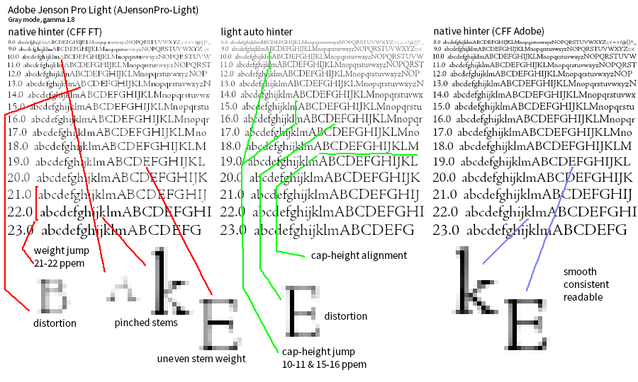
As you can see, the Adobe CFF Engine in FreeType consistently produces smoother and more readable text. And now that it has been accepted by FreeType, and is on by default, we are one step closer to achieving great quality rasterization for CFF fonts on devices that use FreeType. We expect this new feature to be picked up by products in the coming months and we will keep you in the loop as adoption increases. Stay tuned!
To read Google’s blog post please visit http://google-opensource.blogspot.com/2013/06/youve-got-cff.html.
7 Responses
Comments are closed.
I can’t find how to get a mail to you, so i’ll put it here!
i’m a photographer and graphic designer in China, and i would like to make a suggestion regarding Adobe’s Chinese fonts. you need Glyphs for punctuation. the spaces caused by ). ” is like ) . ” very unattractive. if you employed glyph they could still keep chinese character space yet fit two punctuation marks, thus reducing the size of the gaps to a visually appealing level. At the moment i go through the text at the end (i design art catalogues and there are lots of punctuation marks!) and do a -600 kern on them!!!! This would make Adobe’s chinese fonts very popular in China as we all see this problem and i can’t believe with Opentype, it has not be sorted! please fix 🙂
If my suggestion is picked up, i would expect thanks by offering my your type package, on continual licence.. (think of this as a user agreement, you being the user of my idea)
cheers
g
it’s interesting that in my post the gaps i put in the example are closed up! unlike Adobe Song font!
What you described is a function of a layout engine, not a font. Thus, our Adobe Song Std L font is not problematic in this regard. CJK fonts typically include full-width punctuation, and as you have observed, sequences of some of them result in seemingly odd spacing. These contextual rules, to remove extra whitespace, were first specified in JIS X 4051, which is a japanese standard. Actually, the rules specified in that standard indicate that the glyphs for such characters be changed to half-width, and in some contexts, a half-width whitespace is added. Most of these rules, including the one that covers the case you described, are applicable to Chinese. Just out of curiosity, which layout application are you using?
indesign, remember the lessons of quark, market dominance is the first step to a fall if you don’t stay on your toes!
🙂 i was using Adobe Song Std L which i inherited… but it is only in one weight and we have the rather odd situation of trying to please someone who is in the western tradition… I used this as it is open type, which i thought would be better, i was about to go to another song, which has three weights… (would make my life easier, as a small group of us doing bilingual things in China are making for a new typography in Chinese, using bolds and less of the chinese strange punctuation… like <>, i will have a closer look and compare.
In case you’re using the English version of InDesign, in order to enable correct CJK line layout, you can do so by using the InDesign templates that Diane Burns prepared.
I was wondering – how do I use the Adobe CFF Renderer for text in, say, JavaFX? Or is that not possible?
What you are asking is a question that should be posed to those who develop JavaFX, and boils down to a matter of how to incorporate a new version of FreeType—if FreeType is already being used in that environment—or how to incorporated FreeType in the first place. The former should be simpler than the latter.