Coming to your desktop: fonts from TypeTogether
This is our fourth post in a series highlighting foundry partners who will offer fonts for desktop sync, including Dalton Maag, FontFont, and Mark Simonson Studio.

Launched in 2006, TypeTogether is the creation of José Scaglione and Veronika Burian, who studied together in the Typeface Design program at the University of Reading. Among the foundry’s leading operational principles is the idea of working together on designs, (“hence the name,” they say) and TypeTogether functions as a collaboration space for several other type designers in addition to the two founders.
As a guiding theme for their designs, TypeTogether focuses especially on the professional editorial market and its need for typefaces that allow for extended reading while still exhibiting a high degree of personality.

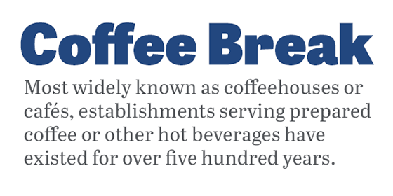
Tablet Gothic shown as a heading, with body text set in Abril Text. (Source text.)
TypeTogether designed Tablet Gothic with titling in mind—in particular, for publications that have both an online and physical presence. This is a typeface that translates beautifully from screen to print, and now that it’s available for desktop sync, it’ll be even simpler to use in designs intended for multiple media types. With 42 different styles to play with, this is a titling font that easily maintains consistency without ever appearing repetitive.
As a recommended pairing with Tablet Gothic, Abril Text is an attractive typeface well-suited for publications, with the four main text weights all manually hinted to ensure a smooth progression between digital and printed works. Subtle curls in the descenders give the typeface an extra boost of charisma without being distracting.

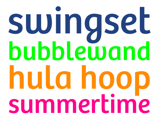
Bree.
With even more character, Bree is a delightful typeface that was modelled after the TypeTogether logotype and takes a lot of inspiration from handwriting. Its long-form uses are more limited than those of Abril, but it performs beautifully as a headline or subhead font, and would also do nicely for pull quotes. Even with its strong personality, Bree is easy to pair with other fonts.
This powerful flexibility is the real beauty of TypeTogether fonts: they’re built to work hard, and they make it look effortless. Below is a complete list of the families from TypeTogether that we’ll be making available for desktop sync. Add them to your favorites so you can find them quickly when we launch the desktop sync feature, and use them on the web today. If you’ve never given Typekit a try, sign up (it’s free!), and upgrade to a paid plan when you’re ready.
- Abril Text & Abril Fatface
- Adelle
- Adelle Sans
- Alize
- Athelas
- Bree
- Cora
- Coranto 2
- Coranto 2 Headline
- Crete & Crete Rounded
- Edita
- Eskapade
- Eskapade Fraktur
- Givry
- Iskra
- Karmina Sans
- LFT Etica & LFT Etica Display
- Maiola
- Pollen
- Sirba
- Soleil
- Tablet Gothic (including Compressed, Condensed, Semi Condensed, Narrow, and Wide)
2 Responses
Comments are closed.
Bree to my desktop? Hot damn!
sweeet, but I wish they had more descent russian support =)