Adobe contributes font rasterizer technology to FreeType
Today we are pleased to announce that Adobe has contributed its CFF rasterizer to FreeType. The code is now available for testing in the latest beta version of FreeType. This open source project, aimed at improving CFF rasterization in devices and environments that use FreeType, is a collaboration between Adobe, Google and FreeType.
Modern fonts use one of two outline formats – TrueType or CFF. TrueType was developed by Apple in 1990, while CFF (the Compact Font Format) was developed by Adobe as a second-generation form of the Type 1 format (often called PostScript fonts) that Adobe first released in 1984. Either TrueType or CFF can be used in OpenType fonts. The two share many qualities, but differ in two primary ways: they use different math to describe the curves in letterforms, and they have different styles of “hinting.” (Hinting = providing guidance to the rasterizer to ensure each letterform is represented as faithful as possible in a limited set of pixels.) TrueType puts most of the emphasis on instructions built into the font, while Type 1 and CFF rely more on intelligence in the rasterizer. This makes the quality of the rasterizer particularly important, and Adobe expects its contribution to FreeType will produce a noticeable improvement for CFF fonts in environments that use FreeType.
FreeType, an open source library for font rendering, is used either partially or exclusively by Android, Chrome OS, iOS, GNU/Linux and other free Unix operating system derivatives such as FreeBSD and NetBSD. This makes FreeType the font rendering software of choice for more than a billion devices. As a user of FreeType in their products, Google was looking to get the same high-quality text rendering for CFF fonts that their users currently enjoy with TrueType fonts. Google approached Adobe about getting Adobe’s rasterizer technology into FreeType and has been a key financial supporter of this project ever since. And because Google is such a strong supporter of open-sourced technology, all users of FreeType, as well as FreeType developers, will benefit from this contribution.
As a long time developer of fonts and font rendering technology, Adobe saw this contribution to FreeType as an opportunity to make CFF fonts look great on a multitude of devices. Similar to Adobe’s collaboration with Apple and Microsoft 12 years ago to get native support for Type 1 and CFF fonts into the desktop OSes, and more recent collaboration with Microsoft to get the CFF rasterizer into WPF and DirectWrite, contributing the Adobe CFF Engine to FreeType will dramatically improve the CFF font experience for a large number of users. Users of devices that incorporate the new version of FreeType will have the same font rendering experience for CFF fonts that they have enjoyed for many years on Windows and OS X.
The examples below illustrate some of the differences users will see on devices that use FreeType with the Adobe CFF Engine. Samples on the left are CFF fonts rendered with the native FreeType hinter, those in the middle are rendered with FreeType’s light-auto hinter and the ones on the right are using FreeType with the Adobe CFF Engine. Clicking on these images will display a higher (1:1) resolution image.
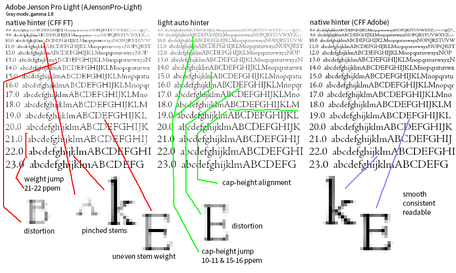

The above examples illustrate the cumulative effect many small improvements can make when it comes to font rendering. Adobe CFF Engine features, such as adding an extra pixel in height to help separate stems in many glyphs, and increasing stem widths to enhance contrast without creating blobs and — when there are not enough pixels — leaving selected stems unhinted, improves the readability of CFF fonts.
Although CFF fonts have been widely popular on the desktop over the last decade, the Web and mobile devices almost exclusively use TrueType. This reflects the legacy of low-resolution monochrome displays, an area where “superhinted” TrueType fonts could produce better results.
With the addition of high-quality CFF font support, developers will have a much richer set of fonts from which to choose. Not only is CFF the world’s most popular font format, it is a great format for the Web and mobile, as Miguel Sousa discussed in an earlier blog post. Two of its most significant benefits are smaller file size than TrueType and a flexible and powerful method of hinting which ensures excellent rendering across a wide range of environments and devices. As Miguel points out, it’s easy to see why smaller font files are desirable for the web and for resource-limited devices.
If you are interested in testing the Adobe rasterizer code in FreeType, visit www.freetype.org. The code is beta and off by default, so you have to explicitly select it using the new hinting-engine property of the CFF driver. Additional instructions are available in the FreeType ‘CHANGES‘ file. If you are looking for a set of CFF fonts with which to test, we recommend that you download one of Adobe’s free, open-source typefaces, Source Sans or Source Code, available on GitHub.
For additional information from Google please visit http://google-opensource.blogspot.com/2013/05/got-cff.html.
Note: We have updated some links in this post for clarity; Adobe open source projects are hosted on GitHub, but no longer on SourceForge. (10/23/2014)
18 Responses
Comments are closed.
This is lovely. Thank you for being awesome, Adobe team.
This is awesome! Thank you very much Adobe and Google!
respect++
Bravo, Adobe!
Great to see, thanks a lot Adobe and Google!
I’m sorry for getting off-topic, but will we ever see the day when (horizontal and vertical) stems will be properly hinted even when anti-aliasing is on ? Look at the vertical stem of ‘E’, which smeared over two pixels. This aliasing of stems makes the whole text look blurry and washy. I always feel I as if my eyes were full of tears when looking at such text; I find it very straining.
Incidentally, every properly ‘hinted’ TrueType font gets this right. Just look at any TrueType font which Microsoft ships with Windows. Even Adobe’s Web fonts have sharp stems (except for very small sizes where ‘hinting’ is apparently turned off).
It’s not so much about being “properly hinted” or not; what you’re asking is for aliased type. I understand that many people prefer aliased type, particularly if you have been using Windows for the last few years. That type of rendering is also mainly appropriate for low resolution environments. But aliased rendering cannot represent every typeface design faithfully, requires the fonts to be TrueType, and demands massive amounts of hinting data in them.
So the answer to your question is No. As the blog post says, Adobe’s approach to text rendering has always been to be as faithful as possible to the design, and to put most of the “hinting intelligence” in the rasterizer, not in the fonts. There are of course tradeoffs with this approach (as there are with the Windows/TrueType approach) but we strongly believe this is the right one.
If you want aliased text all the time, you’ll need to stay in Windows and use the system fonts, pixel fonts, or bitmap fonts.
You’re wrong – what aliasing do you have in horizontal or vertical line? What tk is referring to is pixel-placement (misalignments) which has more (but still little) to do with font kerning than hinting.
And the solution to this problem is known for a long time; in fact it was known before the problem appeared! You just need to select better (original Xft) filter – the legacy one: http://quarto.pl/~gotar/freetype-rgb-matrix.png
It is a mystery to me, why do people use these new filters, while they could have precisely positioned fonts at relatively low cost of some color fringes on some-letters of some-fonts in some-sizes.
The image you linked to says it all: There are people, like yourself, who prefer very regularized letters which snap perfectly to the grid and which stems are represented by an integer number of pixels. I’m glad not all digital text looks like that because it would be pretty dull. When you’re limited by a grid, there’s only so many pixels that you can turn on or off to make up shapes. Fortunately there’s life beyond the grid. And not all designs are going to adhere to it, no matter how many filters you apply.
To have regimented-looking text like the one in your screenshot there’s only two options: 1) you design a typeface that strictly follows a grid, or 2) you make a more natural design but add tons of rules to it (i.e. hinting) to get it to snap to the grid. Option 1 has the disadvantage of making the text look crisp only at specific sizes. And in option 2 the text will look crisp at all sizes as long as you add enough rules that state how to distort the original outlines to make them snap to the edges of the pixels.
You say: “[Y]ou’re asking for aliased type.”. Indeed I do – but isn’t that exactly what your own pictures show? If not, what *is* aliasing to you, and why would it require TrueType fonts?
I also think calling grid-fitted type “dull” is exaggerated; there’s plenty of individuality possible even if vertical and horizontal stems are grid-fitted and don’t bleed into neighbouring pixels. One could even say that almost all individuality is in the parts which are not vertical or horizontal (after all stems have width and height and nothing else).
In the end it seems we can only agree to disagree but to me text should first and foremost be readable (in particular it should not be a strain to the eye) – beauty and individuality, however desirable, must succumb to this (and at low resolutions it is impossible to be faithful to the design anyway).
PS: I don’t understand why you brought up Windows. I’ve been using Linux exclusively at home since ca. 1995. I was talking about the fonts that come with Windows and the fact that they are very well “hinted” so that they look sharp even when anti-aliased by Freetype, not about how Windows renders them. Would you be surprised to learn that I think that “Clear Type” is an abomination? 🙂 Also all the talk about where to put the rasterizing intelligence seems to be beside the point – the CFF rasterizer knows where the stems are and how to grid-fit them.
PPS: Even a display with 300 dpi (such as on my Nexus 10) is in my opinion “low resolution” – or would you call a printer with this resolution “high end”.
Wondering what you include in your strong beliefs of “faithful to the design:”
− Ascender v. x-height proportions?
− Partitioning counters with crossbars?
− Rendering black characters with mostly gray pixels?
See annotated illustration
Great thing for all type designers all over the world who are not deeply in love with the TrueType hinting procedure. And hey, does someone even know only one single designer alive who is really keen on hinting?
😀
Thanks for making things easier!
Beat’s question points to a choice Adobe has made in its approach to antialiasing. The rasterizer is positioning horizontal features (e.g. ascender height & x-height, or crossbars) on the pixel grid and minimizing the amount of antialiasing applied to them, while placing vertical features (mainly vertical stems) so that one edge aligns with the pixel grid in most cases, and representing the stem weight accurately by antialiasing one side or the other. As Beat’s last example illustrates, there are times when the spacing does not accommodate this and the vertical stem must be only partially black.
There are a couple of principles behind this approach.
1) Antialiasing in the horizontal direction: Unlike “superhinted” TrueType which changes the glyph widths to accommodate regular inter-glyph spacing, Adobe’s approach is “faithful to the design” in representing both the glyph width and the inter-glyph spacing designed for the font. This makes the screen display as close as it can be to the result one would get with infinite resolution, while preserving what we consider the key characteristics of each glyph. Others might make a different trade-off, but this one is reasonable.
2) Minimal antialiasing in the vertical direction: The pixel geometry of modern displays (normally LCD) supplies three vertical sub-pixels as the eye moves horizontally across each visible pixel. On devices where we can be certain this characteristic is present a rasterizer can take advantage of the sub-pixels to add increments of weight. In Western writing systems this turns out to be the more critical direction anyway; the weights and spacing of the vertical stems (see #1) are central to Armenian, Cyrillic, Greek, and Latin type designs. In the vertical features the weights and spacing are less critical; what’s more critical is the visual alignment of related features (like the ascenders and x-height Beat mentions). The sense of alignment for these is enhanced by using less antialiasing, while the cruder vertical resolution (full pixels instead of 1/3 pixels) is less of a problem. Even when the rasterizer uses greyscale antialiasing instead of color (a necessary compromise when one doesn’t know the screen characteristics), the horizontal antialiasing preserves the design’s weight and spacing much better than aliased type would.
I think the answer to Beat’s final question is “yes”; what the user has “asked for” is a specific typeface design, and we are striving to give him/her the closest possible representation for its weight and spacing (along with its glyph-specific details.)
Thank you Beat Stamm for your good questions and carefully prepared illustration. Let me add to David Lemon’s response.
Using hints to grid-fit an outline is necessarily a distortion. We strive to minimize this distortion. We do apply hints to horizontal stems and enforce blue zones, because sharp alignment zones improve readability. We don’t apply hints to vertical stems because it interferes with kerning and interglyph spacing. We judge good interglyph spacing to be more important for readability than sharp vertical stems. We also don’t apply stem snapping, because it is unnecessary in a coverage-based antialiased system with sufficient precision.
Your first question is about ascender vs. x-height proportions. These two alignment zones are positioned independently, each being rounded to the nearest pixel edge. After overshoot suppression, stem darkening and scaling, the “ideal” positions for these zones for AJensonPro-Lt at 14 ppem are 5.6 and 10.1 pixels. These round to 6 and 10 pixels. For 16 ppem, the numbers are 6.3 and 11.5, rounding to 6 and 12. For 17 ppem, the numbers are 6.7 and 12.2, rounding to 7 and 12. These are the values shown in your top illustration. So, no; there is no specific mechanism to preserve proportions in a glyph that participates in more than one alignment zone.
Your second question is about counter proportions. Yes, we do make an effort to minimize counter differences in a glyph like ‘B’ or ‘E’. Counters are not represented directly in Type 1/CFF fonts, but there are some things we can do with stem hints. In this font, the midpoint of the middle hstem is .54 of the distance from the baseline to the top. At 14 ppem, the ‘B’ is 9 pixels high after base and cap-height alignment. The middle hstem is not in an alignment zone, so we start by adjusting its unhinted position relative to the zones we’ve already positioned. The hinting proceeds from there. In general, an hstem is moved in one of four directions, top edge up or down, bottom edge up or down. Unless there are conflicting hstems, we take the smallest movement to minimize distortion. The “ideal” position (using the .54 proportion) would place the center at 4.9 pixels. We place the stem at (4.3,5.0) pixels, which gives it a center of 4.65. The next higher possibility is (5.0,5.7) with a center of 5.35. So, the least movement also places the stem closest to the ideal position. The other sizes are hinted similarly. In each case, the midpoint of the hinted middle stem is as close as possible to the .54 proportion taken from the cap-heights of 10 and 11 pixels, respectively.
Your third question is about placement of vertical stems. The example you’ve chosen, ‘L’ at 16 ppem, has a vertical stem width of 1.4 pixel. With coverage-based anti-aliasing, the color of each pixel is a blend of foreground and background color, using the coverage value as a proportion. In your example, the stem is centered between pixels and is represented by two gray pixels of 70% black each. It is necessary for the densities to sum to 1.4 in order to present a stem of the correct visual weight. If we were to grid-fit this stem in order to paint one pixel 100% black and the other 40%, we’d have to move it by 0.3 pixel. It may not seem like much, but this distance is comparable to kerning values at this size, and is clearly noticeable (and distracting) when reading. Add to this an independent placement of adjacent glyphs, and you have interglyph spacing errors of up to 0.6 pixel. So, a consequence of unhinted stems is that 100% density cannot be guaranteed for stems below 2 pixels in width.
Thank you Dave Arnold for detailing the priorities. It is within these priorities that I can now understand “[…] as faithful as possible to the design […].”
Great Adobe!
I’ve been admiring Adobe’s new hinter ever since it came out in about 2001 with Acrobat 5 (if I remember). What are the names of the people who actually developed and implemented the algorithm at Adobe?
Does CFF allow overlapping contours in fonts?