Three Exemplary Typefaces for User Interfaces
With the growing popularity of type design, the sea of typefaces from which to choose gets bigger every year. I’ll be the first to admit that, at times, the waters can be difficult to navigate. There are a lot of variables one must consider when selecting type, and these can be a struggle to prioritize.
Following up on my previous blog post, “Setting Type for User Interfaces”, I’ve chosen a few exemplary fonts from the Typekit library to serve as a reference for your next project. I believe each of the following three typefaces possesses the necessary qualities for distinguished employ within the realm of user interface design.
FF Meta

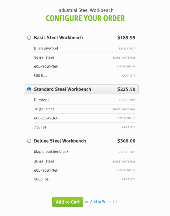
This example uses FF Meta Web Pro, FF Meta Web Pro Condensed Bold, and FF Meta SC Web Pro.
Originally intended for use at small sizes on low-quality paper, FF Meta was designed to be “very legible, neutral, and space-saving [1].” With its flared strokes, angled terminals, open apertures, and sharp intersections, it possesses highly distinguishable letterforms and an approachability that belies its ruggedness.
FF Meta’s unique charm and combination of features lends it an adaptability that is likely responsible for its widespread popularity. Over the years, an untold variety of corporations, publications, and websites have adopted it. Typographers and soccer fans alike will appreciate it’s prominent and tasteful use on the website for the famous EPL club Arsenal.
Typekit hosts a manually hinted version of FF Meta that is available in a variety of weight and styles (including true italics), making it well-suited for a design project with a variety of typographic needs.
Source Sans Pro

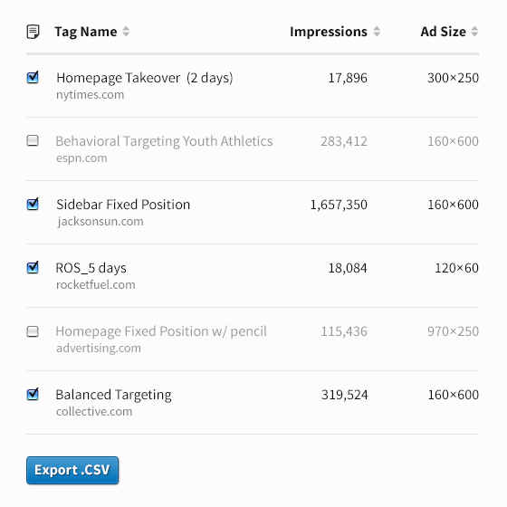
This example uses Source Sans Pro Regular and Bold.
A relatively recent arrival, Source Sans Pro is Adobe’s first open source typeface family. Designed “primarily as a typeface for user interfaces [2],” Source Sans Pro features a hardworking simplicity, elegantly-drawn letterforms, and a familiarity derived from allusions to the “legibility of twentieth-century American gothic typeface designs [2].”
With comparatively wide proportions, large x-height, and balanced upper and lowercase forms, it remains highly readable in both shorter text strings and longer passages. Recently, it has become a staple of Stanford University’s identity, recommended for use in the school’s print and online communications [3].
Manually hinted for cross-platform consistency and available via Typekit in a whopping nine weights (with true italics), Source Sans Pro is an attractive, clinical typeface that can harmonize an interface without drawing undue attention to itself.
LFT Etica

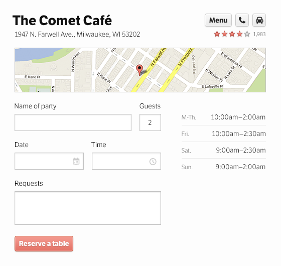
This example uses LFT Etica Web Book and Bold.
LFT Etica by TypeTogether is a brilliant option when you find yourself at odds with a client who really loves Helvetica. Billed as a cure for thoughtlessly prescribed “common” and “cold” grotesque sans serifs (like, ahem, Helvetica), LFT Etica is a delightfully understated typeface. It retains the neutral appeal of Helvetica, but does so in a way that is much more welcoming. It’s got an endearing, unexpected warmth.
Unfortunately, LFT Etica does suffer from a visual conflation of its capital “I” and lowercase “l” letterforms—an affliction that also befalls its austere grandfather, Helvetica. It makes up for this drawback with open counters, large apertures, generous proportions, a large x-height, and personality.
Typekit hosts 6 weights of LFT Etica, which was featured in the recent high-profile redesign of Digg.com.
A place for typography in UI design
By some accounts, web design is 95% typography. And while I don’t intend to examine the scientific truthfulness of this sentiment, I think it is difficult to overstate the importance of good typography. It operates at a functional, almost subliminal level distinct from decidedly more ornamental concerns like graphics, texture, and color. The quality of your typesetting can support your client’s message (and their application’s functionality)—or can detract from it by drawing undue attention to itself.
Even the most tasteful color scheme or well-apportioned graphical treatment cannot make up for a site or application that is difficult to read. Simply put, poor legibility is not a mistake that’s easily forgiven, or overcome. Having a solid grasp of typographic principles will do a great deal to steer you in the right direction—and it never hurts to have a few favorite fonts in mind, either.
References
9 Responses
Comments are closed.
Thanks for this post! I’d sort of forgotten about Meta.
Since Source Sans came out, I’ve been using it all over the place. I’ve served it from Typekit, Google fonts, Edge, and from my own server. All of which have had problems rendering well in Windows (Firefox specifically, and sometimes very erratic). I know this is a hornet’s nest, but do you have any recommendations on improving this.
It also seems like Semibold and Bold are the worst offenders. The Regular cut is decent, but not as good as on my Mac.
Thanks!
Hey Shaun,
Thanks for reading. I’ll be honest, many of the techincal implementation details of web font hosting are beyond my understanding. You’d probably have better luck contacting the support team at one of the hosting services you mentioned.
I’ve had pretty good luck with Source Sans Pro on Windows 8, but that’s as far back as I’ve had reason to test it thus far.
Good luck and let me know why you find out!
Cheers,
Billy
Here is an interesting article on font rendering: http://www.smashingmagazine.com/2012/04/24/a-closer-look-at-font-rendering/
And another: http://blog.webink.com/why-fonts-suck-windows-hinting/
Unfortunately there is no real solution, custom web fonts tend to look crap on Windows in most cases, particularly at smaller sizes (body copy size and smaller).
I’ve found this too. My solution was to run it though fontsquirrel’s convertor, using the OTF source from GitHub.
Surprised to see my local Comet Cafe mentioned in the photo here. Also nice article 🙂 Cheers!
Hey Jordan,
Thanks for reading. I actually live in Kenosha, so The Comet is a (relatively) local haunt. My wife and I go there quite a bit!
Cheers,
Billy
its there yet a third follow up article it have been so useful i feel more confident choosing fonts but remains the question when, where and why use serifs font whats the place for low x heights and those fancy stroke contrast that i love so much
Hey Andrés,
Thanks for reading. We are tossing around some ideas for a possible third post that would explore some of the considerations for setting type in more content-driven scenarios, but nothing has been solidified yet. Stay tuned!
Cheers,
Billy
just recently started using type kit through my sites, as a graphic designer i’m like a kid in a sweet shop and these font’s look great, makes a massive difference to the look of a site, especially when you like clean fresh sites