About Face: JAF Lapture
Today’s About Face was written by Nick Cox, a front-end developer and designer from Seattle, Washington.

I have a confession to make. I’ve had my eye on Lapture for quite some time. Whenever it appeared in my Typekit searches, its stark and distinguished letterforms stood out to me. I was intrigued, and secretly hoped I would find a good excuse to give it a try.
If you’ve been intrigued by Lapture as well, wait no longer. This humanist serif from Typekit’s own Tim Ahrens, working under the Just Another Foundry moniker, is modeled after a cut of a face from a long-defunct East German foundry. And amazingly, this digitization retains the charm, texture, and roughness of old metal type.
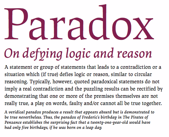
Lapture’s letterforms exhibit an unmistakably historical tone, due in large part to their calligraphic leanings. Their unique blend of linear and carefully curved lines suggest a cut and carved aesthetic, but reference the pen slightly more than the counterpunch. Particularly notable is their gothic proportions, which call to mind a foreboding European cathedral.

Up close, Lapture shows off its curves and angles. Also note the negative space of the counters.
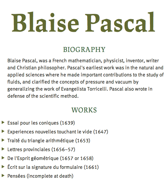
Such a lineage and peculiarity would typically prescribe an extremely narrow range of use cases. Yet Lapture is remarkably versatile, given its range of styles: display, subhead, caption, and text, all with a generous helping of weights and matching italics. The humanist details are clear at large sizes, but when used as a text face, its eccentricities are more felt than seen, making it surprisingly suitable for use in setting paragraphs.

Lapture Display, Subhead, Text, and Caption. (source text)
In pairings, Lapture shows a strong preference for two types of fonts: humanist sans serifs, and blackletter typefaces. A moderately low contrast sans like Cora suits Lapture well: Cora politely yields to Lapture’s details that, when used as a headline font, beg to be noticed.

Cora is neutral with just a hint of warmth, and supports Lapture well.
Cronos, like Lapture, exhibits a markedly human touch, and brings out Lapture’s visceral characteristics. In this duo, Lapture Display and Subhead set the historical tone, while Cronos upholds the medieval mood.

All too human: Cronos and Lapture are a personable pair. (source text)
The ever-popular FF Meta works extremely well alongside Lapture when used as a text face. The letterforms of both fonts are strikingly similar in spite of their differing genres. Meta’s slightly condensed width evokes Lapture’s analogous proportions.

Lapture demonstrates its rational side when used in conjunction with FF Meta. (source text)
For more historic applications, consider Lapture alongside a blackletter face. Though it can often be difficult to find a suitable companion for these flamboyantly Germanic fonts, Lapture shines in these pairings, and makes blackletter faces seem unusually practical.
Type Together’s Givry is one of the more lovely and readable of the blackletter fonts available today, but suitable complements are not readily apparent. However, Lapture deftly encourages Givry’s gothic flair, and shows its sturdy side as a text face.

Lapture Subhead and Givry evoke notably medieval sensibilities.
Another of Just Another Foundry’s offerings on Typekit, Herb, technically falls into the blackletter category, but it has a more colloquial tone than some the other fonts in this genre. With it, Lapture shows that it, too, has a lighter side, and can offer a touch of humanity without evoking the baggage of 16th century Europe.

Fun with the Middle Ages: Lapture Display and Herb show their lighter sides.
With its vast array of offerings in weights and styles, Lapture can handle any aspect of typesetting. So if you just need an extra hint of antiquity, try a decorated initial cap set in a blackletter face like Veer’s Baroque Text, and let Lapture cover both headline and text duties. It might be visually overwhelming to set even a few words in the ornate Baroque, but a decorative cap here and there can support Lapture’s already historical leanings.

A decorative initial cap extends Lapture’s historical feel. (source text) (image source)
At first glance, Lapture may look a touch too pronounced for everyday use, but we’ve seen here that it is actually quite a usable font that can convey a number of tones when set with the right companion. Curious? Start a new kit and add Lapture. You’ll be surprised at the range of typographic responsibilities it handles with finesse and old-world flair.

Nick Cox is a front-end developer and designer from Seattle, WA. He writes about web fonts and web typography at Everyday Type and @everydaytype. He is currently developing Archtype, a typographic reference for the iPhone.
One Response
Comments are closed.
I think it would be nice to give some credit to Albert Kapr, whose “Leipziger Antiqua” inspired Lapture.