Type Study: Pairing typefaces
Type study is an ongoing series of guest posts about typography on the web. In this article, Aura Seltzer provides tips and tricks for pairing type well.
Pairing typefaces is much like choosing flavors at an ice cream shop. We approach the counter with a strategy. We know about common “go-to” pairings like chocolate with vanilla, but we try to find inspiring combinations where each flavor highlights something special about the other. Okay, I think ice cream is great and all, but with so many combinations and “flavors” of typefaces, how do you even begin to decide which to pair?
Let me rip off the bandaid quickly: there are no clear formulas for pairing typefaces. There are no absolute rights and wrongs. But, this is good news. Without formulas, you can create beautiful surprises so your websites won’t look exactly like the one you have open in your browser three tabs over. Don’t worry, there are some techniques that will help make this process less daunting. Let’s walk through four methods for pairing typefaces. I’ll share some tips, define some terms, and suggest some Typekit pairings along the way.
The power of superfamilies
One of the simplest techniques for combining typefaces is to pair typefaces that belong to the same superfamily. Superfamilies — also known as type systems — are extended type families. They contain a large set of weights and widths and typically span different type classifications (e.g., there may be both a sans serif and a serif). Superfamilies also sometimes contain families that are meant to be used at specific sizes, such as caption, subhead, and display. Superfamilies can provide an extensive typographic palette for designs. Because designers build each font with the same proportions and structure, each font works in harmony with the others and can stand out at the same time.
Typekit offers several superfamilies in its collection. FF Dax and Nimbus Sans come with extended weights and widths. Abril, Aviano, and Calluna all feature a sans serif and serif companion. Let’s look at one of Typekit’s superfamilies, Freight Sans and Freight Text, and visualize some of the aspects that lend it to pairing.
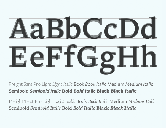
Letters of Freight SansPro and Freight Text, when overlaid, show similar structure.
Freight Sans and Freight Text each come equipped with six weights with corresponding italics. They were built with the same chiseled edges, cap height, x-height (the height of the lowercase letters typically illustrated by the letter x), and baseline. Because each was designed with the other in mind, text occupies the same line length and height no matter which face is used; this means either can take the lead as a headline and you can mix them together seamlessly.
Looking for look alikes
A second method for pairing typefaces is to choose typefaces that have similar physical attributes. Similar typefaces can establish a consistent tone for your content. This strategy requires a careful balance. You’ll want to look for typefaces that are similar enough to create visual uniformity but not too similar that there is an uncanny resemblance. With too many similarities, readers won’t be able to tell your typefaces apart, and their eyes will focus on the slight differences between letterforms instead of on your writing. That’d be a total bummer.
How do you achieve this balance? Start with the x-height. A typeface’s x-height serves as a reliable measure for that face’s proportions. Use one face’s features as a guide. Try looking for similar heights for the typefaces’ capitals, ascenders (the part of a lowercase letter that extends above the x-height, e.g. in the lowercase b), and descenders (the part of a lowercase letter that extends below the baseline, e.g. in the letter g). Also, try to pick typefaces with similarly-sized apertures (the partially-enclosed parts of letters, e.g. in the letters a and c) and counters (the enclosed negative space, like in the letter o). The orientation of a letter’s axis, the thicks/thins of its strokes, and the shape of its terminals are extra points for comparison to add to this laundry list.
This may seem like a lot, but there are tricks. Many type designers test their work using the phrase “Handgloves” or “Hamburgefontsiv” because they account for the different strokes and shapes of a typeface. Comparing these words between typefaces will cover the bases and give you a reliable picture of your pairing. I prefer using “Gaboscegqtf” typeset forwards for one typeface and backwards for another, because the letters let you examine key anatomies, and the phrase doesn’t distract by spelling a word. You can type these phrases right into Typekit’s Type Tester, too!
Typekit’s font browsing features can also help limit your options. When you have one typeface already in mind and are browsing for a similar companion, select the buttons under “Properties” with the same x-height, contrast, width, and weight as your base typeface. And since you might not want your companion to look too similar, limit the classification to one that differs from your base typeface.
Let’s take a look at two pairing possibilities using “Gaboscegqtf” and talk about why they do and don’t work.
Below, I’ve paired Apolline STD and Calluna. Both are small, serif text faces that lean forward horizontally and have slightly-inclined crossbars (see the lowercase letter e?). They share a fairly high x-height and mix pointy edges with curved terminals. But, you can see that when the two typefaces are used together, it’s very hard to tell the difference. They are so similar I might as well just have used one of the two typefaces exclusively.
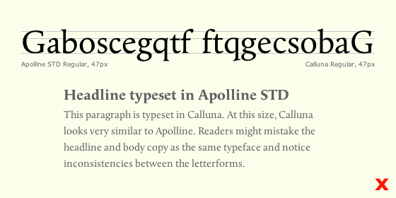
Letters set in Apolline and Calluna show how the two typefaces are too similar to be paired.
But, if we look at Rooney and Skolar, we can see how pairing with look alikes can be seamless and also add pep to the page. Skolar is grittier with its sharp edges, but thick strokes and similar letter widths make this pairing work well. Also, notice how I’ve selected two typefaces with diagonally-protruding “ears” on the lowercase g. It’s all about the details with this technique.
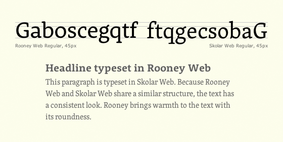
Letters set in Rooney and Skolar reveal that the two typefaces are a good match.
Bump up the contrast
Choosing typefaces that are not similar is another approach to pairing typefaces. Pairing with contrast can reinforce visual hierarchy, eliminate monotony, and add balance to the overall page. Too much contrast can be jarring, so opt for just a few points of difference. Many successful pairs feature a serif typeface with a sans serif typeface or an outspoken voice with a neutral one. You can mix big and small, light and dark, round and sharp. Try everything, but make sure to designate distinct roles for each face — headline, body copy, caption, etc. Doing so will enable readers to deduce order of importance on the page so they’ll know what to read first (and last).
What are some reliable ways to evaluate contrast? Take a look at differences in weight, scale, spacing, and texture. While typesetting “Gaboscegqtf” is always useful for analyzing type anatomy, typesetting both typefaces in a composition with different sizes for headlines and paragraphs can give you a sense if there is enough difference.
The first pairing below features Brandon Grotesque and Proxima Nova, which both land between humanist and geometric sans serifs. Even though there is a difference in x-height, counter size, and the lowercase g, this pairing isn’t the best for showing contrast. The warm touch on their geometric curves makes them too similar.
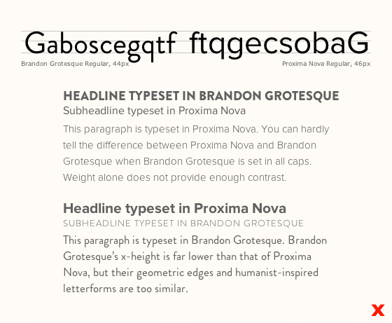
Letters set in Brandon Grotesque and Proxima Nova exhibit how there is not enough contrast between the two typefaces.
On the other hand, FF Meta Serif and Urbana nicely contrast condensed, illustrative lettering with cleaner curves and angles.
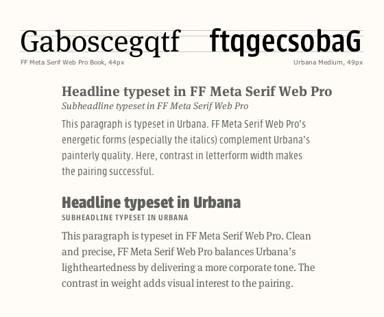
Letters set in FF Meta Serif and Urbana illustrate contrast. The two typefaces make a balanced but dynamic pair.
The rest is history
One last technique for pairing typefaces is to focus on the backstory of each typeface — the context for its creation. You can combine typefaces that were informed by the same tool, output medium, historic era, or concept. For example, you can pair typefaces that were both inspired by calligraphic brushwork, were both designed for low-resolution printers, were both designed in the early 1900s, or were both conceived to address legibility. More specifically, Old Style serif typefaces typically go well with humanist sans serifs despite being years apart, because both were inspired by the pen. Here is one example of how we might visualize that pairing using Dederon Sans and Minion.
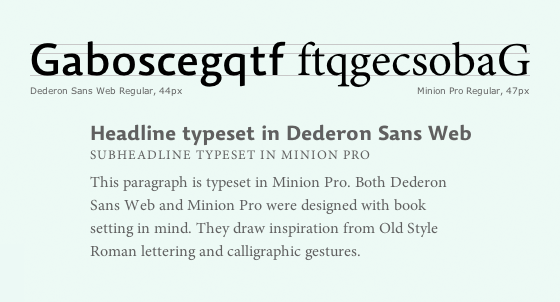
Letters set in Dederon Sans and Minion reveal their shared inspiration.
With this historic method, it’s important to be mindful of anachronism and to acknowledge the historic likelihood of a typeface appearing in a particular context. Because this strategy is more research-focused than visual, it is not mutually exclusive with the preceding methods. Feel free to examine typographic anatomy, look for similarity or contrast, and experiment with hierarchy just like you would with the preceding techniques. It will only make your pairings stronger.
With these four methods to guide you, I hope that you’ll feel excited by all of the typefaces still yet to be paired (and all of the ice cream flavor combinations still yet to be tasted!). With a fitting combination, you’ll design visually consistent and stimulating content that will engage your readers. Plus, you’ll be able to justify your type choices to friends and clients, and you’ll learn a ton about typography.

Aura Seltzer recently received her MFA in Graphic Design from Maryland Institute College of Art. She shares more about how to pair typefaces with her typographic dating game Type Connection.
9 Responses
Comments are closed.
Great read, thanks for your insight. I love collaborative posts such as this because I learn something about type, as well as usually discover a few fonts I didn’t know typekit hosted.
This article really underlines something that I, as a paying customer, have been wanting from you for a long time now: The ability to match different fonts and sizes within Typekit.
I completely agree. As paying customers, we need more of these articles. Especially for those of us that are type challenged (ME). Also, I would like to see Typekit implement some kind of font pairing system where you can test multiple fonts together.
Thanks for the feedback. We are indeed considering ways to help our users pair fonts better. You can also check out the About Face articles (http://blog.typekit.com/category/about-face/) for good pairing suggestions. Often when we release new fonts we also show off some good pairings (http://blog.typekit.com/category/new-fonts/).
Super dope. Aura, you make the Internet more beautiful.
When Aura wrote this piece I bet she wasn’t using Georgia, with its single-storey italic ‘a’.
To avoid unnecessary head scratching a different example character should be provided as an example of aperture:
“Also, try to pick typefaces with similarly-sized apertures (the partially-enclosed parts of letters, e.g. in the letters a and c)”
Thanks for the breakdown and sharing a few techniques that we can apply. I am going to use compare some fonts for our next project. Cheers!
Also, I saw that A Book Apart is going to release a typography book later this year. Their publication are awesome. http://www.abookapart.com/products/on-web-typography
Shopping for fonts like you shop for groceries, tossing independently appealing items into your cart, can result in some poor pairings. Good advice I received years ago: Don’t shop for typefaces, shop for type designers.
Each artist’s unique interpretation of form and space, along with the context of their recent work, leads them to produce type designs that are different but related.
So find a good type designer whose work inspires you, then play mix-and-match with some of their designs. It’s a simple approach but fun and effective.
The one thing I’d add to the type tester is the ability to see ampersands and numerals. I was all set to go with Freight Sans until I saw how it rendered numbers. Being able to preview those characters would be very useful.