New styles of Quatro Slab from psType

Roll up your sleeves! Let’s get to work with new styles of Quatro Slab from psType. Its hefty Ultra Black has been available on Typekit for a while, but the family now includes nine additional styles ranging from Regular to Ultra Black Italic. In a word, and in our demo page, Quatro Slab is strong.

h1 {
  font-family: "quatro-slab", serif;
  font-weight: 900;
  text-transform: uppercase;
  letter-spacing: 0.01em;
  }
Quatro Slab’s massive Ultra Black is a powerful force, especially in all caps. A little letter spacing goes a long way here, and helps the big forms breathe.

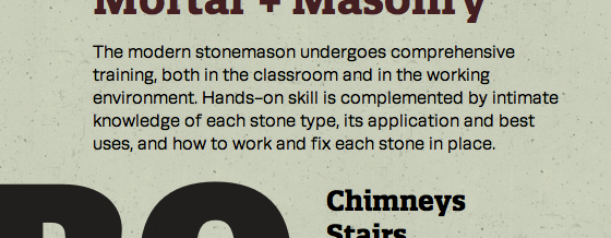
Runda paragraph text, with Quatro Slab Bold above and below.
Runda, also from psType, is a no-nonsense sans that works well with Quatro Slab. While their underlying stylistic rationale differs, these two faces have many structural similarities (compare their specimens), share similar proportions (their cap and x-heights, for example), and both convey a feeling of measured practicality.

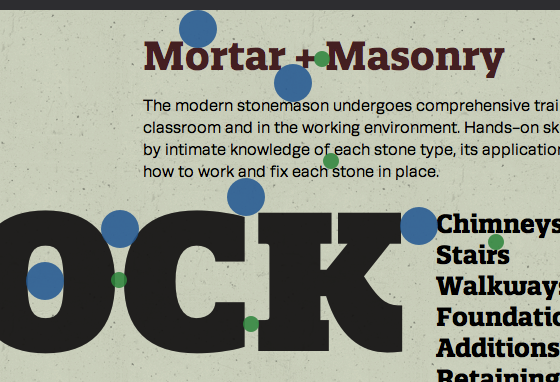
Blue and green dots identifying white spaces that resonate with one another’s volume.
Just as strokes and slabs in typefaces can inspire formal aspects of a composition, counters and crevices can inspire line-height, margins, and other white space. Quatro Slab’s weighty angles and sculpted nooks offer many opportunities for finding balance.
Upgrade to a Personal plan or higher to use Quatro Slab. If you’re already a paying Typekit customer, enjoy the new styles! If you’ve never given Typekit a try, sign up (it’s free!) and upgrade to a paid plan whenever you’re ready.
One Response
Comments are closed.
What a nice K (both lc and uc) and lower case W for Quatro Slab.