How we use data: Shades of gray
This is the first in a series of posts from Typekit’s resident data analyst, Mike Sall.
Data is an incredibly valuable resource, but translating it into something useful isn’t always straightforward. Actually, it’s a lot like apartment hunting on Craigslist: you can’t always trust the postings, the photos can be deceptive, and a lot of information is missing. But after checking out enough listings, you start to get a feel for the market. It becomes easier to spot the best options. And you might even learn to ask about new things, like the best local grocery or the easiest place to find parking.
At Typekit, we approach our data in much the same way. We might not know exactly what we are looking for, so we want to be able to discover the things that matter. At the same time, though, we need to be careful about how we interpret what we see.
To do that, our method is threefold: first, we ask generalized questions; second, we illustrate the answers to those questions across many dimensions; and third, we focus on the trends they reveal rather than any single, potentially distorted value.
It’s an exploratory approach that involves simple calculations and visual illustrations. Like apartment hunting, it’s an iterative process. And it runs the risk of oversimplification, since it doesn’t offer the same level of precision that heavy statistical algorithms might. But if you’re cautious, and you focus on trends rather than single values, you can unearth far more valuable insights in the process. Plus, you can pretty much do everything in a basic spreadsheet.
So, how do we put it into practice? In this series we’ll detail four techniques we use to guide us.
The answer is never black and white, so work towards shades of gray
Frequently, the biggest questions that data can help us answer concern understanding customer behavior. These can cover a wide range of topics. For example, what kinds of products are customers buying? Or, how are they interacting with different features?
To show how we approach these kinds of questions, let’s walk through one that is very important to us at Typekit: how many of our customers are cancelling their subscriptions? We put a lot of effort into understanding cancellation behavior because we want to keep our customers happy. If something is driving our customers to cancel, we need to know about it.
To start tackling this question, let’s look at the equation we need to use:
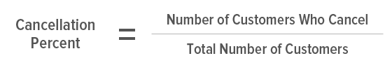
Divide the number of customers who cancel by the total number of customers to arrive at your cancellation percent.
Thankfully this equation is pretty simple — we only need two numbers!
But as soon as we take the next step and look for those numbers, we run into all sorts of new questions. Should we include the customers who used our beta version? Does it still count if the customer renewed for two years before cancelling? Does it make sense to include the customers who cancelled before we shipped a major feature? What if customers cancelled within a couple minutes of signing up — should we still pool them together with the customers who tried us out for a few months?
Of course, we could answer these questions one by one, imposing limitations on who to include until we had a “typical” population of customers, but the result would be totally myopic. For all we know, some of the most interesting insights might be found among the customers that we excluded.
So, instead of trying to shove the data into a single black and white answer, it’s better to spread it out. The shades of gray are a good thing; given our generalized question, we want to find ways to answer it across multiple dimensions.
That’s when all those questions we run into become an asset. Looking over them, they seem to converge on two basic factors: the point in time when customers signed up, and the duration for which they had their subscription before cancelling. Ah ha! Now we have our dimensions, and we can start plotting the cancellation percentage across them.
After trying out several different groupings and visualizations, here’s the chart we ended up with:
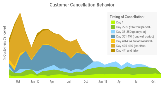
Customer cancellation behavior, charted across the month when the customer signed-up.
Let’s walk through this chart. On the x-axis, we have the months when customers signed up. So, the area above Jan ’11 represents all the customers who signed up during that month. On the y-axis, the total height of the area represents the total percentage of customers who cancelled. We then split that percentage into stacked bands that represent the different durations for which the customers had their subscriptions before cancelling. For example, the light green band on the bottom represents all the customers who cancelled within a day of signing up. Above that, the darker green band represents all the additional customers who cancelled within the 30-day trial period but after the first day.
Now we can really explore what the chart reveals. Most prominently, cancellations appear to happen at three specific points in time: the 30-day trial period, the year-end renewal mark, and later when enough failed payment attempts essentially render a customer inactive. Within the 30-day trial period, customers act quickly, with around a third of those cancellations occurring on the first day alone. These numbers are changing, however. The overall cancellation percentage of older customers has been decreasing, mostly due to fewer cancellations at the renewal mark, while failed payment attempts have remained steady. Conversely, cancellations prior to the renewal mark have increased since last year, particularly around last November. Still, these trends are separate from the unique behavior we see in our earliest customers — a spike in failed payments but also fewer initial cancellations (likely attributed to the extra patience of early adopters).
All put together, this is incredibly valuable. It represents a multifaceted understanding of our customers’ cancellation behavior. To improve customer retention, we know there are specific points in time when we can focus additional messaging or improvements. On the first day especially, when customers make quick decisions based on initial impressions, we need to nail that on-boarding experience. Likewise, we know there are large swathes of time when customers are not making these decisions, so we don’t need to focus our attention there.
On that point, now that we know how cancellations are distributed across these periods of time, we can better prioritize our efforts. If we think the renewal period cancellations seem high, for example, we might try out different notification messages or re-examine how we’re welcoming customers back to their account settings. As for initial cancellations, we might take a closer look at the increase we’re seeing; we added some major functionality to our transaction system around November of last year, so perhaps some new step or message produced an unwanted side effect.
The chart also leads to additional questions. For instance, how do these trends and distributions differ for customers who have upgraded or downgraded, or for each of our individual plans? When we look at some of these more specific segments, we find even more differences:
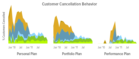
Customer cancellation behavior for each of the main payment plans.
It appears that a larger portion of our Personal Plan customers cancel, especially early on during the free trial period, so we can tailor messaging specifically to these users at this time. It also looks like the increase in cancellations prior to the renewal mark is limited to Portfolio Plans, so we can focus improvements on those customers. And for Performance Plan customers, we can feel comfortable making few changes since we see very little cancellation behavior among them.
The more questions we ask, the more insights we can gain. Plus, this is just what we’re seeing today. We reproduce this analysis on a regular basis, so if any of these trends changes significantly, we’ll see it, and we’ll be able to react.
That’s the beauty of quantifying values like these across other dimensions — it allows us to quickly examine the whole landscape of customer behavior. And beyond that, it can reveal answers to questions we never thought to ask. In this case, we weren’t initially asking how specific groups of customers were cancelling at specific times, but now we’re acting on those discoveries.
Still, this particular technique has its limitations. It works best when we want to understand all our customers generally or the differences between just a few groups, like our three subscription plans. When there are many more categories, such as customers from different countries or the results of different advertising messages, it can become burdensome. In the next post we’ll discuss how we approach that end of the spectrum.
3 Responses
Comments are closed.
Sooooo cool! I love Typekit and this blog is AWESOME!
Really impressive! Typekit is great…can’t wait for the next post!
Really excellent analysis. Concise and thoughtful. Drawing from such a large data set and making cogent conclusions is super difficult – good job.