Introducing MAC Rhino Fonts

Please join us in welcoming MAC Rhino Fonts to Typekit. Since 1997, designer Stefan Hattenbach has been creating unique, historically-inspired type designs chock full of little details that can be both subtle and surprising. Today’s offerings are Oxtail, Sophisto, and Luminance, all of which are served with PostScript outlines, as these details are best seen at large display sizes.
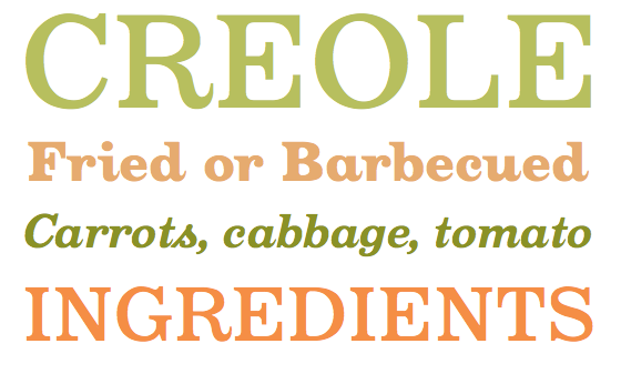
 Top to bottom: Oxtail Medium, Black, Bold Italic, Medium
Oxtail is a bracketed slab serif typeface; on first glance at the caps, you might be reminded of Clarendon, for which Oxtail is an excellent alternative. But what makes Oxtail special is the tapered finials found in the lowercase set (as well as the cap R and Q). Angled slab serifs sit atop vertical and diagonal strokes, in strong contrast to the pointy, script-like tails.
 Top to bottom: Sophisto E Gauge Italic, C Gauge, D Gauge, A Gauge Italic
The sturdy Sophisto comes in five weights, each with italics, and is accompanied by a set of small caps. Sophisto is rigid, but not uniform: it contains some unexpected angles and curves, like those found in the cap K, R, and P, as well as in the asymmetrical O. The italics offer just a touch of softness in an otherwise hard typeface, with ever-so-slightly curved in- and outstrokes.
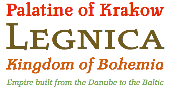
 Top to bottom: Luminance Bold, Regular Small Caps, Bold Italic, Regular Italic
For Luminance, Hattenbach drew inspiration from the calligraphic typeface Pracht, drawn in the early 1940s. Its stems sit on heavy half-bracketed slabs, while outstrokes curve abruptly upward, as if the characters are stubbornly holding onto their calligraphic roots. Affectionately noted during our type review as having an “ass-kicking K,” Luminance comes in two weights with corresponding italics, as well as a small caps variation.
If you’re already a Typekit customer, enjoy these new fonts. If you’ve never tried Typekit, sign up now for free. You can use these MAC Rhino fonts right away, and upgrade your plan as needed.