Sites we like: Fray, Simple, and Talking Points Memo
Sex and death, money and politics, in this week’s sites we like.
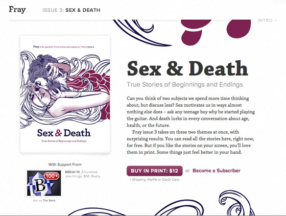
Fray is back with their third issue, Sex & Death, and a lovely combination of Chaparral and Proxima Nova. Chaparral’s bold weight looks like the regular weight bundled up for a cold day — it’s hefty, but still graceful. Proxima Nova makes for friendly, neutral small text.

Next, Proxima Nova pairs up with Museo Slab on Simple, the forthcoming service designed to replace your bank. A classic financial color palette (reds and blues) plus a subtle nod to the old way of doing things (a textured background that recalls paper checks) communicates trust, while the typography suggests a livelier, more human touch. Nicely done.
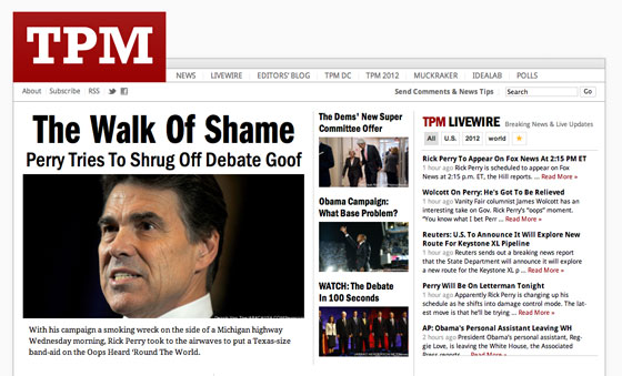
Finally, Talking Points Memo launches a redesign with Franklin Gothic URW and Droid Sans and Serif. The condensed and compressed weights of Franklin Gothic URW are ideal for long headlines, and the design’s stark, red, white, and black palette feels newsy but fresh.
That’s it for this week; share sites that you like in the comments!
One Response
Comments are closed.
Love the Fray site – some really wonderful imagery to go with the typography!