Optimizing Fonts for the Web: Unicode values, glyph set, underlines, and strike-through
This is the second in a series of articles from Typekit’s resident type designer, Tim Ahrens, on how we optimize fonts for the web. Read the first article.
Unicode values
Whenever text is stored or transmitted digitally, it is done so using the computer’s favorite language: numbers. If you type an “A”, for example, it is actually stored as “65.” This system only works if all computers agree upon which number corresponds to which character. Fortunately, Unicode provides this standard, and is supported by practically all computers today. When a web page is rendered, the browser reads the text – in other words, the numbers – from the website; then for each character, it looks to the font for the corresponding glyph — the drawer with that number on it, figuratively speaking.
Not all glyphs in a font have a Unicode value attached, however. Those glyphs without a number label can only be used if they are made accessible through OpenType features. These are substitution rules stored in the font, which “redirect” to a different drawer when activated. Not all browsers support OpenType features yet but their support is growing.
Some desktop fonts will have additional glyphs (such as a foundry logo) that have no Unicode value nor are they available via OpenType; since these glyphs can never be used on the web, they should be deleted in order to save file size.
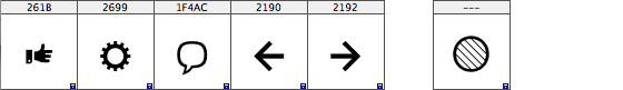
Left, symbols from Allumi and their Unicode values. Right, a symbol from Freight Sans which has no Unicode value and cannot be used safely on the web.
Additionally, some fonts may even have glyphs consciously attached to the wrong code points, and come with usage instructions so you know which character contains which image. This can be a sensible strategy if it allows you to simply type in certain glyphs (even logotypes) through your keyboard. If the document is subsequently printed, this hack is invisible on paper, and all that matters is what you can see.
On the web, however, things are different. Not only should the website look like we want it to, we also need to make sure the underlying code is standards-compliant so that search engines, screen readers, translation tools, or web archives can make sense of the text. This is why we make sure that each “drawer” contains what it says on the label, so as not encourage font use that may look like it should but contradicts the principles of the web. (This is also why we do not accept symbol fonts in our library: since no Unicode values yet exist for most of those characters, the only way to use them is to map the images to letters and numbers. The result is gibberish for anyone using an alternate means of reading the site.)
Adding the non-breaking space and soft-hyphen
The text we put on a web page can contain two very useful characters. The non-breaking space (&#nbsp;) is essentially a regular space with the additional quality that it does not break across lines. The soft hyphen () looks the same as a normal hyphen, but rendering engines know that it should be omitted unless it is actually used in a line break.
These two characters should not be necessary in any font since their visual appearance is by definition the same as their standard counterparts. In fact, desktop applications use the latter whenever necessary. Many foundries don’t even include the additional glyphs for non-breaking space and soft-hyphen in their fonts, which is, in some sense, the technically cleaner solution.
However, some browsers switch to fallback fonts when these characters are not present in the font, so at Typekit we add them to the fonts we receive if necessary.
Vertical metrics
On the desktop, vertical metrics values in a font are generally ignored, but on the web, they become incredibly important. When determining the line spacing in a paragraph of text, the browser either follows the line-height specified via CSS, or calculates a default value from the ascender, descender, and line gap values stored in the font. While the line height is something that should ideally be chosen and set consciously by the web designer, not everyone does this; as a web font provider, we have to make sure the default line height is consistent across all browsers. This is not a trivial task for historical reasons: a font contains as many as three values each for the ascender and descender, plus two for the line gap. Applications apply these values in different ways – and by no means in compliance with the specification.
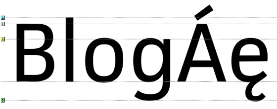
The key vertical metrics: ascender, cap height, x-height, and descender.
For example, above, some of the letters protrude above the ascender and descender values, either because of optical compensation or because they contain diacritics. From a technical point of view, these must be included in the ascender and descender values in order to avoid clipping.
Underline and strike-through
Each font contains information on the ideal position and thickness of the underline and strike-through line. However, these values are completely ignored by all desktop applications, which typically use a hairline at a default position. So far, foundries have had no reason to set these values in their desktop fonts carefully. But many browsers do adhere to these instructions, so they need to be evaluated and adjusted for web fonts. Neither underlines nor strike-throughs can be set on a purely objective basis; just like hinting, they are partly a design decision. For many fonts, we manually set these instructions based on our own assessment of what looks best.
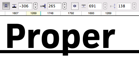
For heavier fonts (here: FacitWeb bold), the underline weight is chosen to match the design. The crossbar of the e is a good visual reference. The position is chosen to strike roughly through the middle of the descenders and to leave an appropriate gap on the baseline.
In our next post, we’ll talk about both TrueType and PostScript hinting; the latter, while not as difficult or critical as TrueType hinting, is still important and, of course, has its own set of unique constraints.
10 Responses
Comments are closed.
Your statement “Those glyphs without a number label can only be used if they are made accessible through OpenType features.” might only be true on the web. Desktop OSs support access of glyphs via their “glyph index”. I am assuming that existing web font mechanisms do not support such mechanisms. This would allow access to characters representing logos, etc. without interfering with software that attempts to read the page.
Paul, your assumption is correct – while some desktop applications allow to insert any glyph from the font (internally handling it by index), this is not possible on the web. The two environments have somewhat different “rules of the game”, therefore we make modifications to the fonts. This is what this series of blog posts is about.
I don’t think webfont mechanisms will ever allow to access glyphs by index. Why do you think this would not interfere with software that attempts to read the page? What would the browser display for that glyph when the font is not available or overridden (such as in Reader or Readability). It would be against the principles of the web as far as I understand them.
I should have been more clear. If web font access mechanisms allowed specification of characters by glyph index then reading software could at least not misinterpret such characters as some other character. I am assuming, of course, that a glyph index character reference has a different representation in HTML than a Unicode one. If such a character represented a logo, then it would be good to have some sort of “alt text” for such readers (eg, “Acme Inc. logo”). On the other hand, such a mechanism would probably not have much over SVG for this purpose.
I do not worry so much about the “missing font” issue. I hope downloadable web font technology progresses to the point where a reference to a font that is not present on the web server is equivalent to a reference to a missing image file. A reference to a glyph index from a missing font would be displayed with a red “X”, just like a missing GIF.
Of course, all this is fantasy and not going to happen. Sigh.
Instead of trying to access glyphs by index it would make more sense to use Unicode values from the Private Use Area (PUA), which is intended for cases like you describe. Rather than trying to introduce a new, unreliable, implementation-revealing mechanism, you should use the existing principles that will still work when the font is updated and the glyph order changes.
In some sense, by using a PUA value, you make the statement, “This is not a standardized glyph, please do not apply another font”. I do not know exactly what search engines or browsers do when they encounter PUA values, though. You may be unlucky to have a font with that glyph somewhere down the (explicit or implicit) font stack, when it would display the wrong symbol. The PUA is generally to be used with caution, although having a logo with PUA value is not as problematic and against the standards as using PUA for things like small caps.
@tim ahrens Yes, perhaps PUA is the best way to go. In my work in mathematics, I have found that PUA is something to stay away from but in this particular situation, it might be the best solution. Still, sticking with the academic discussion a little longer, I wonder why font access by glyph index is good at the OS level but not at the web level. Part of the world is trying to make HTML5 and associated standards into a new platform for app development — a new OS in a sense. It would seem like being able to address fonts at the glyph level would be a good thing for the same reason it is in OSs.
@richard fink Sorry, whatever you are talking about is not clicking with me either. Somehow you have assumed that I have some sort of specific rendering problem I am trying to solve. I do not. This is purely a philosophical, technological discussion.
“The non-breaking space (&#nbsp;) is essentially a regular space with the additional quality that it does not break across lines. The soft hyphen () ”
Wrong on both counts? Non breaking space has a Unicode ‘name’ and of more use, with your notation, a code point, expressed as an entity, & # x A 0 ; here spaced to allow transmission on a web page. Similarly with the soft hyphen, It is named ‘SOFT HYPHEN’ with code point & # A D ;
The names used in the Unicode specification (which are NO-BREAK SPACE and SOFT HYPHEN) are completely irrelevant, the only thing that matters is the index (here, 0x00A0 and 0x00AD). The whole point of Unicode is to have fixed, standardized code points (i.e. numbers), in contrast to old PostScript fonts, which were in fact name-based. Unicode names can even change (although very rarely) so we shouldn’t even think about using them to identify characters.
In HTML, you can write and , which are so-called named character entities. This is equivalent to writing & #xA0; or & #xAD;, as you have pointed out. You could also use the Unicode characters directly if your HTML document is in UTF-8 but the downside would be that you cannot spot them easily in the source code since they look the same.
@paul topping
“A reference to a glyph index from a missing font would be displayed with a red “X”, just like a missing GIF.
What you are suggesting is – perhaps as a CSS property – the ability to turn off font fallback.
I suggested this on the W3C Fonts mailing list a long time ago, and the idea was considered out of the question. As in “Fuggedaboudit!”
They were right. At the very least, browser support would become a nightmare if the author could defeat the locally installed fallback fonts.
rich
No, I was not suggesting turning off font fallback in general. Characters accessed by glyph index are only valid for a single font. As I said, failure to find the font would be considered identical to serving a missing GIF. With the ability to put a webfont on one’s website, and universal browser support for webfonts, the only way the character fails to display is when the website has an error in its construction. As I said, identical to the missing GIF situation.
If I was to advocate a CSS property that turned off font fallback, it would only turn it off for webfonts delivered from the same website as the page. It basically would allow the web designer to say that they absolutely want to know when they have failed to supply the font on their own website.
Paul
@paul topping
I didn’t mean to put words in your mouth but it seemed a reasonable paraphrase – If the glyph is missing from the font and therefore no glyph is displayed, there’s been no fallback. (And Typekit’s split-font obfuscation won’t work, either – y’know you’re suggesting putting them out of business, right here on their own blog. Good heavens, man!)
Seriously, I’m having a little trouble figuring out what you want to have happen and under what circumstances, and perhaps it’s my fault but I’m trying.
How’s this: As part of EOTFAST – the free EOT maker – there’s a fallback font that contains nothing but solid black boxes. It’s there to verify that the EOT has loaded in IE. It’s in the font-stack right behind the font that’s being tested. If there’s a problem with font, you see the black box, if there is no problem, you don’t.
In my own testing, these days I use a slightly more sophisticated ttf (converted to WOFF and EOT as well) for the same purpose.
Would something like that solve the problem?