New from Typekit: Faster font browsing
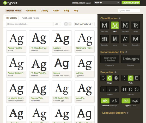
Today, we’re excited to release the first of many improvements to the Typekit website. We set out to make it as fast as possible to browse thousands of fonts. Just a few clicks, in a few seconds, to get to what you want.

The new browsing interface.
To start, we completely revamped the tagging system, ditching the plethora of unorganized, and often confusing, tags, and replacing it with a much more robust system designed around font classifications (i.e., serif, monospaced, etc.) and properties (i.e., x-height, width, weight, etc.). This means the new tagging system is derived from the physical characteristics of the fonts themselves — a much more useful means for discovery.
Additionally, we’ve added two new categories of recommended fonts: headings and paragraphs. These categories are handpicked by Typekit’s staff and feature fonts that are both aesthetically and technically exceptional. (All of the paragraph fonts have been manually hinted, and many of the headline fonts are served with PostScript outlines.) If you’re looking for the best fonts in Typekit’s library, start here.
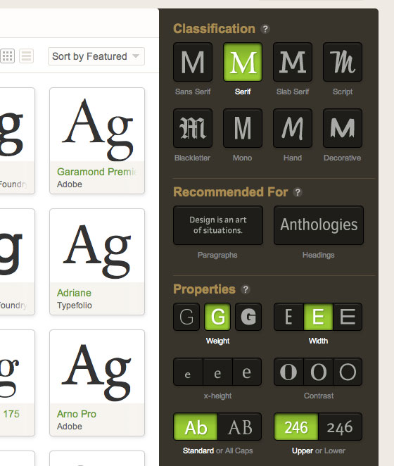
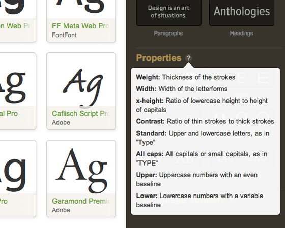
The look of the tags has also changed, trading text links for a visual presentation of each tag. This also aids in browsing fast, and it means you can successfully browse by font characteristics even if you are unfamiliar with the terminology. Helpful tips are tucked away for those looking for more information about the tags themselves.

A new visual design for the tags makes it easy to understand at a glance.

Helpful tips are just a click away.
We consulted with type designers and typographers on the new taxonomy, and our type team then reviewed and retagged every single font in the library. The result is a browsing experience that’s much more intuitive, and fast. Try it and see for yourself.
Under the hood, we’ve worked incredibly hard on performance, taking advantage of the capabilities of the latest browsers, while gracefully degrading in older ones. You can now see many more than nine fonts per page (an oft-heard request, and one we’re very happy to deliver on). In modern web browsers that support pushState (such as the latest versions of Chrome, Safari, and Firefox), we update the url as you browse, so you don’t have to wait for the entire page to reload. As you click around, the browser progressively loads only the necessary information. (In older browsers, we fall back to the standard behavior of links and reload the page each time.)
There’s a lot more to this new interface on the technical side. We’ll have more to share about the process of creating it in the coming weeks.
And there’s more coming down the line: better search, improved detail pages, favorites (at last!), and new ways to preview fonts — plus even more help finding the perfect font for your needs. Stay tuned!
Update: By popular request, we’ve added a size slider to the browsing pages, so you can now adjust the size of the fonts as you browse. Enjoy!
17 Responses
Comments are closed.
Lovely work, Mandy & Team!
This is a huge step forward for account holders.
Thank you very much.
Yes, this is amazing. Thank you for doing this!
Love the changes! I’ve been waiting for this since the Adobe merger announcement when Jeff previewed the new layout.
Very nicely done. Can’t wait to try them out!
Thank you, because it was seriously awful trying to navigate through all the fonts before. This helps me narrow it down with the greatest of ease.
Wow, this is really great work. Like all good UI design, it doesn’t just give you tools to work with, it also educates you. Those “Recommended for” buttons really make it easy for people without a design background to make good choices.
Great idea and implementation. The otherwise great UI raises a few question marks though:
* Shouldn’t the Contrast progression go the other way (from light to strong)?
* Why show different fonts (serif and sans-serif) as examples of “Standard” vs. “All Caps”?
* And wouldn’t the x-height examples be clearer by adding a standard-height ‘l’ or another character to emphasize that the variation isn’t in the height of the ‘e’ character itself?
Just my two cents 🙂
Good points. The all caps one is to filter those fonts that are “caps only”, like Trajan on the right. That would actually be a better term.
Congrats on this, Typekit. Huge improvement and a lesson for other font sellers.
Thanks, Stephen. That means a lot.
Really a big step forward for you guys. Nice work!
One criticism, though. The interface is a large percentage of the screen real estate. Any chance we can get a minimized version of the interface that allows the beautiful typefaces to own more of the pixels?
(Also, for those of us who love to pair fonts when browsing, I’d love to be able to browse with more than one Classification checked.)
Great work guys. I really hope that Adobe has the good sense to just let you keep doing the awesome stuff you’ve been doing.
Thanks for cutting down my typeface browsing time! Nice work.
Great stuff, Typekit team. The interface is beautiful. Any chance of adding new languages in the ‘language support’ section? I’m thinking about Romanian specifically, as I know certain fonts in your library support it. Thanks.
Yes, we’re planning to add more languages; I don’t have a date for when that might be available, but it’s on our list.
Great job here. This is a great time saver for me! Nice work
Yes, very cool work. I have found your page today and am impressed. In my next project i will try it.
This is a very nice new interface, but it needs some more options. Specifically, I liked being able to browse fonts tagged with “Geometric” or “Modern” or “Humanist”. The broad classifications don’t allow me to get as specific as I want sometimes.