Allumi STD from Porchez Typofonderie

From Porchez Typofonderie comes Allumi STD, a sleek, sturdy sans in eighteen styles. Like its wider counterpart, the recently released Allumi STD Extended, most styles are served with PostScript-based outlines for smooth rendering at large sizes. Plus, Allumi STD’s basic four styles (Regular, Italic, Bold, Bold Italic) have been TrueType hinted — so they look great at text sizes.

Top to bottom: Allumi STD Black, Regular, Light Italic, and Extra Bold. (source text)
Right angles, squared curves, and bulky joints give Allumi letterforms a massive quality that’s also evident when the font is typeset. Heavyweight headlines set darkly, with stroke thickness mostly overpowering the white space in counters. Paragraph text appears flat and stout, with wide glyphs and horizontal stroke endings producing lines of text that feel anchored into place.

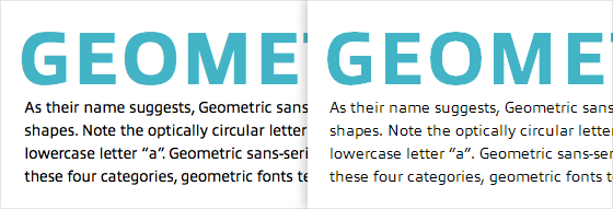
Allumi STD Extra Bold with Regular. Left, on Mac OS X. Right, on Win 7 (GDI ClearType).
Upgrade to a Portfolio Plan or higher to use Allumi STD. If you’re already a Portfolio plan customer, enjoy the new fonts! If you’ve never given Typekit a try, sign up (it’s free) and upgrade whenever you’re ready.
One Response
Comments are closed.
Allumi seems to be born for the screen. This sort of construction, like Verdana, suffers less from the constraints of hinting, remaining clear and relatively true to form on Windows. In fact, I’d love to see a Verdana sample to compare with the last image above.