About face: Chaparral

In our latest installment of About Face we take a look at Carol Twombly’s masterful slab serif Chaparral. I call it a slab serif, but it’s actually more of a hybrid of a classic roman book serif and a slab. “Roman” generally means “upright” when it comes to type, the best of which (usually serif faces) we’ve read for centuries in books. You can identify a slab serif due to the widths of the serif strokes (generally, when serifs are equal or greater in thickness to the normal stroke weight, you’ve got a slab).

Notice how the serifs are about the same width as the main strokes.
Conventional wisdom says to avoid hybrids; often, in trying to do multiple things, a hybrid will miss the mark at everything. Unlike your old TV/VCR combo, however, Chaparral is a wonderful exception to this rule. It combines the legibility of a nice roman serif with the distinctive authority of a slab serif, and does so with a grace that most typefaces can’t touch.
The key to Chaparral’s beauty is in its combination of flowing curves and powerful angularity. While some slabs can feel a bit more beefy and boxy, Chaparral takes a cue from book types of yore by keeping the contrast low; as a result, it works exceptionally well in running text, by varying the stroke widths only when necessary.

Notice the way the curves taper and expand.
By combining those qualities, Chaparral makes for a great text face. But it comes in a variety of weights to keep things interesting. The lights are delicate and wispy (making for some really stunning headlines) and the heavier weights bulk up while still retaining a soft look (perfect for emphasis that doesn’t need to shout). When used large, some of the details really shine. Look at the subtle angularity of some of the letterforms.
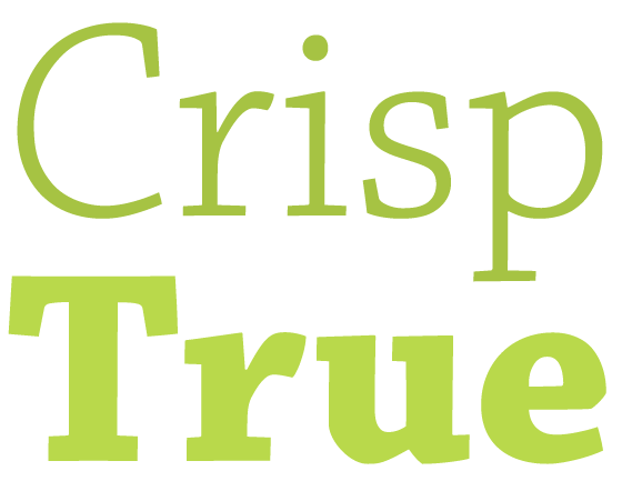
From light to heavy, Chaparral has charm in spades.
Chaparral is a good meat and potatoes typeface, providing flexibility for use at most any size and subject matter. It really shines as a text face, but doesn’t knock you over the head. It’s professional, but more playful than stuffy, like a nice suit with a bright red tie and sneakers. And it really stands apart from the serifs most folks are used to seeing. You can see it used very well for running text over at Stories & Novels.
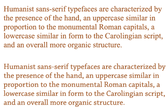
Compare Times New Roman (top) and Chaparral (bottom). (source text)
Plus the italics are really lovely, especially in the middle weights like the semibold. Even the heavy italics have a surprising charm to them.
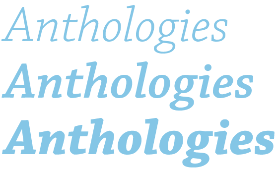
Some of Chaparral’s italics.
And Chaparral comes in a variety of optical sizes including Subhead, Display, and Caption to help you really tailor your typography for the appropriate size. If you’ve never used optical sizes before, the names should give you a pretty good idea of their intended use. The designs of each optical size is adjusted for the best possible display at that size. For example, Chaparral Display has slightly more decorative lines and higher contrast, as is appropriate for shorter bursts of text at larger sizes.
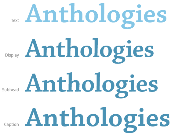
Some of Chaparral’s optical weights.
Because Chaparral is a hybrid (roman book meets slab serif), some good options for pairings can be found by taking those siblings and finding typefaces that embody them fully. Play off of those slabs with something boxy and geometric like CamingoDos.
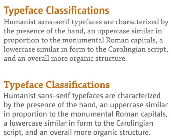
CamingoDos headline with Chaparral text (top), Chaparral headline with CamingoDos text (bottom).
Or contrast it more heavily with something very round and flowing like Bello or the bubbly Bree.
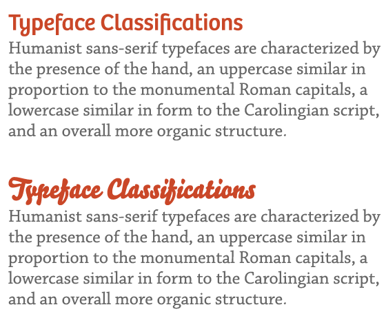
Bree headline with Chaparral text (top), Bello headline with Chaparral text (bottom).
Chaparral is one of those quiet typefaces that you could easily miss at first blush, but it will win you over with its beauty and high versatility. It’s quickly become one of my favorite typefaces.
7 Responses
Comments are closed.
I love chaparral! Such a friendly character.
It also seems to combine well with Proxima Nova (what doesn’t?). I found the lovely combo at this site: http://www.101cookbooks.com/
Love Chaparral 🙂 To me it compliments Futura, Helvetica and Myriad well.
Terrific shout-out to one my favorite fonts for online reading.
I’d hazard a guess that I’ve used more Chaparral on http://storiesandnovels.com than on any other site. It works great on white, see: http://storiesandnovels.com/the-path-of-all-that-falls but I’m still uncertain when it’s light on dark (see homepage).
I’m sorry, this is a bit too much. I contacted first time Typekit 26th May. The issue was that my blog, using Chaparral (I’m an Adobe supporter) that is a very beautiful font to me, was behaving strangely. Ligature seems to be coming from a bolder set. So all the “li” “fi” and so on where easy spotted and very ugly. Support told me that the solution, non optimal, was to turn “language support” from “default” to “all characters”. My kit’s weigh was 196kilobyte, turning that bring it to 429kilobyte. The Typekit website itself was warning me (copy/paste):
Whoa, hold on a sec
Your kit is 429K – that’s pretty big and could slow your page down. You can make this smaller by removing some fonts, or unchecking some options in the Weights & Styles section.
Yes, guys, it is slowing my website. After more than three months you didn’t solve the issue, you’re still advertising this font and you’re writing posts about it too. Chaparral -is- one of my favorite fonts, that I’m forced to a 500kilobyte kit to use it is a pain I can deal with. But, I think, everyone should be at least informed that use it ain’t so cool. I will report Adobe about this, too.
I will stay as a Typekit customer, because I believe it is a very good and strong product, but seeing that you’re not doing anything to solve my issue is quite depressing.
Good typography to everyone,
DDS
I’m sorry this has been frustrating. When we first set up the default character set, our goal was to make it as small and optimized as possible. At the time, ligatures were not widely supported, so excluding them from the default character set made the most sense.
Since then, ligatures have become more widely supported; we share your desire to make them available without requiring the full character set, which most of our users don’t need. (And I personally want to see them available with Chaparral, as it’s my my font of choice, too). I don’t have a date for then such a feature will be released, but rest assured it’s in the works.
Nice Font 🙂
You’ll find another example @ my website: http://friedemann-ohse.de/
Regards from Germany,
Friedemann
Chaparral is one of my absolute favorites. I always imagine it would be the perfect font for a “don’t panic” message, written (as it is) in friendly letters.