Using Typekit fonts in your own CSS
With some of the recent improvements to our kits, Typekit is providing more tools for using fonts on the web than ever before. The options range from basic and drop-dead simple (just add fonts and selectors, then drop in the JavaScript) to the more complex (taking advantage of variation-specific font-family names to work around style-linking limitations in old versions of Internet Explorer), and everything in between:
/* Option 1: Add selectors to your kit and don't write any CSS */

/* Option 2: Use Typekit font-family names */
font-family: proxima-nova, sans-serif;

/* Option 3: Use font-weight and font-style
 * to use more fonts within a family */
font-family: proxima-nova, sans-serif;
font-style: normal;
font-weight: 900;

/* Option 4: Use variation-specific font-family names
 * to work around IE bugs */
font-family: proxima-nova-n9, proxima-nova, sans-serif;
font-style: normal;
font-weight: 900;
With all of these different options, it’s useful to step back and consider them as a whole. How do all of these options work, and which factors determine the option that’s right for your project?
Option 1: Don’t write any CSS at all
The first and simplest option is to let your kit add all of the CSS that’s necessary to apply fonts to your page. In the Kit Editor, just add CSS selectors to each of the font families in your kit.
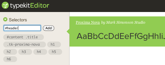
You can add CSS selectors directly to your kit in the Kit Editor.
Publish the kit, and it will automatically include its own CSS when it’s added to the page. All you have to do is add two short lines of JavaScript to the of your page:
Use this option:
- When you don’t want to write any additional CSS yourself
- When you can’t add new CSS to the page
Option 2: Use Typekit font-family names
The next option is to write the Typekit font-family name for each family into your own CSS. You can find the font-family names for each family inside the Kit Editor. Just select a family on the right and then click on “Using fonts in CSS” in the Selectors section on the left. You’ll see the font-family name to use, as well as additional examples of how to write CSS rules.
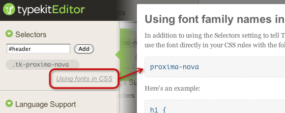
Click “Using fonts in CSS” in the Kit Editor to find the CSS font-family names to use.
After including the Typekit JavaScript snippet in the , just add the font-family names to the CSS rules in your own stylesheet. For example, to style all the headings on my page in Proxima Nova, I might add this to my stylesheet:
h1, h2, h3, h4, h5, h6 {
  font-family: proxima-nova, sans-serif;
}
Remember to include your own fallback fonts in case the web fonts fail to load for some users.
Use this option:
- When you want your font definitions and the rest of your CSS together in one place
- When you’re using the basic four weights and styles of a font family in your kit
Option 3: Add font-weight and font-style
If you’ve used the font-weight CSS property before, you’re probably most familiar with two values: normal and bold. But the CSS spec also defines a whole range of numeric values from 100 to 900. When you use font-weight: normal and font-weight: bold in your CSS, browsers automatically find the font mapped to the nearest numeric font-weight (400 for normal and 700 for bold).
By default, Typekit selects a basic set of four weights and styles from each font family when you add them to your kit. It chooses fonts as close to 400 (normal) weight and 700 (bold) weight in both normal and italic styles, so that font-weight: normal and font-weight: bold just work. You can add additional weights and styles for each font family in the Kit Editor under the Weights & Styles section on the left.
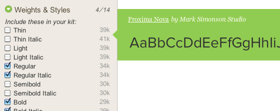
A basic set of four weights and styles are enabled by default, but you can enable more in the Kit Editor.
If you’re using weights in your kit other than the ones that are selected by default, or you’re using more than two weights in a given family, you may need to define numeric font-weight values in your CSS instead of relying on the normal and bold values. You’ll find the correct numeric font-weight values to use in the Kit Editor. Just select a font family on the right and then click “Using weights & styles in CSS” in the weights and styles section on the left.
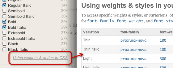
Click “Using weights & styles in CSS” in the Kit Editor to find the numeric font weights and styles to use in your CSS.
Copy the numeric font-weight for the specific font that you want, or use the handy “Copy CSS” buttons to copy the font-family, font-style, and font-weight for each font in one click.
For example, what if I added the 300, 600, and 800 weights of Proxima Nova to my kit, and I wanted to use the 600 weight italic variation for headings on my page? By default, browsers might select the 800 weight as the bold weight for headings, but I can be more specific in my own CSS to ensure I get the exact font I want:
h1, h2, h3, h4, h5, h6 {
  font-family: proxima-nova, sans-serif;
  font-style: italic;
  font-weight: 600;
}
Use this option:
- When you’re using weights that don’t map to
normalandboldby default - When you’re using more than than two weights in a single font family
Option 4: Add variation-specific font-family names
While most modern browsers follow the CSS3 draft spec pretty faithfully when it comes to @font-face, the older Internet Explorer browsers have a few limitations. The biggest limitation is that in IE6, IE7, and IE8, you can only link up to four fonts with two weights into a single font-family name before the entire family stops working. In IE8, there are additional @font-face bugs that are triggered by having more than one font linked to a font-family name, which we wrote about in more detail recently.
In order to avoid breaking things completely in these older browsers, Typekit filters the set of fonts that you select in each family down to a basic four weights and styles when serving fonts to these browsers. The downside is that you no longer have access to any additional weights and styles through the main font-family name.
The solution is to add additional variation-specific font-family names to your font stack. Typekit serves these additional variation-specific families only to IE6-8. Each of these families contains only a single weight and style, which means that they won’t trigger any of Internet Explorer’s style-linking bugs.
You can see the variation-specific font-family names for each weight and style of a family in the Kit Editor. Select a font family and then click “Using weights & styles in CSS” in the weights and styles section on the left. At the bottom, check the box to show variation-specific styles, and they will appear in the table above. Once visible, you can copy them in one click using the copy CSS buttons.
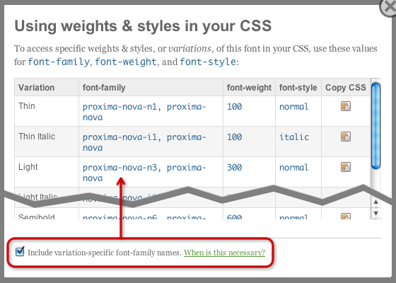
Check the box to view variation-specific font-family names in the Kit Editor.
To make use of them, copy these variation-specific font-family names and include them as the first item in your font-family stack. These font-family names are only defined in IE 6-8, so they’ll get used in these older browsers. Newer browsers will fall through to the normal font-family name and make full use of style-linking instead.
In my previous example, if I wanted to make sure that the display of my Proxima Nova headings was totally consistent in IE6-8 when I added three weights to my kit, I could include the variation-specific font-family name for the 600 weight italic Proxima Nova as the first name in my font-family stack:
h1, h2, h3, h4, h5, h6 {
  font-family: proxima-nova-i6, proxima-nova, sans-serif;
  font-style: italic;
  font-weight: 600;
}
Use this option:
- If you’re using more than two weights in a single font family and want to ensure consistent rendering in IE6-8
- If you’re using more than one font in a family and run into any of the IE8 style-linking bugs that we outlined in our previous post
Every project is different, so it’s nice to have an array of options for using Typekit fonts at your disposal. When starting a new project, you can use the guide above and your own comfort level to decide which option works best for you. Happy developing!
One Response
Comments are closed.
Great post and useful information. Thanks.