Type study: A better kerning experience with Kern.js
This is part of a series of guest posts on web typography. Today’s post was written by Brendan Stromberger.
Let’s face it: kerning on the web kinda sucks. Kern.js, however, is a nifty new tool out to make kerning less of a chore.

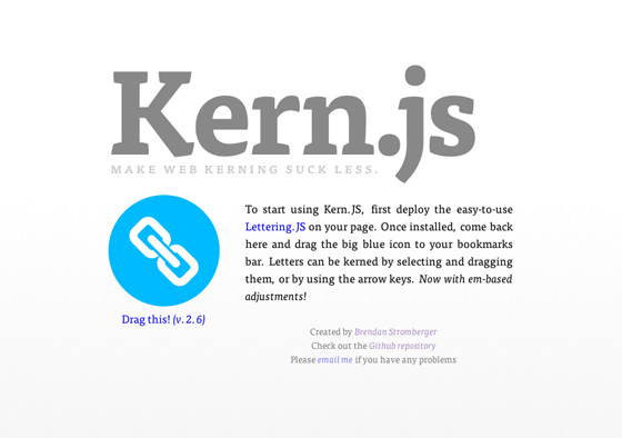
Kern.js is a simple javascript bookmarklet that adds powerful functionality to Paravel’s first-rate Lettering.js. Rather than having to guess-and-check CSS and make repeated, tedious adjustments, Kern.js allows you to kern letters like you would in a desktop app like Photoshop — simply and visually. It then generates the CSS for each individual letter, which you can plug directly into your stylesheet.
If you don’t know about the wonder that is Lettering.js, you’ll want to first take a look at Trent Walton’s article about it. For our purposes, Lettering.js breaks up any text-containing element into individual letters — conveniently giving a unique class name to each individual span element. With Kern.js, we can tweak the styles of each of those span elements to make your words look perfect.

To show how it works, I’ve whipped up an example showcase page featuring the ubiquitous Hellenic Wide, Stud, Atrament, and Chennai. To get started, drag the Kern.js bookmarklet to your bookmarks bar, visit the example page, and click the bookmarklet. A new panel will appear at the top of your page, letting you know that Kern.js is loaded and ready.
At this point, you can click on any header element (h1, h2, and so on) and Kern.js will then split the contents of the clicked header into individual spans with unique class identifiers. (It is highly recommended that you provide ID attributes for each header element you want to kern.)
From there, click on an individual letter to kern it; it will become highlighted, indicating that you may now move it by either dragging the letter to the left and right with the mouse, or moving it incrementally with the left/right arrow keys.

Let’s take a look at the example page and start tweaking these letters. For this example, our changes are going to be small and subtle. Here, I’ve adjusted the spacing around the “A” in “San” and most of the letters in “FRANCISCO.” Tweaking the letters a bit at a time and seeing them update automatically in the browser makes this easy. Once you’ve made your changes, click “Finish Editing.” Kern.js will provide you with the styles to add to your stylesheet. Here’s the adjustment css for my example page:
#san .char2 { margin-left: -0.033em }
#francisco .char2 { margin-left: 0.093em }
#francisco .char3 { margin-left: 0.093em }
#francisco .char4 { margin-left: 0.056em }
#francisco .char6 { margin-left: 0.037em }
#francisco .char7 { margin-left: 0.037em }
#francisco .char8 { margin-left: 0.037em }
#francisco .char9 { margin-left: 0.056em }
At this point, just add the provided CSS to your stylesheet (making sure Lettering.js is already active). Click the “toggle adjustment” button on the example page to see the before and after.
The ability to easily kern letters on the web also opens up some exciting new ideas for designers to play around with. When you combine kerning with varying opacities, rotation transformations, colors, and other exciting CSS3 properties, you can make some really spiffy designs.


Brendan Stromberger is a designer in the Bay Area with a lovely wife who can now tell the difference between Arial and Helvetica.
4 Responses
Comments are closed.
Thanks for the great post, Brendan! I’m finding Lettering.js to be a very useful tool. If you’re interested in another reference, I wrote a similar article on kerning for the web a few weeks ago.
Hey Adam, thanks for the kind words. I enjoyed your article as well!
Have there been any tests on how (or if) wrapping each letter in its own tag may affect screen readers?
Hey Ashley, all the changes occur in the DOM. If I’m not mistaken, screen readers parse the HTML source code and leave the DOM alone. Using Lettering.js and Kern.js should not affect usability in the slightest.