At long last, Futura comes to Typekit

The wait is over. We’re delighted to announce that Futura, our most oft-requested font, is now available on Typekit. What’s more, ParaType’s Futura PT has been manually TrueType hinted and looks fantastic on Windows.

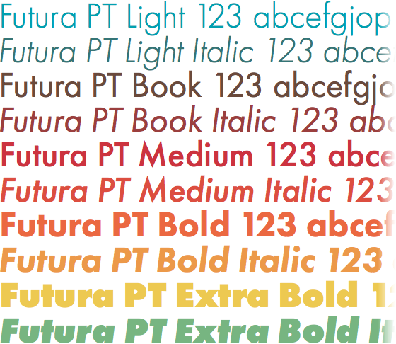
Futura PT’s classic design — tall ascenders, near perfect geometric shapes — make it both instantly recognizable and irrepressibly modern. And a range of five weights, from Light to Extra Bold, each with an italic, make it perfect for a variety of uses. Try the Book weight for text, the Medium or Bold weights for headings and navigation UI, and the Light or Extra Bold weights for large text.
In addition, Futura PT benefits from ParaType’s extensive experience with language support. Futura PT supports Russian, as well as Catalan, Czech, English, French, German, Italian, Polish, Portuguese, Spanish, and Swedish.
Most importantly, Futura PT has been meticulously prepared to render well on screen, even in Windows, and even with font smoothing disabled altogether. Very few web fonts have been given this amount of care — the result is a completely reliable, strikingly legible typeface that feels like a native part of every browser and operating system.

Futura PT Book, from left to right: Mac OS X, Win 7 (ClearType), Win XP (smoothing off).
Upgrade to a Personal plan or higher to take advantage of Futura PT. If you’re already a paying Typekit customer, well, enjoy the new fonts! If you’ve never given Typekit a try, sign up (it’s free!) and upgrade to a paid plan whenever you’re ready.
20 Responses
Comments are closed.
Oh heck yeah.
Awesome news! It’s requested loads for good reason 🙂
J.
You’ve just made our day.
Oh yes! This will be one of the most used (at least by me) webfonts
Right on time as I was searching for a Futura replacement on typekit. Grand man!
Beyond happy to read this news, we’ve been using Futura via coufon on our site for over 2 years now and been dying to see it listed on TypeKit. Thanks so much!
God help us all.
Excellent news. Another step for a more “beautifully” web 🙂
According to studies conducted by our most handsome scientists, nobody has ever been fired for using Futura.
Magnifique!
Renner would be glad to hear that. Love it! Cheers
Woop-woop. *raises the roof*
That’s great news. We’ll soon see the web flooded with this font. Lol.
Maybe Ikea will switch back from Verdana now.
Excellent news! Futura is such a great typeface
Whooop!!! Nice work everyone.
Amazing! Thanks so much for doing this.
How long until we start seeing Futura on the Web!? 🙂
Looks utterly exquisite under DirectWrite on Windows. Sharp, tight and smooth at all sizes. Those round geometric shapes look a bit jaggy under standard ClearType at larger sizes, but this is offset by the first-rate hinting at smaller sizes. Smaller sizes look a bit wooly under Core Text on OS X, but larger sizes (>14) stand up well. A fantastic release that does a particularly good job of showcasing DirectWrite. Deserves to do really well as a web font.
BTW, when are we going to get a DirectWrite type tester specimen, guys?
Do it. Just keep giving me reasons to love you.