Type study: Typographic hierarchy
This is part of a series of guest posts on web typography. Today’s post was written by Frank Chimero.
Workers of the web are familiar with establishing a hierarchy through markup by using tags like and , but what of the aesthetics of it? On the web, a large chunk of our content is text. This means it’s important to understand how to reinforce this hierarchy typographically. A clear understanding of hierarchy results in more beautiful, meaningful, and communicative designs that better serve their audience.
I’m going to address these concepts with an example that slowly builds complexity by introducing new visual elements. With each step I’ll add a new tool to support the hierarchy. I think you’ll be surprised to learn how much of this behavior is native, and how flexible the solutions can become as more tools are added.
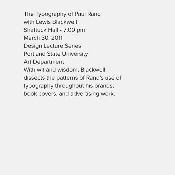
Fig. 1
To begin, I’m not using any typographic devices to establish the hierarchy: it’s all one typeface in one size and weight (fig. 1). The only thing communicating hierarchy is the order in which the text is presented. This isn’t realistic for most design work, but it’s a great place to start.
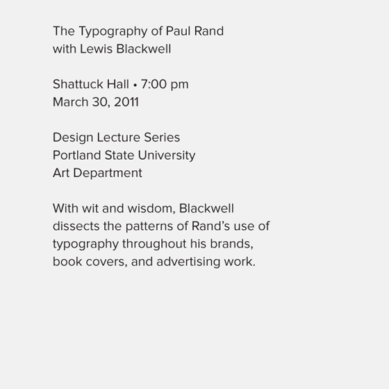
Fig. 2
Above we have the same typeface and type size, but we’ve started to introduce some clarity to the information by chunking it into logical groups (fig. 2). Again, we’re establishing hierarchy by the order in which the text is presented.
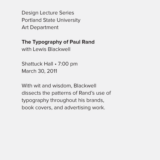
Fig. 3
Next, let’s emphasize the most important element with a weight change (fig. 3). Notice that when we have at least two graphic devices working, we no longer need have to have our most important piece of information on top in order for it be read first. Above, “Design Lecture Series” and related text has moved to the top to serve as an umbrella for the content below: it’s descriptive meta-content that describes the whole, but it’s not the most important text.
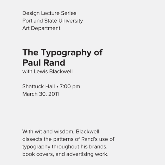
Fig. 4
Next, we introduce a new type size to the hierarchy (fig. 4). The increased size shows the reader where to begin reading. Varying the vertical spacing provides a bit more structure.
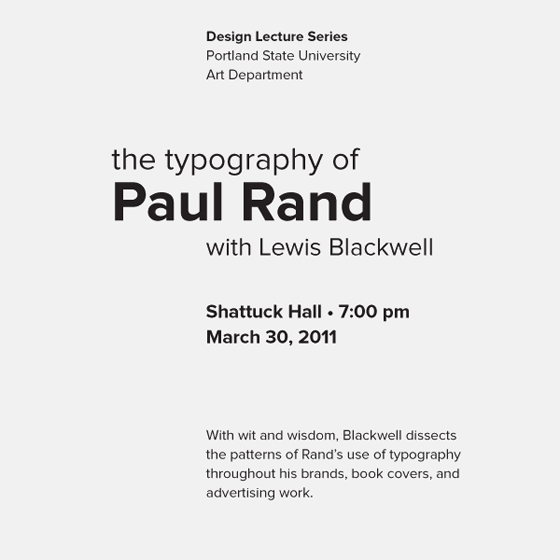
Fig. 5
Now let’s add some variety by varying the alignment and spacing, and introducing multiple sizes and weights (fig. 5). The overall trend has been to increase contrast: we use tools such as weight and size to emphasize the most important content, while simultaneously employing those same devices to make the subservient content recede.
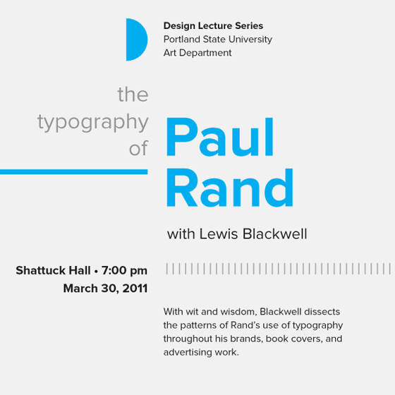
Fig. 6
Next comes color, which we are using to guide the eye around the composition (fig. 6). Above, graphic elements (such as lines and shapes) are also added to emphasize certain blocks of content. Largely, the same rules that applied to the type also apply to these elements: color and heavier weight denote greater importance. We can also balance the composition with graphic elements by creating directional tension (pushing left versus pushing right) and by creating tension with the edge of the page by bleeding off. All together, the effect first brings your eye in, then takes it logically to nearby elements, then lets it jump to other areas by following the color around the composition.
In practice, proper typographic hierarchy surfaces at the micro-level—inside of the smaller, building-block elements of a design—and at a macro-level—the design of the full page. Let’s look at some real-world examples.
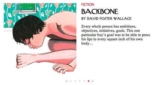
The New Yorker’s featured article carousel manages a basic micro-level hierarchy issue: imposing a structure to title, author, description, and meta content. Here, the hierarchy is established through two different typefaces and changes in size and color. Note how the meta content is placed on top even though it’s less important than the title: the hierarchy is communicated through manipulation of the size and color of the text.

Detail from creativemornings.com
On the Creative Mornings website, a simple hierarchy challenge is multiplied four times over. Clarity is added by color-coding each city, and complex information is chunked together. Inside each chunk of content, a hierarchy is established with size and weight, as well as graphic elements. The most pressing information, that of the upcoming lecture, is reversed out on a color field to give it the highest importance. Type size is also used to establish hierarchy, and a typeface change is implemented to emphasize more important information, such as the speaker name. Variable spacing is also used to deemphasize the “More Info” links below the lecture details. Pertinent information about the event organizer is given the lowest priority by being placed at the bottom with the least amount of contrast. (Although, hierarchy still exists in this block by setting the organizer’s name in bold and setting their title with a smaller, all-caps treatment.)
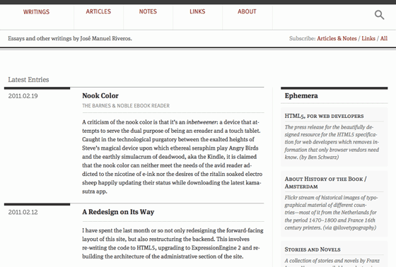
José Manuel Riveros’ awritings.com makes great use of hierarchy on the layout level. The two columns, as typical on the web, have widths to match their importance: dominant content in the wider column, supporting content in the narrow column. But inside each column, titles, sub-titles, metadata, and content merge with design elements such as rules to reinforce the hierarchy. Most changes between the styling of text feature only one or two modifications—such as change of size, weight, or color—but by handling these modifications in a smart fashion, the hierarchy is clear while remaining simple and pleasing.
Proper hierarchy is a foundation for excellent type, whether on the screen or the page. I’d suggest that most great examples of fine typography are merely designs that have wise typeface choices, savvy use of space, and a clear hierarchy that’s echoed through the structure and presentation of the text. Communicative, fine typography is of the utmost importance, and it is encouraging to think that by understanding a few simple precepts and their thoughtful application, clarity in communication is within anyone’s reach.

Frank Chimero designs and draws, writes and thinks. He makes pictures about words and words about pictures. He is working on a book entitled The Shape of Design.
29 Responses
Comments are closed.
Really informative refresher and a nice read overall. Never hurts to be reminded about the importance of type. Thanks!
Great post Frank. This is a really good follow up to the panel you did at SXSW.
Good stuff, but figure 5 > figure 6. Those additional elements (in blue) are colorful, but formally superfluous. I understand the concept behind adding them for this exercise in hierarchy, but they are merely visual crutches in that composition.
my .02
Fantastic article Frank! I’ve always loved two things in design, Paul Rand and Typography, seeing that they go hand-in-hand. Missed SXSW altogether, but I hope to see your presentation online at some point.
As a huge fan of meta data on a page, the key really is to put it in it’s place. The content *is* the medium, but organizing the zen garden makes the garden a pleasure to ingest. Designing boring content is still the funnest and most challenging part of what I do.
Thanks for posting this, Frank & Mandy.
Beautiful read. Love the idea of a sort of tutorial/process/lecture combined in one article.
Thanks for the kind comments, everyone.
Doug: You’re right. The color doesn’t serve a crucial purpose in supporting the hierarchy from an objective standpoint, but I think it is incredibly important in making the tone of the piece fit the content. (And also provides a bit of spirit to the thing.)
It was perfect at step 4! Also very nice at step 3. Nice introduction to overdesigning.
Exactly.
I’m enjoying the read. Agree with Arney, despite there’s tutorial-lecture notion, the overall prose remain pretty solid and enjoyable and there’s sense of plot humming along. Frank was a truly gifted teacher. He explained not just what he had them doing, but also why, and what he hoped to gain from those actions.
Lovely work, as ever, Sir. We run through a very similar series of exercises with our students to encourage them to first consider the inherent hierarchy that exists within information itself. Teasing out those hierarchies allows a great deal with very little. Getting the students to grasp that, the power and potential of restraint, can prove incredibly liberating.
“Getting the students to grasp that, the power and potential of restraint, can prove incredibly liberating.”
Indeed, there’s great power with restraint… and so hard sometimes to follow through with; there’s far too much temptation out there! It’s something I’ve been trying to address in my own designs.
I think, after working for months on a project, bound by brand guidelines, oftentimes married to horrible choices beyond one’s control, (staring at Century Gothic as body text, till I want to cry) well, I just want to be as typographically promiscious as I damn well can.
😉
Awesome pointers there fine sir!
Indeed, contrast is a great way to establish heirachies. Something to chew on; beyond all the weight and size changes, from what I’ve been able to gather, traditionally, CAPS, italics and roman were some of the only tools in a typographer’s belt to delineate content.
To learn how the structure of a design is created, following rules and perception is always a great reading.
Doug:
Frank’s right to back up his decision to add colour. Design is also emotive and the colour does help the piece’s tone of voice.
Having said that, you as designer also have the right to emit that colour and, for arguments sake, stop at step 5. Step 5 does what it needs to do and by choosing to not add colour you’re defining your style and we all know there’s nothing wrong with that!
Probably one of the best posts on Typekit so far: and there have been some good ones. Thanks for doing this.
This is a great breakdown of using different typographic factors to create a hierarchy. I have taught a college course on typography, and developed a similar lesson plan. I’m also including a similar breakdown in my book, Design for Hackers.
I feel that many beginning designers get distracted by more inconsequential details such as font choice, when, in fact, they really should be mastering the use of these factors that you have talked about. Great work!
We need more designers doing typography right. Thanks for sharing. 😛
Thanks for sharing Frank!
I always try and emphasise how easy it is to make something stand out simply by varying the size, weight and spacing of type on websites. People rely on other graphical assets far too much these days.
Frank has written a clear, concise article once again.
Very informative read, thanks for sharing!
Very good article, but there is a lot more going on here in terms of causing tension, and good typographical hierarchy. He also starts to use an “Axial” typographical system, which is another subject in of itself.
Great read, Thanks for posting it!
Excellent post, thank you for this clever explanation.
Great article.. such a simplistic way of laying out exactly how good type should be displayed on the web. Given me some inspiration to apply to our own site right away. Thanks!
Heya Frank,
As usual, a great post. You do open one issue though that I think is a difficult one to work with, especially if you are designing a new site, or refreshing an existing one.
That is, most content-rich sites are not / can not be designed as freely as a poster can. So you end up focusing on the micro-level formatting and hierarchy (the elements that will be reused from page to page), and with the overall visual balance those elements create when composed on the entirety of a page.
Maybe there’s a short series of posts here for you, taking us all down the path of a content site’s overall design by looking at it’s micro- and macro-level composition. I could see something like creating a fictitious news or magazine site as a great example.
You can just squeeze that in with everything else right? :p
Thanks again for this great post.
The end result here is an inelegant, over-designed jumble.
This adds to my confusion as to why F. Chimero is regarded as a design guru.. A talented illustrator? Yes. A gifted communicator? Absolutely. A savvy self-marketer? Oh wait.. that’s why..
Well to his credit Frank Chimero is taking steps in the right direction. I feel there’s a whole generation out there, who’ve intuited and grownup with Photoshop and a battery of typefaces, but without every receiving the historical context to sew their experience into the greater whole, or any rigid methodologies guiding their practises.
I know pure design argues that only anonymity in the elements we use to transcend self, and “the giving up of personal vanity (up till now falsely called “personality”)” are the goals to aim for. Form follows function; honour and serve the text, etc…
I feel a lot of early modernism worked because of the power of contrast; I imagine, an orderly, rational and clean design on white broadsheet, must have been MINDBLOWING against the rose and yellow jumbled messes that were the order of the day… cut through and contrast against the noise!
It served its purpose of the day, but I feel the pendulum is in constant swing. We use computers which divorces us from the human hand and live in a world of “neutral” san-serifs, themselves becoming an expression of a highly sensitive eclecticism. In contrast to the wall of accepted Helvetica, things that are letter-pressed, hand scripted, and flourished jump out as though they’re coming from left-field.
I think there are valuable lessons to glean from modernism, with regard to the construction of objects in obedience to their purpose. But, I think people are yearning for that emotive spark; that sense of uniqueness that is lost with this affected “neutrality”.
Food for thought; I’ve wept at paintings, but have never shed a tear for carefully organized and rational lists.
@Nathaniel – You make a great point when you say:
As an educator, working in the field of web design education – and someone currently in the process of designing a new web design degree level course from the ground up – one of the key aspects that is missing in web design education is a firm grounding in historical, theoretical and contextual awareness.
All too often web design courses (at all levels) focus on the tools we use and spend very little time on the rich typographic and communication design history that our practise has evolved from. What’s great about this piece by Mr Chimero, and a great deal of the pieces Typekit are publishing here, is that they foreground some of the fundamentals of design that are a critical part of the equation.
Web design as a profession is maturing and to be a part of this industry at this time is certainly exciting. If we are to further develop as an industry, now is the time to focus on the ‘why’ as much as the ‘how’. We’re part of a long line of communication designers and we owe it to ourselves, and those embarking on a career in this industry, to impart the knowledge we can glean from those that travelled this well-worn path before us.
Your closing sentiment is an interesting one. I can think of many paintings (and other works) that have moved me. Of course I’ve also been moved by designs that exist within the static world of print and the more fluid world of the screen, but we need to set the bar higher, challenge ourselves to deliver more than surface and think long and hard about the fundamentals that, when put in place, deliver truly beautiful and memorable experiences.