Type rendering: review, and fonts that render well
This is our seventh and final post in an ongoing series about type rendering on the web. Read the first, second, third, fourth, fifth, and sixth posts.
We’ve done a lot of research on type rendering, all of which has helped us understand why text looks the way it does on the web, and we hope you’ve enjoyed learning with us. Let’s review everything so far, and then look at a selection of fonts we trust to render well.
Type rendering is the product of many layers of technology. Operating systems, web browsers, font smoothing preferences, font files and outlines, hinting, and type design philosophy: All of these play a role in translating the beautifully drawn shapes of our favorite typefaces into pixellated screen text. So the next time you see a web font that looks excellent (or awful), consider the mix of responsible technologies at play.
No one way of rendering is “correct.” Users, as well as designers, have preferences and comfort zones when it comes to reading on screen. Some people believe this is a matter of familiarity — that we read best what we read most — and there’s no denying that the introduction of an unfamiliar rendering style can be met with resistance, even if that style is popular elsewhere.
Consider the debut of Safari for Windows — a marginal case we didn’t mention in the post about web browsers, but an intriguing bit of history. In that early version of the browser, Apple circumvented Windows OS text rendering engines by including its own OS X-style rendering directly within Safari. But Windows users didn’t like it: to their eyes, it looked thick, blurry, and unlike any other text on their operating system. While it remains an option, it’s now disabled by default.
A font’s rendering is mostly about its design intentions. The way a font looks on screen has as much — or more — to do with how it was designed to be used as it has to do with a technical preparation like hinting. Low contrast, open counters, and simple outline geometry are critical to a web font’s performance at low resolution — say, for paragraph text. But these same features make for odd-looking headline type.
Hinting is arduous, expensive, and only matters for a dwindling population of web users. Hinting, as you may recall, helps a font’s vector outlines conform to the pixel grid, and can involve anything from minor adjustments to size-specific, pixel precise instructions.
As Windows browsers begin to adopt Directwrite — which relies on TrueType instructions much less than previous Windows rendering engines — and screen resolution increases, the need for hinting is waning. Although the fruit of these advancements is a long way off, we can expect font rendering at all sizes to naturally improve. Meanwhile, we should heap praise on foundries who invest in hinting despite its shelf life.
Fonts that render well
Typekit users know that we regularly update the fonts in our library whenever our foundry partners release improvements. Today, we’ve also updated our lists of Paragraph and Headline fonts based on everything that we’ve learned and discussed in this series of blog posts.

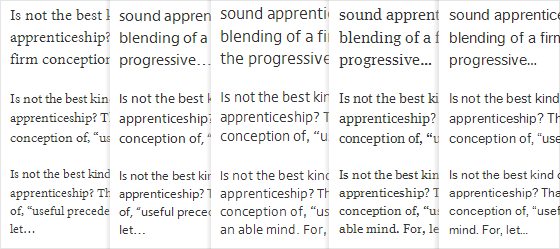
From left to right: Minion Pro, Myriad Pro, DejaRip, FF Meta Serif Web Pro, and FF Dagny Web Pro
All of the fonts tagged Paragraph have been manually hinted to look great on screen at text sizes in every major browser/OS mix. Use these recommendations to make informed decisions about how well a font will render, knowing that they are backed up by Typekit’s font diagnostic tools.
Type rendering on the web is the result of many factors, and understanding these factors is the first step toward improving the way our web projects look, and read, on screen. While this series is concluding, we will continue to research new developments in type rendering, and share what we learn along the way. And as we look to expand Typekit’s library, we are paying careful attention to rendering quality and working closely with our foundry partners to ensure that their fonts meet our — and your — high standards.
7 Responses
Comments are closed.
Great article! I did not know about the Safari Windows complaints. (I’m Mac). It’s great to hear that rendering will improve. I do so love using web fonts and all the personality they can impart into a site.
Excellent article, Tim! I honestly believe that articles such as this one are the reason why the Typekit team is making giant leaps in terms of changing the face of the web forever. You are demystifying and democratizing typography by bridging the gap between engineers, designers and type foundries—something ought impossible just few years back. Thank you for sharing this important knowledge.
I <3 Dagny Web Pro.
Thanks for the info Tim, great article.
I am endlessly amazed by the subtleties involved in type, and equally fascinated. Thanks for explaining it so clearly for even non-designers to understand.
> Hinting is arduous, expensive, and only matters for a dwindling population of web users.
Uh … and “Nobody needs Flash anymore”?
While I strongly prefer auto-hinting and don’t care about Flash, your post sounds a bit too much like Apple-speak, doesn’t it?
So “a dwindling population” basically means everyone running Windows?
And after (some) people update their Browser to IE9 (when it will be released … they got a load of complains about their new rendering (which just sucks, by the way)) except those who can’t update like people using WIndows XP?
Really. Get over it, not everyone uses or wants to use a Mac.
I have my font set to a larger, more full-of-character size, but you’ve mandated that my browser show it at 13px.
I suggest using ems.