Font events: Fallback fonts and styles
This is our third post in an ongoing series about using font events for better control over how web fonts load. Read the first post for an overview of font events, the second post for information on controlling the FOUT, and the fourth post to learn about JavaScript callbacks with font events.
Most browsers and operating systems in use today support web fonts, and Typekit was designed to make supporting each of these different combinations easy. As a conservative estimate, more than 97.5% of the people who visit sites with Typekit have a compatible browser and are able to see web fonts.
But what about the other ~2.5% of visitors who have an older browser that doesn’t support web fonts? Or the visitors who have a user preference that disables web fonts? What will they see when they visit your site? This is where fallback fonts and styles come in. Typekit font events give you more control over the fallback fonts and styles for the few users who don’t see web fonts.
Why are font events necessary for defining fallbacks? After all, you can use the vanilla CSS font-family property to specify a list of fonts to use (called the CSS font stack). If the browser can’t find the first font, then it will use the second font, and so on down the list. It’s always a good idea to pick a fallback font that’s as close to your chosen web font as possible, but there are often minor differences in optical size and appearance. As a result, you may want to serve slightly different styles depending on whether the web font or the fallback font is used, and that’s where font events come in.

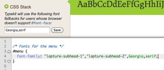
Examples of setting fallback fonts in the Kit Editor or directly in your CSS.
How do you choose and set your fallback fonts? Your fallback font stack should contain at least one fallback font that is uniformly available across platforms (like Georgia or Arial), followed by a generic font-family name (like serif or sans-serif). W3schools has a list of fallback fonts that are available on most platforms. So, for example, if I choose Adobe Minion Pro as my Typekit font, then my fallback stack could be "Times New Roman", serif. You can set your fallback fonts in the Kit Editor under “CSS Stack,” or you can include the Typekit fonts and fallback fonts directly in your own CSS, like so:
.post-body {
  font-family: "minion-pro-1", "minion-pro-2", "Times New Roman", serif;
}
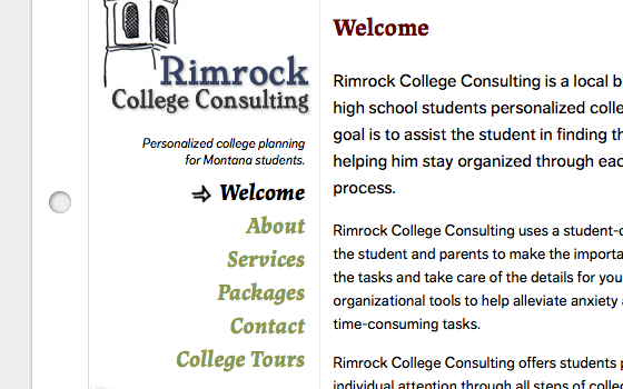
Let’s look at a real-world example of using fallback fonts and styles. I recently added Typekit to the website that I maintain for Rimrock College Consulting. I chose Lapture Subhead by Just Another Foundry for the headings and navigation, since it has a distinguished, almost collegiate feel. Since Lapture is a wider serif font, I chose Georgia as my fallback font, followed by a generic serif family name. To keep things simple, we’ll just look at styles that apply to the site navigation.

Navigation for the Rimrock College Consulting website with web fonts active.
First, I wrote CSS to apply my Typekit fonts and fallback fonts to the menu. I also included some font-related styles to adjust the size, line-height, weight, and other properties:
#menu {
  /* Fonts for the menu */
  font-family: "lapture-subhead-1", "lapture-subhead-2", Georgia, serif;

  /* Font styles for the menu */
  font-size: 20px;
  font-style: italic;
  font-weight: bold;
  line-height: 1.2;
  text-align: right;
}
After adding these styles, I was happy with the way the menu looked when web fonts are active. But what about when web fonts are inactive? To test it, I used the Firebug Firefox extension (or the developer tools in Chrome and Safari) to edit the live CSS and remove the Typekit font names ("lapture-subhead-1", "lapture-subhead-2") from my font-family definition.

Comparing the navigation with web fonts (left) and unstyled fallback fonts (right).
Removing these fonts from the stack allows me to see what my page will look like when the fallback fonts are used. Georgia isn’t a bad fallback, but at a given font-size it looks bigger than Lapture. In order to make my fallback fonts look less obtrusive, I needed to add fallback styles for a smaller font-size and increased line-height when the fallback fonts are used:
#menu {
  /* Fonts for the menu */
  font-family: "lapture-subhead-1", "lapture-subhead-2", Georgia, serif;

  /* Font styles for the menu that look good with Georgia */
  font-size: 16px;
  font-style: italic;
  font-weight: bold;
  line-height: 1.5;
  text-align: right;
}

.wf-active #menu {
  /* Lapture needs a bigger font-size and smaller line-height compared to Georgia */
  font-size: 20px;
  line-height: 1.2;
}

Comparing the navigation with web fonts (left) and fallback fonts and styles (right).
Now I’ve got a menu that looks almost as good with my fallback fonts as it does with the Typekit fonts, and it’s easy to swap between the two (by removing and adding the wf-active class). It was a little bit more work, but I’ve ensured that users who can’t see web fonts (due to an older browser or a user preference) still get styles that I’m happy with.
In the next installment of our font event series, I’ll talk about using font events in JavaScript. We’ll use JavaScript-based font event callbacks to add additional behavior to a page, like making the headings fade in once web fonts are done loading. Until next time!
Update (Nov 12, 2010): As nimbupani pointed out in the comments, there’s a much better resource for choosing fallback fonts available at Code Style. They have data on which fonts are installed across Windows, Mac, and Linux machines. Use their very helpful font stack builder tool to see the percentage of users on each platform that each font in your fallback stack will cover (see this example). I’ve already found this resource to be extremely helpful. Check it out!
10 Responses
Comments are closed.
The generic serif or sans-serif should be the default fallback. The only time I would include another option to fallback to before the generic would be when something like Georgia more closely matches your intended web font. Never specify Arial and then sans-serif, or you create a situation where Mac users will get Arial instead of Helvetica
What about using font-size-adjust? Do you consider using this approach a better solution?
font-size-adjust is a part of the current CSS3 working draft, and it’s a great tool for matching the x-height (the height of lowercase letters) of a font with fallback fonts. Unfortunately, it’s only currently supported in Firefox. In addition, depending on your design, you may want to adjust more than just font-size when fallbacks are used. In my example, I also decided to adjust line-height. Font events work today in all browsers that Typekit supports and allow you to adjust any CSS property.
Oops, left the comment on a wrong post! This is the post I wanted to comment on 😐
It seems a sacrilege for a respected blog to give credence to W3Schools. I think Code Style’s Most Commonly Used Fonts is a much better reference.
A sacrilege?? That’s a bit strong isn’t it? W3Schools has done some pretty amazing work over the years – I realise that they may have fallen out of favour recently but I think they deserve some credit in terms of the work they have done – obviously you’ve forgotten how much of a nightmare it was before they existed??
As for the link you provided, it’s useless, considering it gives not indication of cross-OS compatibility anyway. A list of commonly installed fonts does NOT constitute a list of web-safe fonts.
Luke: W3Schools is *truly* a disgrace. It exists to fill a void between ignorance & clicking the first result in a search.
Where is the evidence for W3School’s list of websafe fonts? How do you know those are facts? Code Style’s at least has an open font survey that anyone can submit (pity it runs on Java Applet though).
Thanks for the pointer to the Code Styles resources! Their font stack builder is really helpful, and their data on font installs across platforms makes choosing fallback fonts much more data-driven. I added an update to the post so people can check it out.
I checked out http://www.rimrockcollegeconsulting.com using Safari 5, but I was served Georgia instead of the Lapture font I expected.
How/where are you using the .wf-active class? Is it placed in the TypeKit stylesheet? I’ve tried something similar, but couldn’t get the browser to use the fall back styles.
Thanks!
-Steven
That’s unusual. The fonts work as expected in my copy of Safari 5. It’s possible that you have a preference that’s disabling web fonts or JavaScript in that browser? You can shoot an email to support@typekit.com if you’d like.
I’m using the .wf-active class in my own stylesheet for the website, which in this case is at http://www.rimrockcollegeconsulting.com/styles.css . Check out the references near the top of the stylesheet.
Thanks! It all made sense after I read the previous posts about EVENTS & FOUT. I checked out your stylesheet and it then became crystal clear. I think it must have been my connection that displayed Georgia instead of Lapture. What a great example of your post!