Sites we like
Starting this week, and continuing (almost) every week thereafter, we’ll be sharing sites that caught our eye for their attention to typography and sophisticated use of web fonts from Typekit. Here’s what we noticed this week.

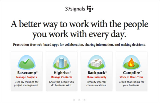
The newly redesigned 37Signals pairs a sparse layout and minimal color palette with Robert Slimbach’s Minion. Big, centered headlines enable the great copywriting to shine, plus they contrast beautifully with smaller subheadings set in red Lucida Grande. The result is elegant, confident, and classy.

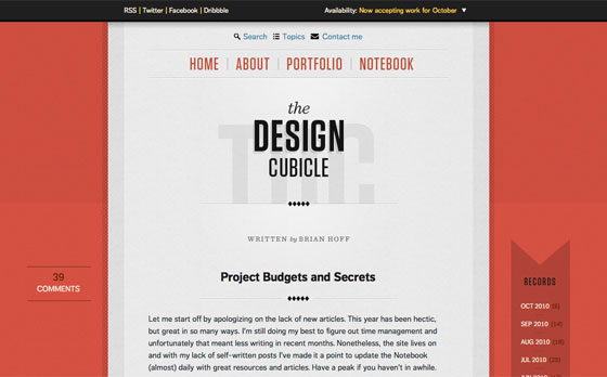
The Design Cubicle uses FF Dagny Web Pro for both headlines and body text, showcasing the font’s flexibility. The small body text is compact and readable (thanks in part to the generous line-height), while the larger, bold headings stand out. Note how the same font can work successfully as both a title (centered, larger) and subheading (left-aligned, smaller). FF Dagny appears again in the pagination at the bottom of the page, carefully set inside circle backgrounds. A nice touch for an often underserved element.

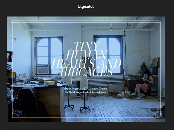
Big Cartel hits one hundred thousand stores and celebrates with a beautiful photo essay featuring LTC Bodoni and Ambroise. Large, italic, all-caps headings set the tone, while narrow columns of small body text (set in Georgia) carry the story along. Notice that the body text is set in light gray (#bbb) against a dark gray (#222) background; the result is soft and pleasant to read. Hover over an image with a “plus” sign in the corner to reveal captions and lovely little price tags for the jewelry.
Feel free to share sites that you like in the comments!
9 Responses
Comments are closed.
I really like the gradual page loading effect used on Big Cartel. Does anybody know what it is?
I really like Naomi Atkinson’s portfolio website: http://naomiatkinson.com
The typography and use of subtle illustrations seem to compliment each other excellently.
They’re using the jQuery plugin Lazy Load.
Nice! As someone just getting into using Typekit on my blog, I like seeing the possibilities. By the way, I think your text link for Big Cartel is missing an http:// ? It’s just getting tacked on to the URL for this page.
Link is fixed now, thanks!
A site I launched a few months ago uses Typekit for Proxima Nova for the body copy and Legitima for the headlines at http://AllThingsUNCHARTED.com – Typekit made the process incredibly easy and let me dump the need for Cufón!
Love your overviews… Pleasantly precise
And here’s the great typography experience we Windows users get http://twitpic.com/2wu9sj/full Hooray!
May I suggest my own blog?
http://www.attackofdesign.com/
I’m using Typekit for the body copy (skolar web).
Big fan of the 37signals site as well as their products. Very elegant yet simple. also, their writing is top notch!