Thirty years of Japanese font development at Adobe (Part II)
This is a continuation from a previous post. Read Part I.
The Japanese version of this article is posted on the Creative Station blog.
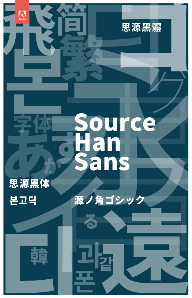
Adobe and Google co-developed Source Han Sans, which was a Pan-CJK type family — meaning it could be used in the five main regions in East Asia: China (using Simplified Chinese ideographs), Hong Kong, Taiwan (using Traditional Chinese ideographs), Japan, and Korea. Even when you need to produce a multilingual document or publication requiring region-specific ideographic glyph variations, a Pan-CJK typeface like Source Han Sans provides good design consistency. Adobe and Google released Source Han Sans and the Google-branded Noto Sans CJK as open source font families in 2014, with licensing conditions based on Open Font License version 1.1.
Until the Pan-CJK font was realized, it had been necessary to obtain a region-specific font for each region, separately, due to the differences in glyph set and glyph style preference between the regions in East Asia. For example, the most preferred glyph style for the ideographic character “骨” (meaning “bone”) is represented differently between its Simplified Chinese glyph “骨” used in China, Traditional Chinese glyph “骨” used in Taiwan, and Japanese/Korean glyph “骨”. On the other hand, there is not such a region-dependent glyph shape difference for the character “一” (meaning the number “one”).
First, for each character, it is necessary to clarify the most standard and preferred glyph shape for each region. Then, by comparing the preferred glyph shapes for each character, we need to decide whether it is possible to unify any glyphs or not (especially when the differences between the glyphs are very subtle). If there are glyph shapes that cannot be unified with one other, we need to decide which glyph shapes belonging to which regions need to be preserved. As more glyph shapes are unified between the regions, the total number of glyphs that need to be included in the font becomes smaller, which can help to reduce the file size of the font. The smaller the number of unified glyph shapes, the larger the number of glyphs that need to be contained in the font, and the smaller opportunity to reduce the file size of the font.
However, it is important to respect the glyph preference of each region. If the difference between the most preferred glyph shapes of the regions look to be neither negligibly small nor evidently large, it becomes difficult to judge whether the glyph shapes are to be unified or not, the question entering a gray zone. We commissioned Changzhou SinoType in China and Iwata of Japan to produce ideographic glyphs, and Sandoll Communication in Korea to produce Korean Hangul glyphs. The judgments for the unification of glyphs were made by Ryoko Nishizuka, the designer of the typeface, based on input and opinions of the designers of the partner type foundries, and those of Dr Ken Lunde, the Source Han architect. When there was a difference in opinion among the designers, it was necessary to have discussions to resolve the discrepancy. This was one of the most difficult parts of the process in developing Source Han Sans.

Source Han Sans
Although the design of Source Han Sans ideographs was based on that of Kozuka Gothic initially, it was redesigned radically, reducing the average bounding box size as well as the counter space on average. The average counter space size of Source Han Sans’ kana characters were adjusted so that it would appear moderately smaller, making the typeface more suitable for body texts such as electronic books. As a result, Source Han Sans’ kana glyph design retains a flavor of Japanese traditional “Gothic” (sans-serif) typefaces. Nishizuka also introduced straight-line features in some character strokes to prevent the typeface from looking too conservative, and to be useful for short words and phrases used in menu items of smart phones, tablet PCs and other mobile devices. She tried to find a “sweet spot” at some intermediate point on the axis between traditional body text typefaces and other, newer typefaces for display purposes. The design of Source Han Sans was intended to be basically traditional, but not too traditional.
In 2011, Adobe acquired Typekit, which was a web font service provider, and has made great efforts to improve the interoperability of Typekit’s font distribution with Adobe’s application software such as Photoshop, InDesign and Illustrator, and the overall Creative Cloud service. As a result, Typekit today is composed of two main pillars: Typekit Web, which enables a wide variety of high quality fonts to be used in web documents, and Typekit Desktop, with which the user can use the Creative Cloud desktop application to add fonts from Typekit’s library to their computer. In the beginning, Typekit supported only Western fonts, but Typekit started to support Source Han Sans shortly after the fonts were released, and in June 2015 began supporting Adobe’s Japanese fonts. And in October of the same year, 20 fonts from Morisawa (including TypeBank fonts) were added to Typekit’s collection of Japanese typefaces. In July 2017, Morisawa added 10 more TypeBank fonts to the collection. In September 2017, four Japanese type foundries added 74 fonts to the collection. Visual Design Laboratory, Jiyu-Kobo, Dai Nippon Printing, and Fontworks are Typekit’s newest Japanese foundry partners. These Japanese fonts on Typekit can be used as Web fonts and also as Desktop fonts.
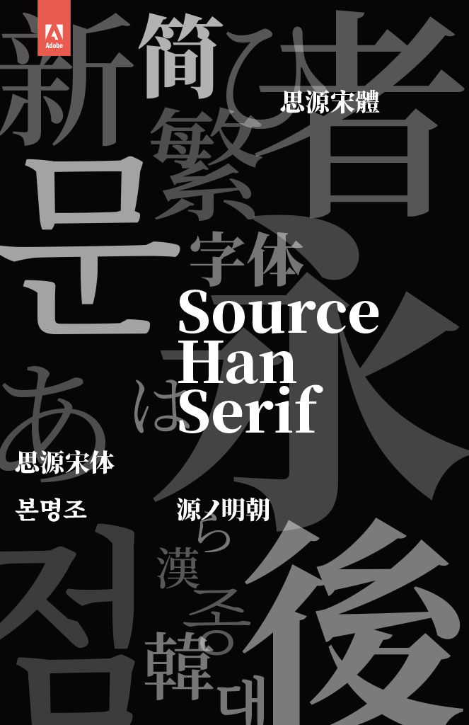
In April 2017, Adobe and Google released the co-developed Source Han Serif typeface families as open-source fonts, with licensing conditions based on Open Font License version 1.1. Source Han Serif is the second Pan-CJK font family after Source Han Sans. Like Source Han Sans, Source Han Serif was designed by Ryoko Nishizuka. Source Han Serif can also be used for regions of East Asia where Han ideographic characters are widely used, and it provides good design consistency when it is used to produce multilingual documents incorporating regional glyph variations. This is one of the most important characteristics common to both Source Han Serif and Source Han Sans.
However, the process of designing Source Han Serif included more difficulties than that of Source Han Sans. The Mincho typeface style had been developed in various regions in East Asia uniquely, though the very long history of writing and printing in ideographic characters originated in China. Therefore, the diversity of glyph shapes had also been enlarged between different regions in East Asia. Furthermore, as the Mincho style type had long been used for books and documents including long texts, people were also very particular about subtle glyph shape differences, and tended to stick to their own regional style. The distribution of shared versus unshared region-specific glyphs is different than Source Han Sans. However, it is very meaningful that the typeface in the Mincho style was implemented as a Pan-CJK font family, because while we expect that it will be used mainly for body text composition, it can be used also for a wider range of purposes than would be the case for a sans-serif typeface.

Source Han Serif
When designing Source Han Serif, Nishizuka intended that it should have a traditional style, yet it should not look too traditional. Before she started to design kana characters, she repeatedly drew sketches to find suitable shapes that could be created manually with a brush. She didn’t exaggerate the calligraphic features and subtly simplified details of strokes, trying to make the resulting character shapes in an unobtrusive and subtle manner. With this approach, she could succeed in incorporating the stylistically traditional elements and a kind of modern simplicity into the typeface.
Both Source Han Sans and Source Han Serif are provided as open-source fonts. It is expected that various new usages of fonts that are not yet known today will be explored and discovered.

Ten Mincho
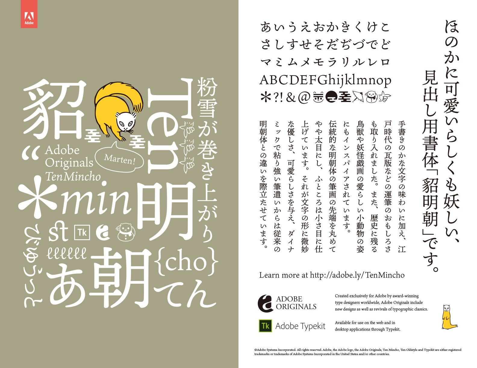
In November 2017, Adobe added Ten Mincho (also designed by Ryoko Nishizuka) to the Typekit library. Prominent in the design are the dynamic characteristics of hand-written characters, as well as a stroke formation style that is typically seen in the Kawaraban printed newspapers in the Edo period (1603–1863) in Japan. Ten Mincho also features a full set of Latin glyphs designed by Robert Slimbach, Adobe Type’s Principal Designer. Also, several fun glyphs in the shapes of small animals and additional emoji are included. Digital fonts today are used on a diverse variety of display devices including cellphones, tablet PCs, as well as electronic books. Ten Mincho demonstrates one form of Japanese typeface design for display purposes suited to the current era.
Since the first PostScript printer was released in 1989, Adobe’s font implementation technologies have changed and improved continuously. However, it was necessary not only to come up with the changes in the font use environment but also to realize high quality typography in Japanese. Adobe has been involved in various changes: for instance, the dissemination of Unicode to assign codes to characters of the world’s large number of scripts uniquely, the introduction and transition to OpenType, the development and maintenance of the OS-independent glyph set needed in Japanese typography, the development of software tools enabling high quality typography in Japanese, and Typekit’s font distribution services for the web and desktop computers. In each stage, Adobe has provided the world of Japanese typography with new typeface designs. Those typeface designs have been closely tied with or highlighted various new technological elements.
Adobe’s relationship with Japanese fonts has lasted for 30 years. Since Adobe released its first original Japanese typeface, Kozuka Mincho, nearly 20 years have passed. Desktop publishing has been firmly established and widely disseminated in Japan. As the web and various different kinds of display devices have been adopted, the application area of fonts has been largely expanded. Today, it is possible to use high quality fonts on smart phones and tablet computers. In this ever-changing world, Adobe has been making great efforts to facilitate effective use of digital fonts for the benefit of users.
On the other hand, the expanded use area of fonts is bringing us new challenges today, including the handling of textual information changing dynamically on the web and application software; how to create responsive documents whose appearances can be automatically adapted to conditions of the display devices and format that may be changed dynamically, and what relationships with fonts such dynamic form of documents will have; and what structures and configurations of fonts can enable multilingual typography supporting a wider scope of languages and scripts.
We will continue to make efforts to adapt ourselves to the changing technological conditions of the world, developing useful and attractive typeface designs to provide our users with a wider variety of choices, inspiring and stimulating the users’ own creative ideas. In short, we will continue to advance the art and science of Japanese typography.