New fonts on Typekit from Lettersoup
We’re delighted to add several new fonts to our library from Berlin-based type foundry Lettersoup, founded by Botio Nikoltchev in 2014. If you already have an account with us, or a paid Creative Cloud subscription, these fonts are all part of your collection and can be used on the web or synced. Check them out and let us know what you think!
Milka
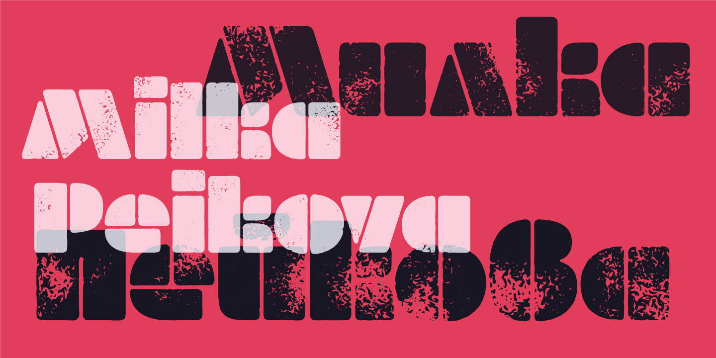
Bulgarian artist Milka Peikova designed the stencil alphabet that would become Milka in 1979, which Lettersoup has now turned into a fully-supported digital font. Milka passed away in 2016 at the age of 96, but worked with Botio on the revival design beginning in 2014 along with Ani Petrova and Anelia Pashova — and, back in Berlin, with Adam Twardoch and Andreas Eigendorf. The echo of the late 1970s is strong here, but the design doesn’t feel remotely dated. The six different styles are a fascinating exploration of the effect a slight texture can have on the overall mood.
Quasimoda
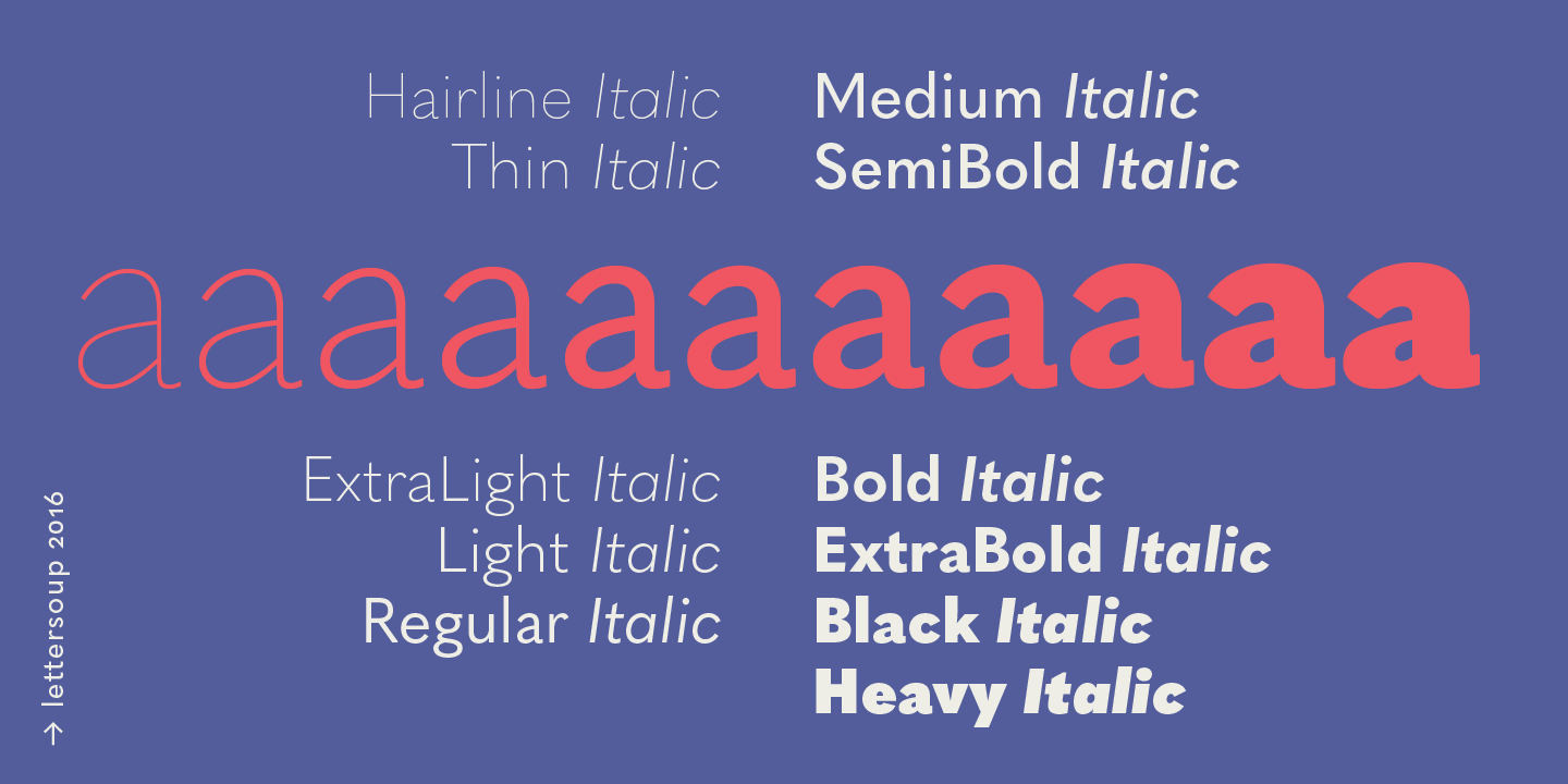
Speaking of moods! Quasimoda comes in eleven weights, giving you ample variety when designing around any number of constraints. The extreme weights make for excellent headers or subheads, and at medium weights the type is beautifully proportioned for a smooth reading experience with longer texts. Friendly geometric shapes are a feature at all weights, and the relatively small x-height and long descenders makes this a great typeface to pair with Garamonds or similar serifs.
Ropa Sans, Soft, & Mix
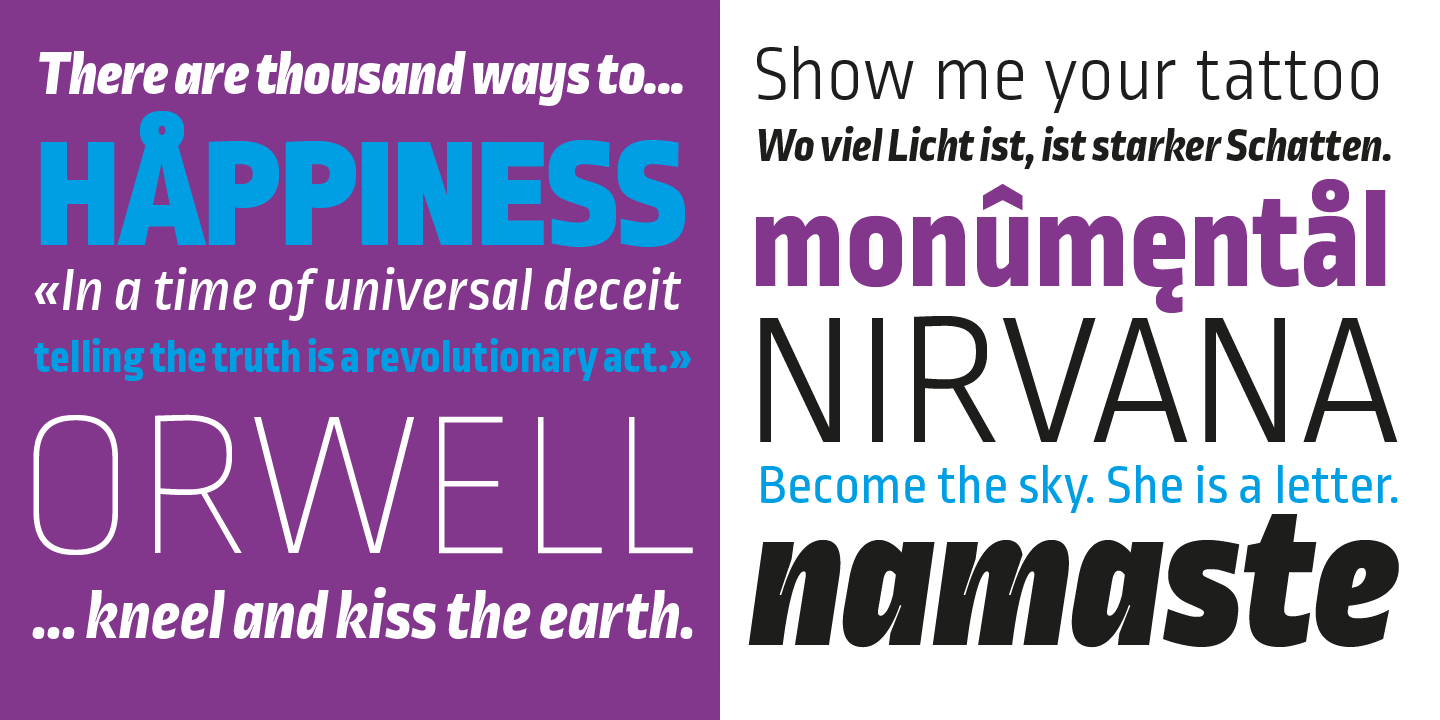
Ropa Sans
The influence of DIN — classic rectangular precision — is definitely visible in Ropa Sans, Soft, and Mix. Botio refers to the three subfamilies as siblings of one another, with Ropa Sans the most straightforward and technically-minded of the trio. It’s certainly the most DIN-like.
Ropa Soft
Ropa Soft introduces a warmer personality, especially noticeable at the thicker weights. The italics are a lovely and striking feature in all the different subfamilies, perhaps most prominently in Ropa Mix where those narrow lines make an emphatic contrast within the letterforms.
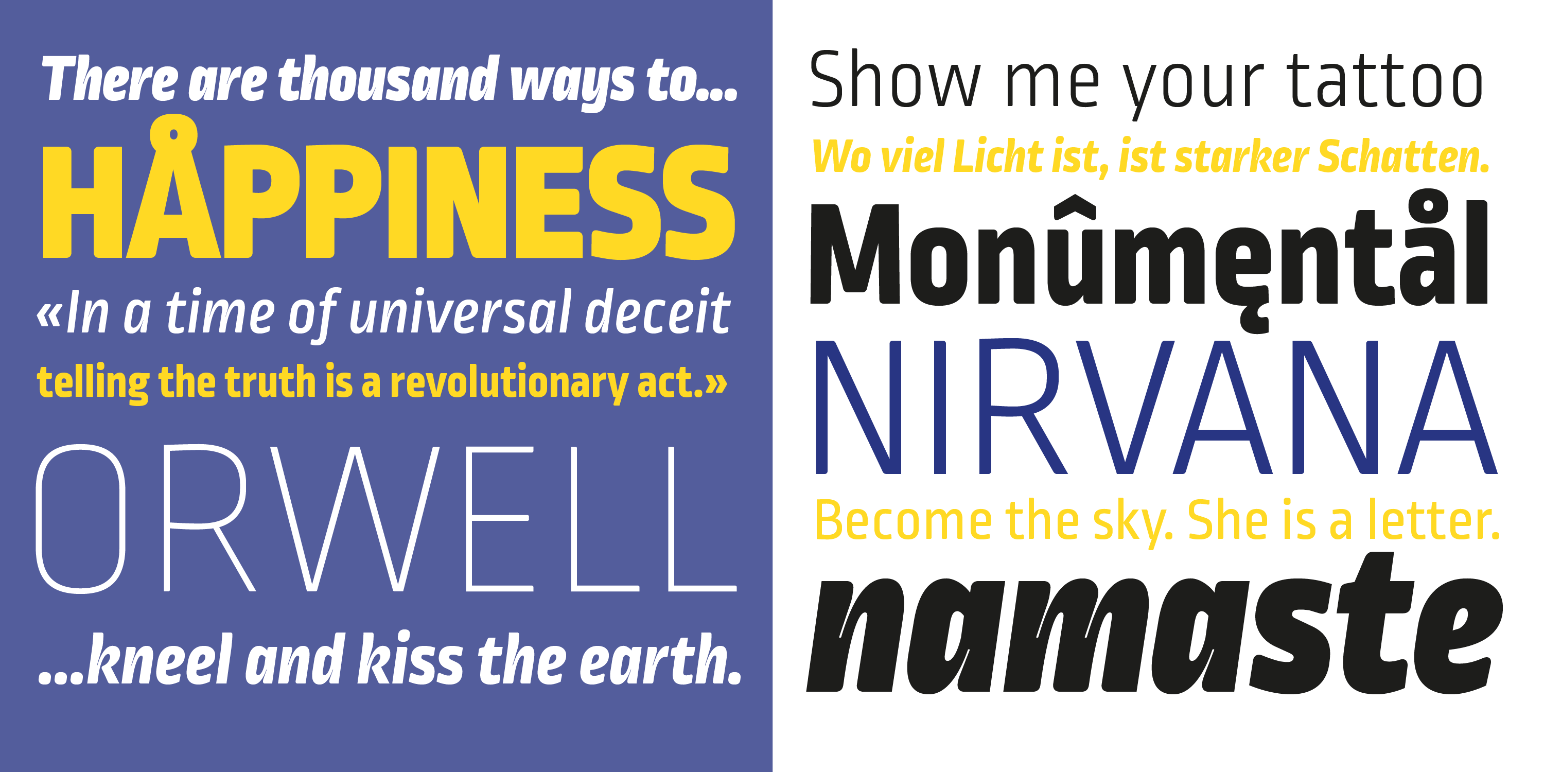
Ropa Mix
Let us know what you think — will you mix together a couple different Ropa styles, or maybe experiment a little with Milka? We’d love to know what you’re working on. Tag us (and the fonts!) anytime on Instagram. We love seeing fonts in use!