Sites We Like: Green Chameleon and Zaengle
Sites We Like is all about profiling excellent examples of web type in use. In this week’s post we’re sharing two design agency sites that really practice what we preach!
Green Chameleon

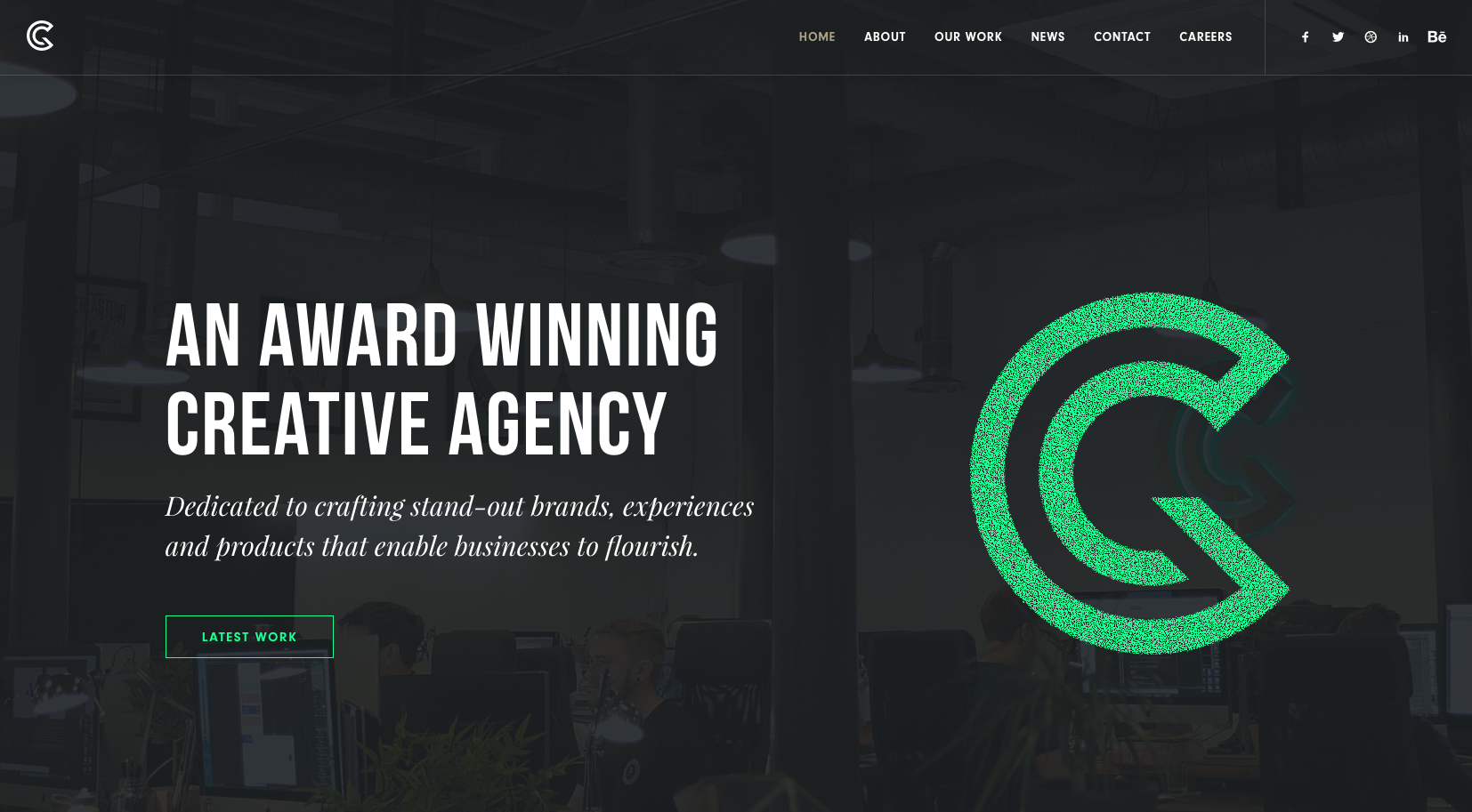
First up we have UK-based agency Green Chameleon. The uppercase-only Bebas Neue immediately demands attention with its condensed yet elegant capitals. We also can’t stop playing with the interactive logo that really makes this site stand out.

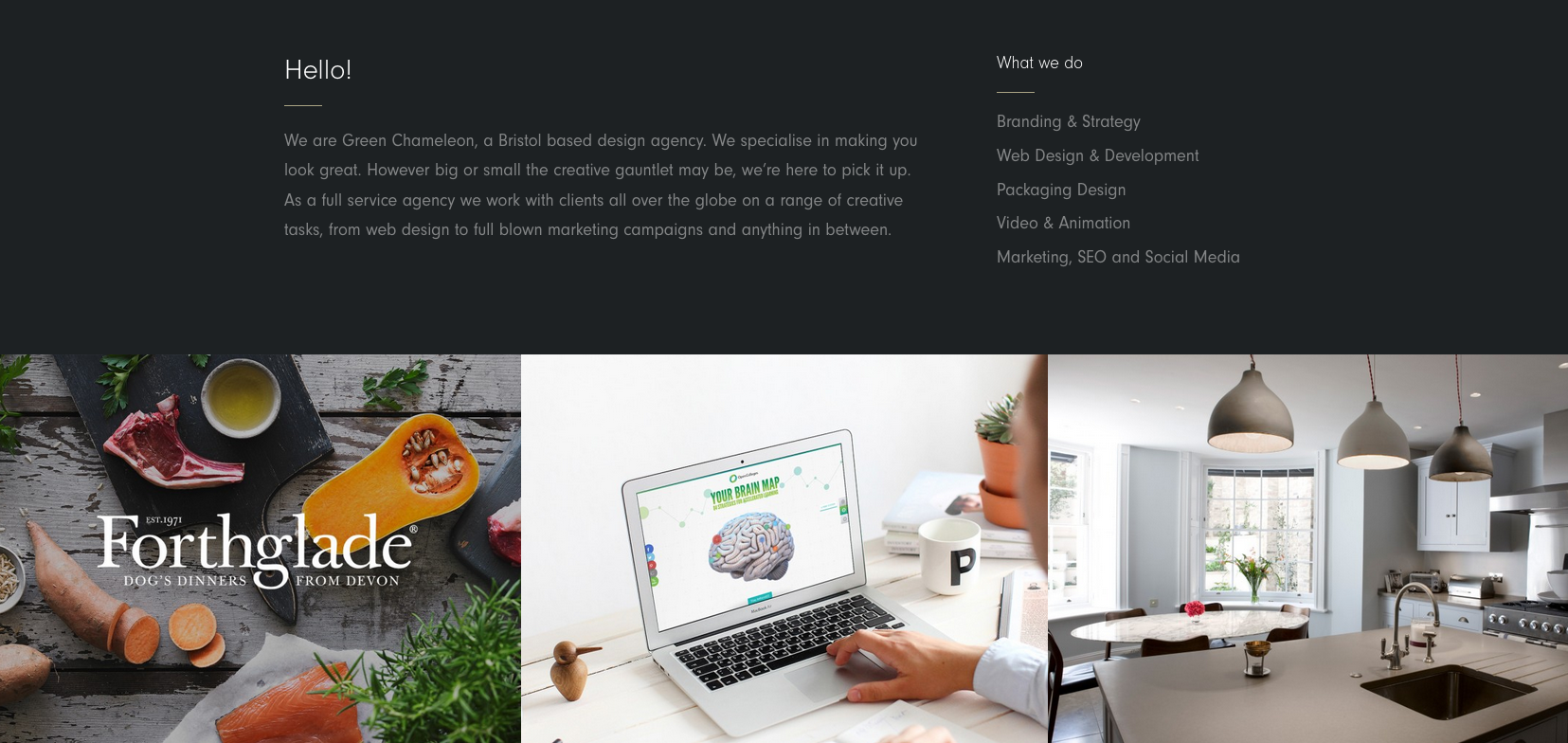
The site’s content is set in the modern sans serif Neuzeit Grotesk. The clean lines of this typeface allow the images on the page to speak for themselves.
Zaengle

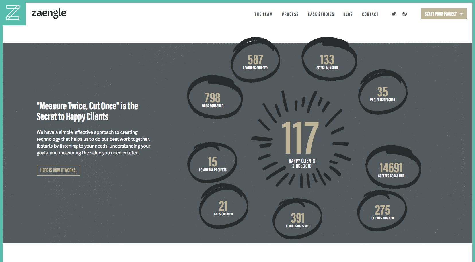
The next site that caught our eye this week belongs to web design agency Zaengle. The site utilizes web type in some amazing and creative infographics like the one pictured above, which uses Acumin and Adelle Sans.
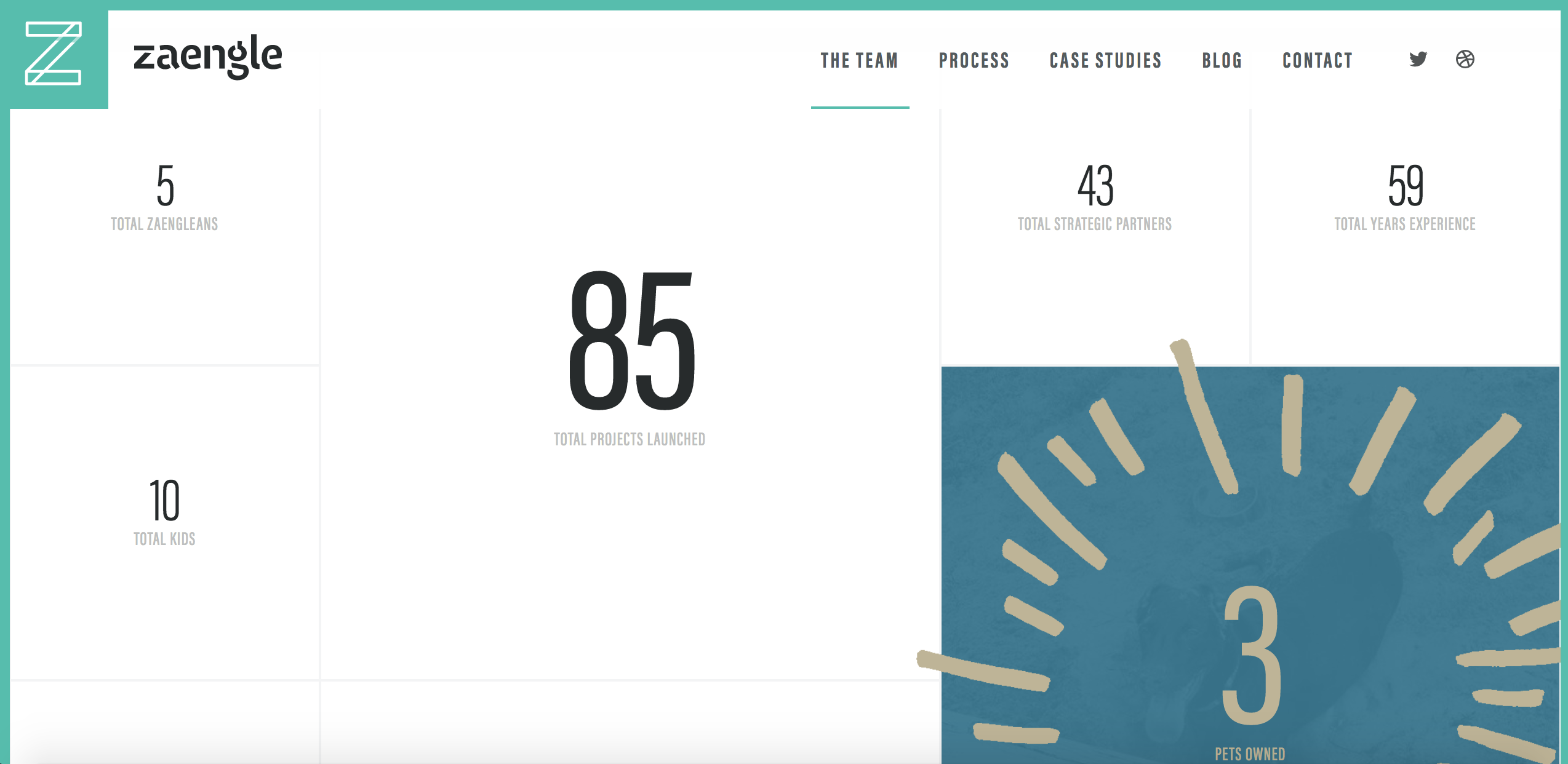
Not to mention the snazzy animations that decorate the team statistics on their About page, shown below!

We hope this week’s Sites We Like gives you a new perspective on how web type can be applied to your projects. If there are any sites that you like, please be sure to drop a comment below or find us on Twitter!
4 Responses
Comments are closed.
Lovely design! Bebas looks like the right choice!
Really nice design, the color complements the typeface. I am not sure about the animation in the slider but the portfolio design is nice.
Good desig! Good post
Nice design!!!!!