Preview a new look for fonts on Typekit
We have some big news today: we’ve just shipped a brand new experience for browsing fonts on Typekit — the biggest change to our web interface in almost five years. We’ve rebuilt font browsing from the ground up to make it faster and easier to find the fonts you want to use across a wider range of screens and devices.
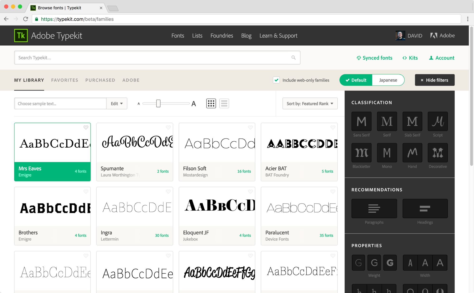
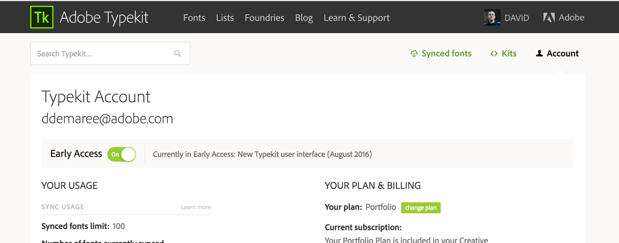
We’re still putting on some finishing touches, but we really want your feedback, so we’re releasing it today via our Early Access program. To test-drive the new Typekit interface, go to your Account page and flip the Early Access switch on.
What’s new?
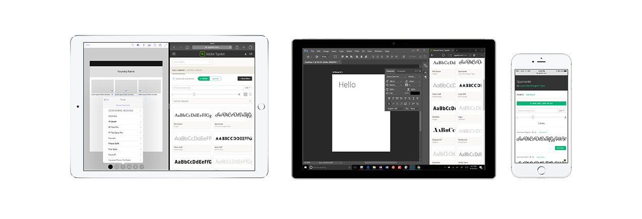
First off, Typekit now has a beautiful new responsive design. Our font browser and family detail pages now look great on screen sizes ranging from phones to giant widescreen displays. We’ve optimized them for touchscreens too, so Typekit works well on iPad Pro as well as hybrid PCs like the Surface Pro.
Next, we’ve made it simpler and easier to to find the fonts you want, by rethinking the tabs and controls in what we now call the scope bar.

New options and controls on the scope bar simplify the font browsing experience.
My Library shows all the fonts you can use with your plan, including any fonts you may have purchased from some of our foundry partners for use on Typekit — making it easier to focus on fonts you can use under your subscription plan.
Some customers have told us it’s frustrating that many of our fonts are still only available for use on the web. So, in our new UI, we’ve condensed this to a single web-only families checkbox. If you don’t want to see web-only fonts, uncheck the box. (As of this writing, around 52% of the fonts in our full library are available for both sync and web — so you’ll still have plenty to choose from regardless of how you check.)
See more of the fonts you love
We’ve built wider type previews in both browsing and family pages, with custom sample text and robust character set support offered throughout.
One of our biggest customer requests has been the ability to enter non-alphanumeric characters in the browsing interface. While browsing, you can now preview Latin fonts with our complete default character set.
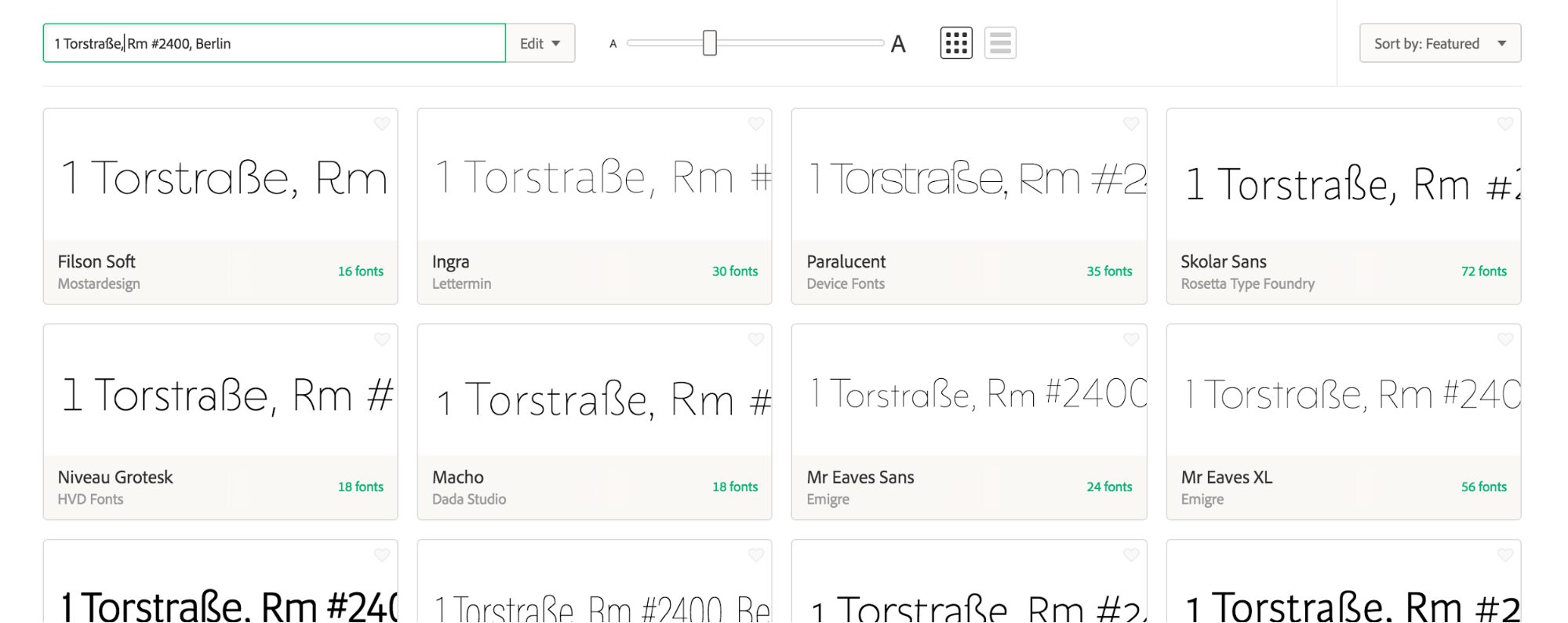
You can also now hide the sidebar to free up more preview space:
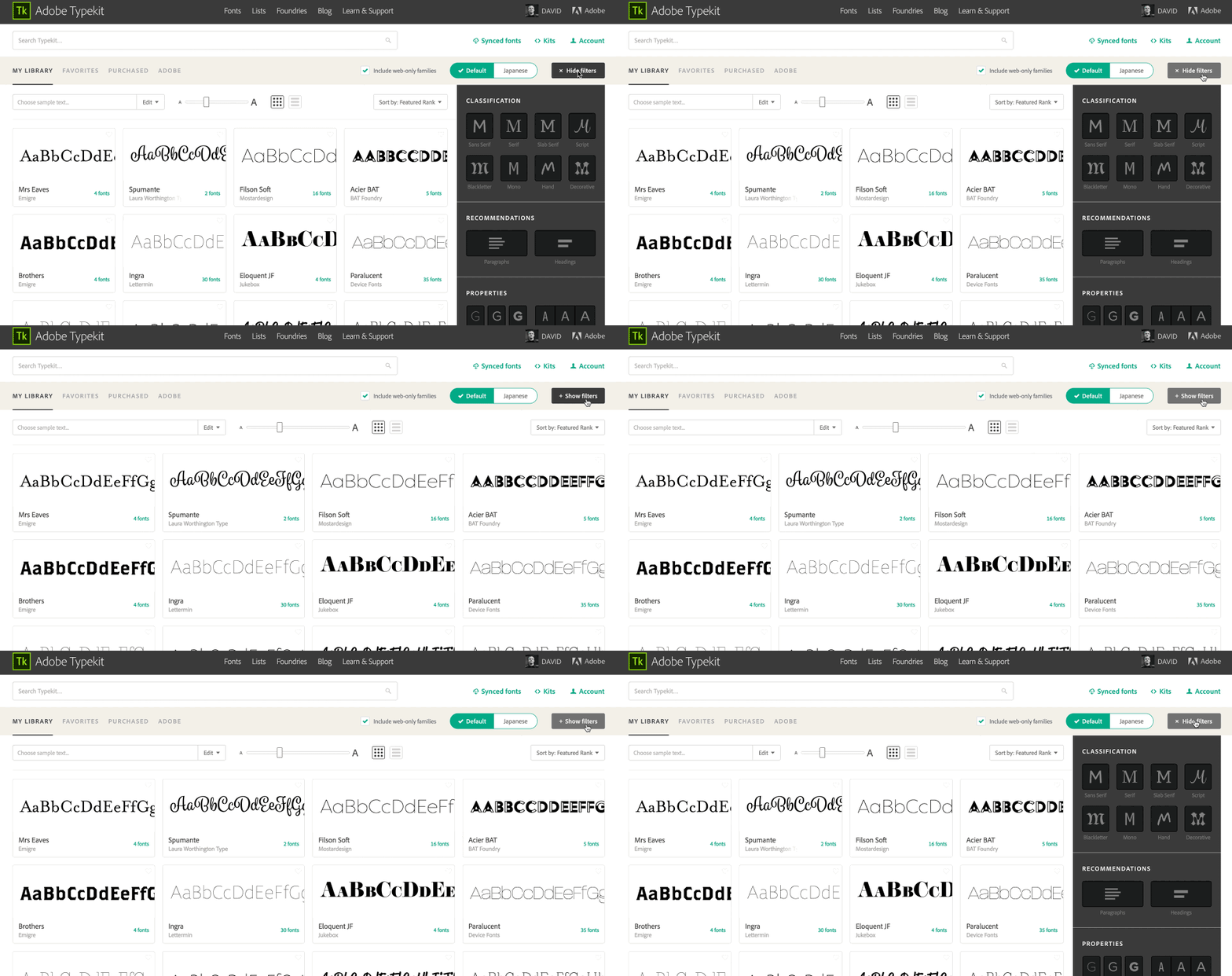
And we’ve made improvements to pagination and filtering: per another of our top user requests, we’ve replaced the “Load More” with more conventional “Previous/Next” pagination buttons, and filter selections are saved in the address bar so your settings aren’t lost when you use your Back button.
More expansive font families
Since Typekit launched in 2009, we’ve aligned font family grouping on Typekit with how fonts are grouped in CSS for use on the web, and we kept this structure for organizing fonts even as we expanded our service to include desktop sync. While we’ve found that web font families can work for desktop fonts, they can also create some unforeseen hassles — especially when working with large families like Acumin.
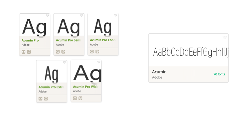
In the new interface, we’ve combined many large families that had previously been split across multiple family cards and pages into single families — so instead of navigating to “Acumin Pro Condensed” and “Acumin Pro Extended” separately, you can just go to Acumin, and see all 90 fonts that make up that family.
Sync fonts with a single click
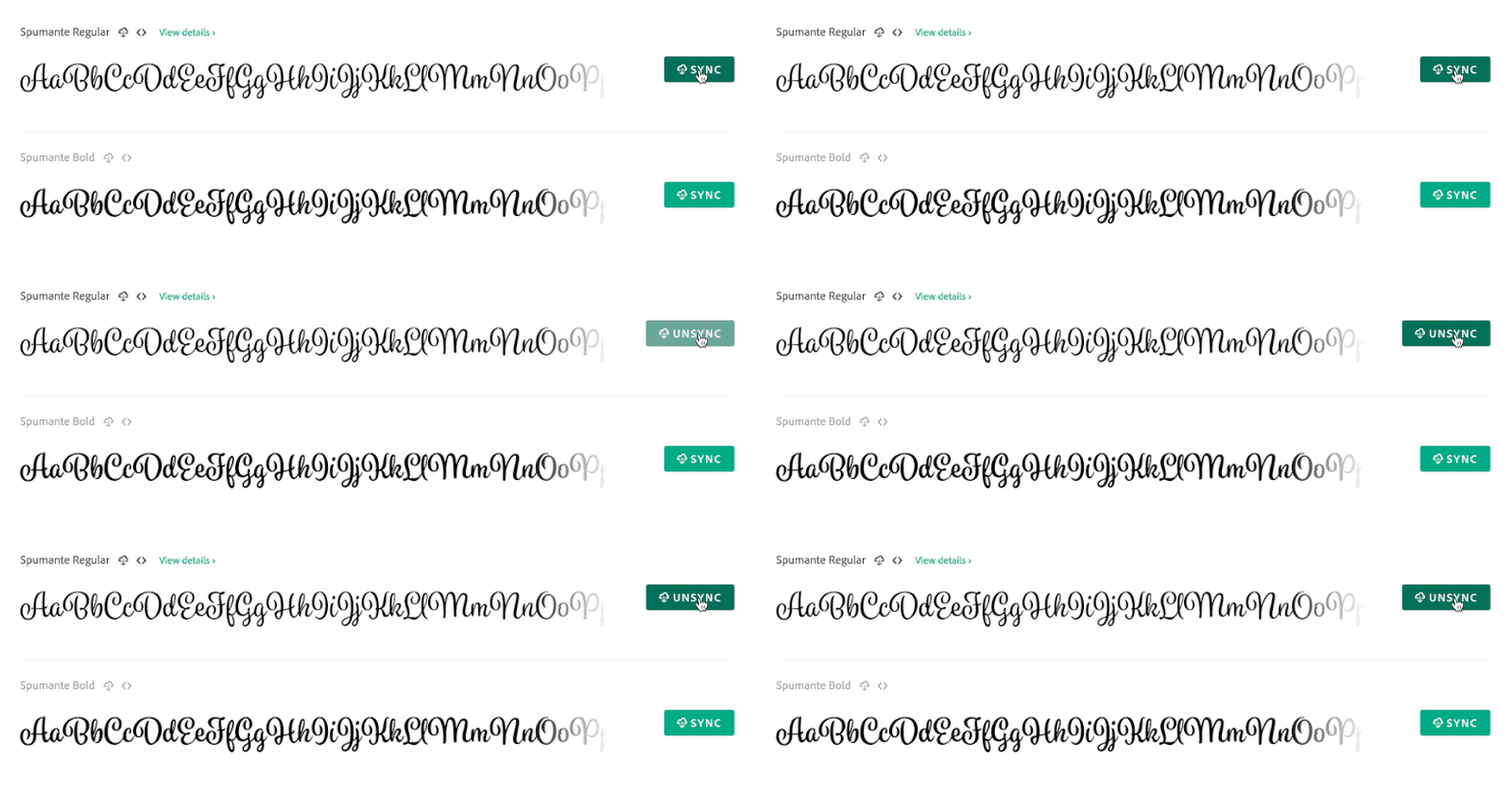
We’ve also simplified the process of syncing a font. Instead of opening the Use Fonts dialog, there are now Sync buttons next to each syncable font on family pages, allowing you to add or remove a font from your sync selections with a single click.
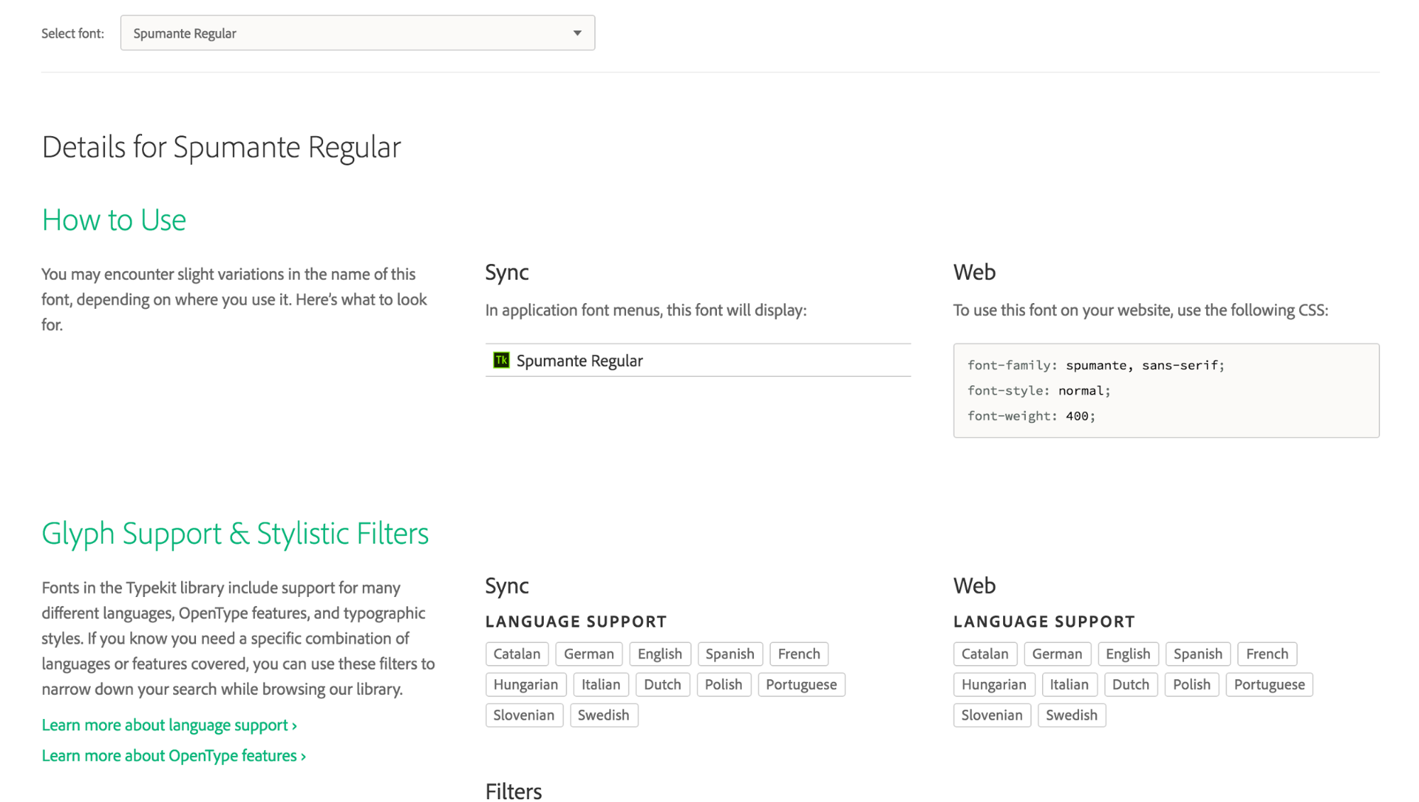
Last but not least, family pages now include a Details tab, giving you a wealth of “back of the baseball card” information about each font in a family: how it’s named in both font menus and CSS, detailed web font specimens, language support information, and more.
What’s missing from this preview release
While we’ve worked hard to make everything perfect for this preview release, there are a few loose ends we’ll be tying up over the next few days:
- International users will see some UI text has not yet been localized and will display in English.
- Type tester support for Japanese fonts is currently not available on family pages.
- We have not yet finalized our default sample text strings, and we want your help! If you have a few minutes, please check out this survey to help us better understand how you preview and choose type.
- Our help documentation and screenshots are in the process of being updated for the new UI.
We’re working to ship fixes to these and other known issues as soon as we can, and we plan to continue making improvements in the months ahead in response to your feedback.
In the meantime, we are very eager to hear what you think of the new Typekit. Please send any general comments, suggestions, or bug reports to our support team at support@typekit.com, or reach out to us on Twitter.
4 Responses
Comments are closed.
Thanks for these changes, particularly the web-only exclusion.
Here’s a suggestion. Often books come with constraints on their length or have a font that needs to be replaced with another. It’d be helpful if fonts had a measure of their compactness, meaning how many words would fit on a page of a given size. For instance, if a book in Alphafont is 10% too long, it’d be helpful, when looking for a replacement, to be able to limit the search to fonts that are 10% more compact. Otherwise, we’re stuck wasting a lot of time experimenting.
The results will depend on the particular text, but even a less-than-perfect measure would be better than none.
Other suggestions include:
1. A darkness rating that’d be a measure of how dark or light a font appears on a page given certain parameters. Again, that would help when looking for replacement fonts.
2. A way to find fonts that are readable by people with various visual impairments. I’d be good if that could include a suggested minimum font size.
This is a really great and intuitive update. However, I couldn’t find a Type Tester. That is the most important tool that helped me to choose and decide on fonts. If it’s not being included in the new update, that will be very disappointing. I really hope it’s not the case. Otherwise, a great job on making Typekit an even better tool than it was already.
THANK YOU! I’ve hoped for these features for a long time.
Great update. A lot of nice features implemented. Thanks!