Sites We Like: Lu Yu & Brandtpunt
Fonts in the Freight collection are popular picks, and it’s easy to see why. Check out how two very different sites create their own unique looks with thoughtful pairings of varied weights and styles.
Lu Yu

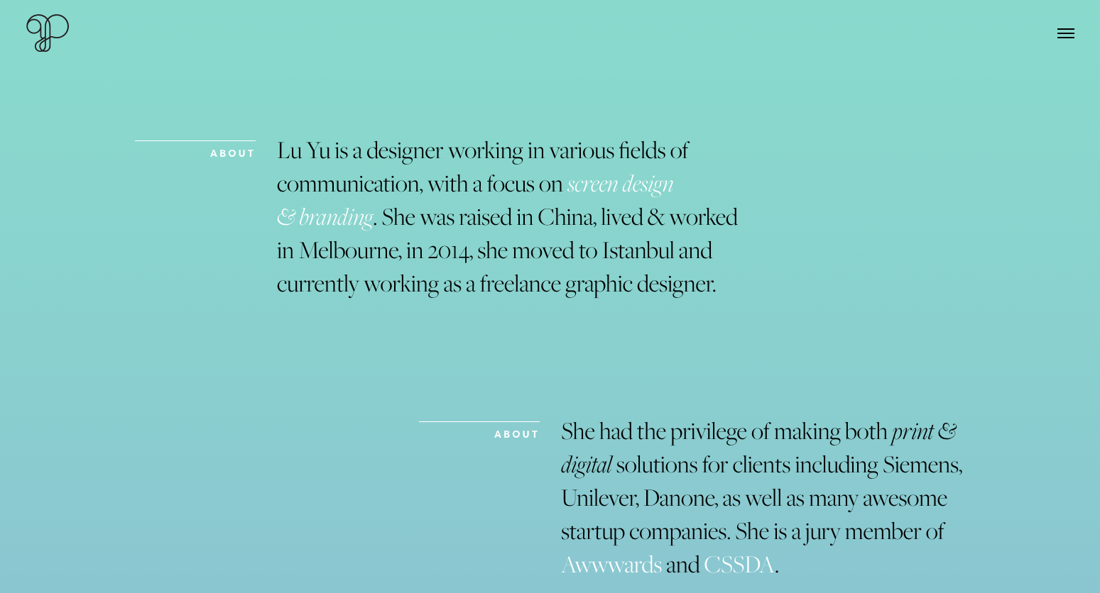
Lu Yu‘s portfolio site makes gorgeous use of Freight Big — not a usual choice for longer text sections, but it looks great here at a relatively large size. Subheads are in Filson, which pairs beautifully with the high-contrast display text when set at a smaller size, as it is here.
Brandtpunt

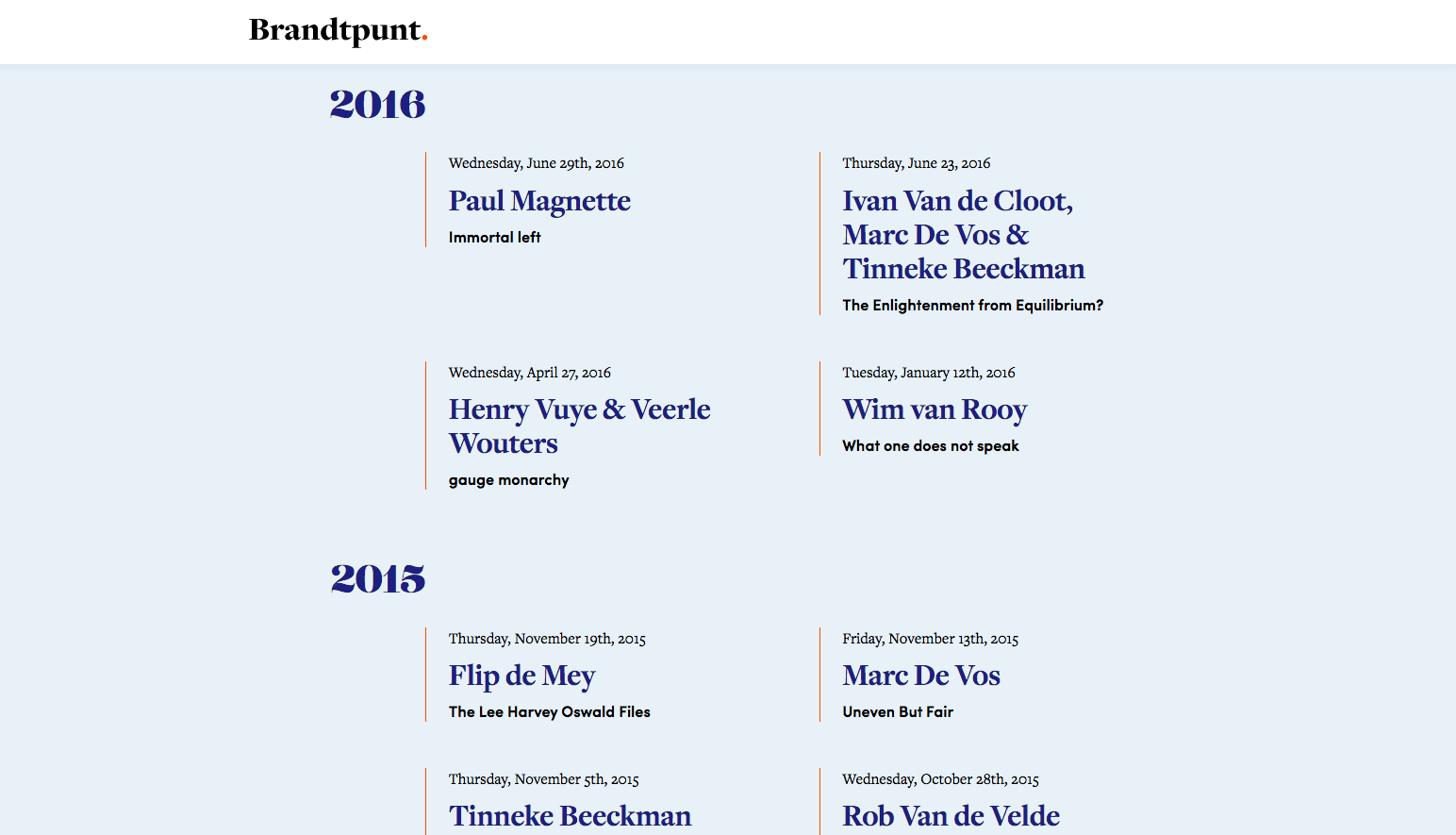
Freight Display, used here on the Belgian marketing site Brandtpunt, has a similar character to Freight Big but tones down the contrast a little — which gives it more latitude for interesting pairings like Lust Didone (used for the gorgeous numbers in the event year headings). Sofia is a solid pick for tidy, slightly modernist subheads in a clean sans-serif face, and pairs well at text sizes with Freight Text.
That’s it for this week; share sites you like in the comments!