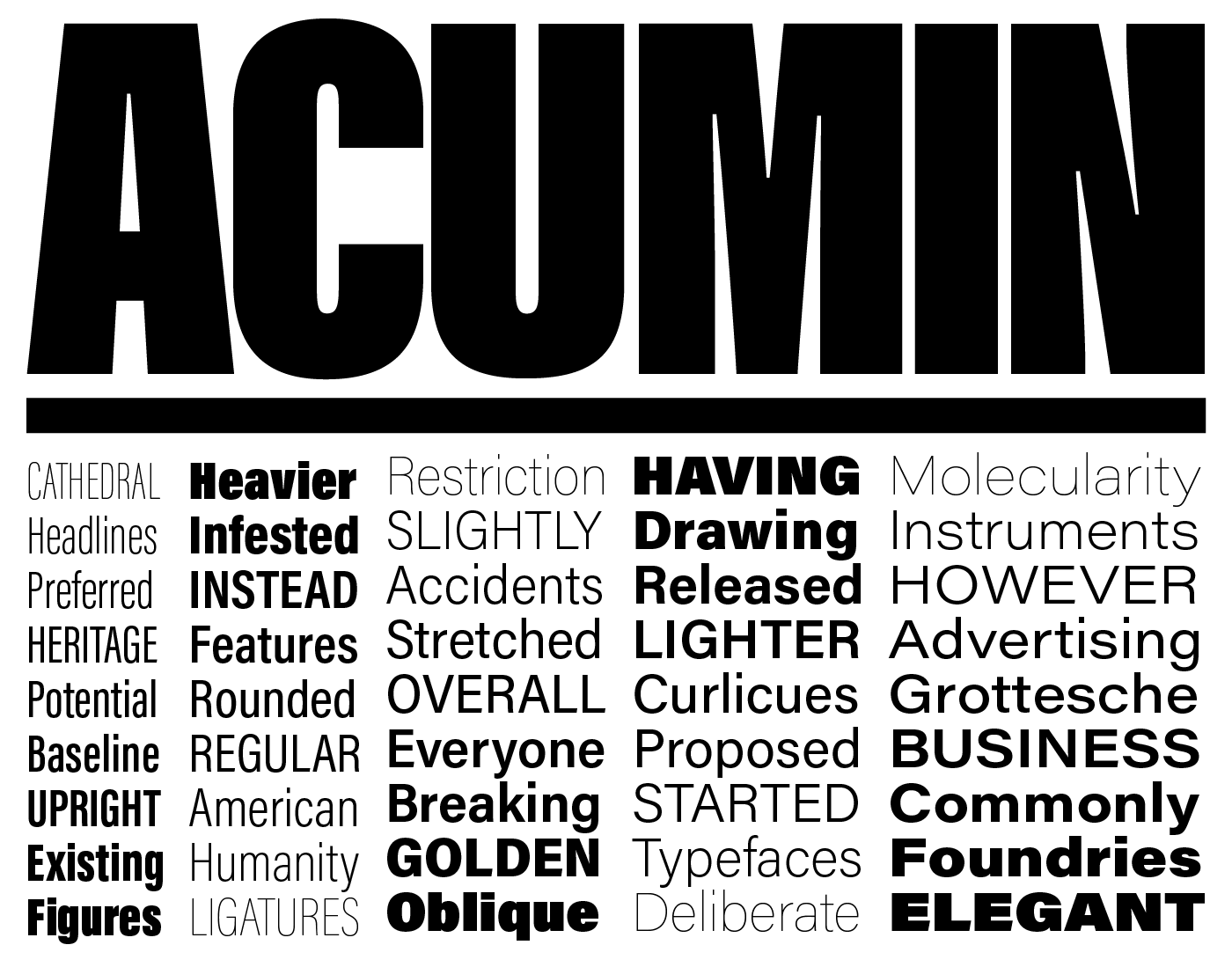
New on Typekit: Acumin from Adobe Type
Coming in with a staggering 90 different weights and styles, the Acumin family is the latest typeface from Robert Slimbach, the principal designer at Adobe Type. It’s our pleasure to add this to our library for use on the web and for syncing.

Acumin is a sans serif that classifies firmly as neo-grotesque, with all the relevant historical lineage informing its functionality. Robert’s aim was to strike an original note with the design while resisting the urge to make the face more “human” (and thus less of a true neo-grotesque). The ubiquity of popular neo-grotesques gave Robert a very “narrow design latitude” to work within.
Neo-grotesques are typically great for display typography, but tend to be harder to read as a text face. Robert took pains to counter this, and applied a great deal of attention towards making the middle weights and widths of Acumin workable for text settings; in his design notes, he explains, “With practical neutrality in mind, my attention was focused primarily on the subtleties of design that make a type more readable.”

Type historian John Berry wrote an extraordinary background on the history of neo-grotesques and the design process that Robert went through to shape Acumin. Take a look at the Acumin site for more details, as well as suggestions from Robert about usage and an interactive type specimen. (Nick Sherman put a lot of time into making the site, with help from Chris Lewis, and we’re pretty impressed!)
All of the weights and styles are available for use on the web and for syncing to your desktop. If you need a perpetual license, the entire family is available from our partners at Fontspring. This is a lot to play with, and we’re excited to see what you make. Let us know what you think!
One Response
Comments are closed.
Acumni looks really outstanding and professional.