Sites We Like: Proxima Nova edition
Mark Simonson tweeted on the occasion of the 10th anniversary of Proxima Nova’s commercial launch the other week, and it caught us by surprise. Ten years already?! It’s been one of the most popular fonts on Typekit since we launched, and for good reason: it works beautifully on the web, and is hugely adaptable to different design directions.
We’ve rounded up a few recent examples of Proxima Nova in use to showcase some of that versatility. If you’re inclined to learn more about the design, here’s Mark’s original blog post from shortly after the initial release — as well as a more recent visual history of the typeface from Cameron Moll.
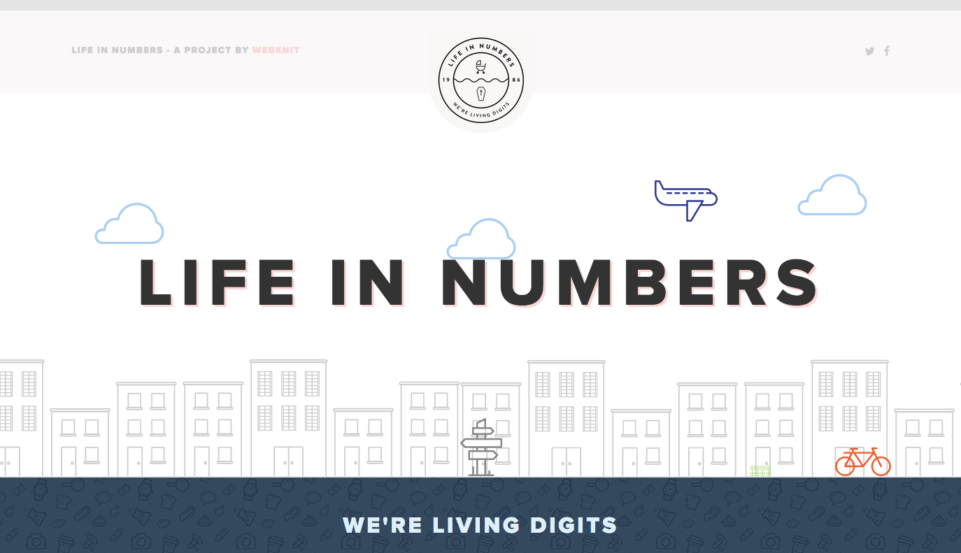
Life in Numbers

Proxima Nova works nicely as a display face on Life in Numbers, a fun website that begins with your birthday and then supplies you with random facts about the hours you’ve spent on Earth.
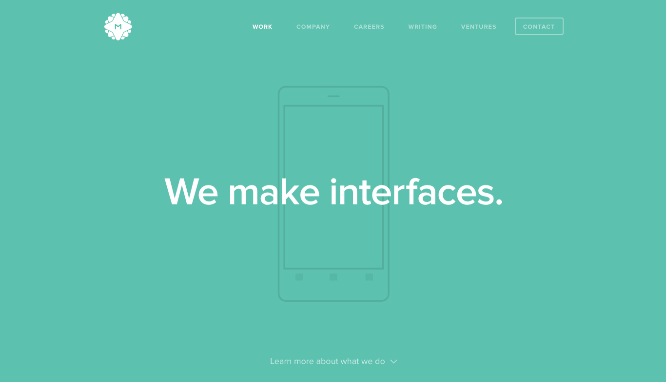
Metalab

You don’t have to go all-caps for a big effect when you pick Proxima Nova for headers, though. Here on the Metalab website, regular title case suits the header perfectly, especially against the bright teal background color.
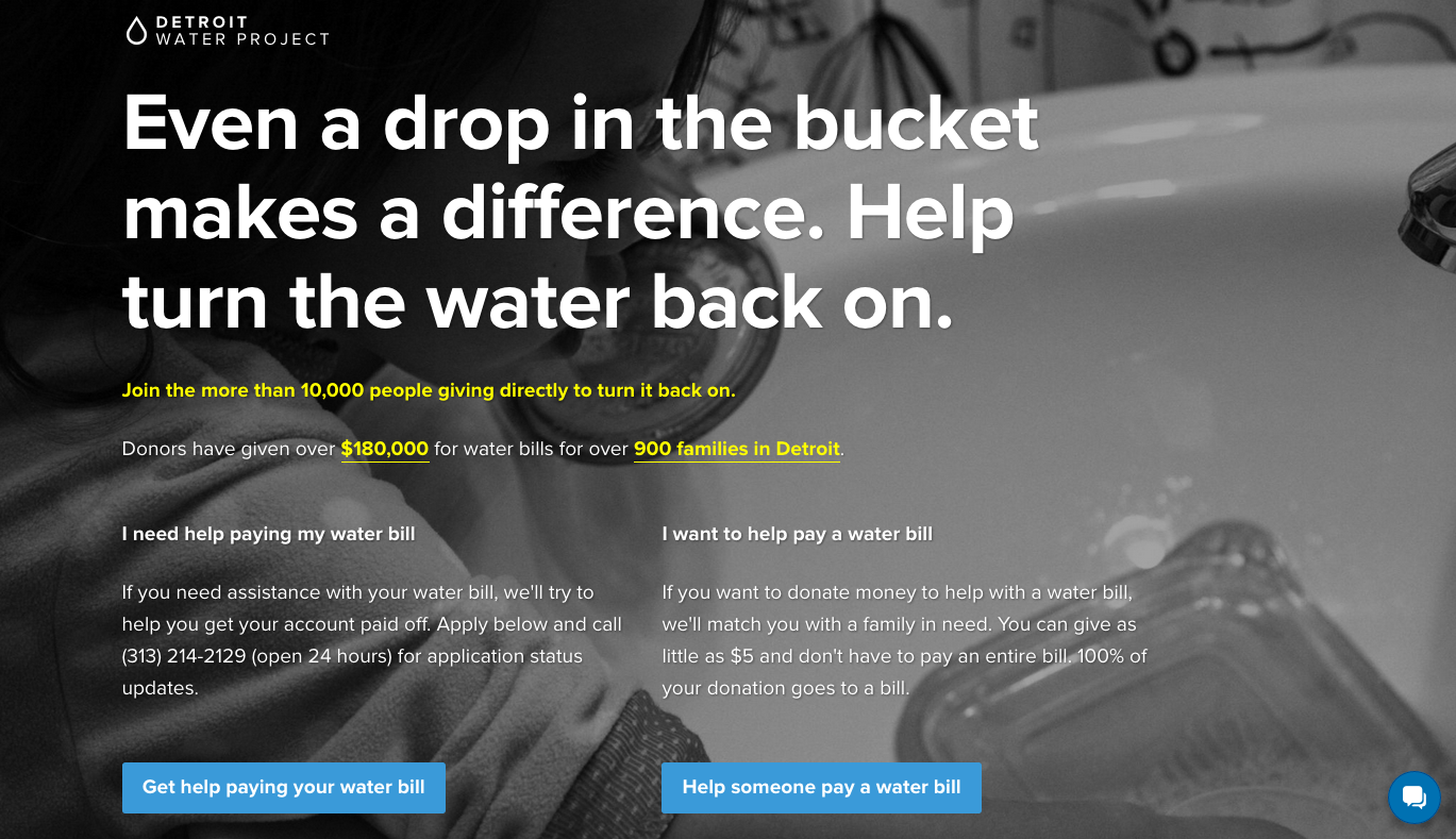
Detroit Water Project

Proxima Nova is especially useful for its high legibility, which makes it a good pick for easy-to-read text with a friendly tone. The Detroit Water Project website does a great job of balancing size and weight to keep the text organized — and to get people involved that much sooner.
Grid

The Grid website features a great pairing of Proxima Nova with icons — the line weight of the icons is well balanced with that of the text — and they manage to pack a lot of information on their page without letting it overwhelm.
That’s it for this week. If you’ve seen some great type in use (Proxima Nova or otherwise) let us know in the comments!