Sites We Like: Rush & Taylor Swift
Let’s be clear about our bias here. Yes, we like these sites. But the music of Rush and Taylor Swift has a special place in the hearts of various Typekittens, far surpassing mere admiration. We’ve made a little extra room this week so that some of their most fervent fans can make their feelings known to the world.
Rush

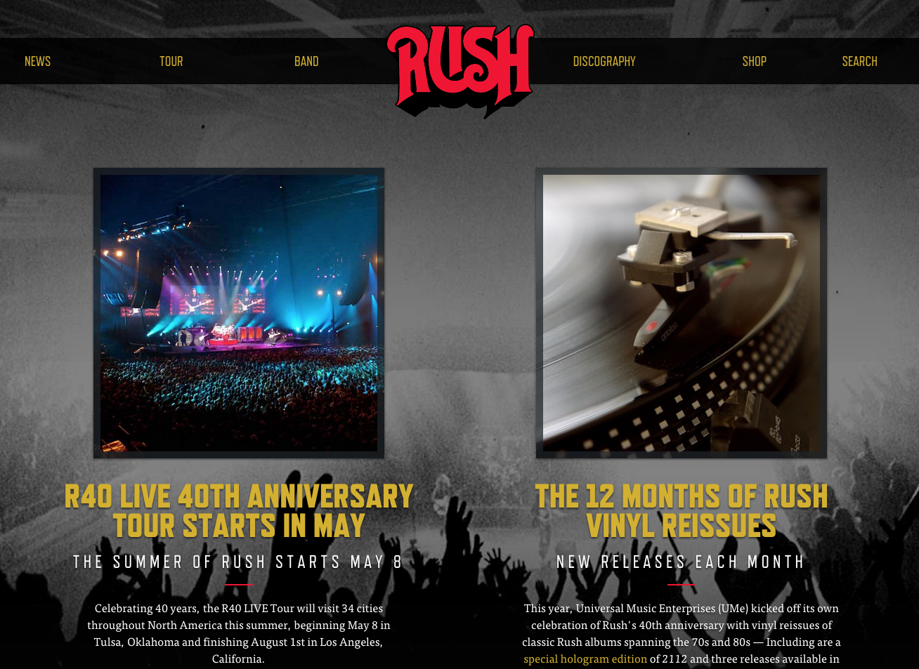
Attention all planets of the solar federation. With more than 40 years of solid rock career in the bag, Rush is touring again this year, and sporting a fresh new website — which, much to the delight of longtime fan Greg Veen, serves fonts with the very service he co-founded. Headings are in Refrigerator Deluxe, with the body text in FF Tisa — a great pairing that makes for effortless reading and tidy organization overall.
Taylor Swift

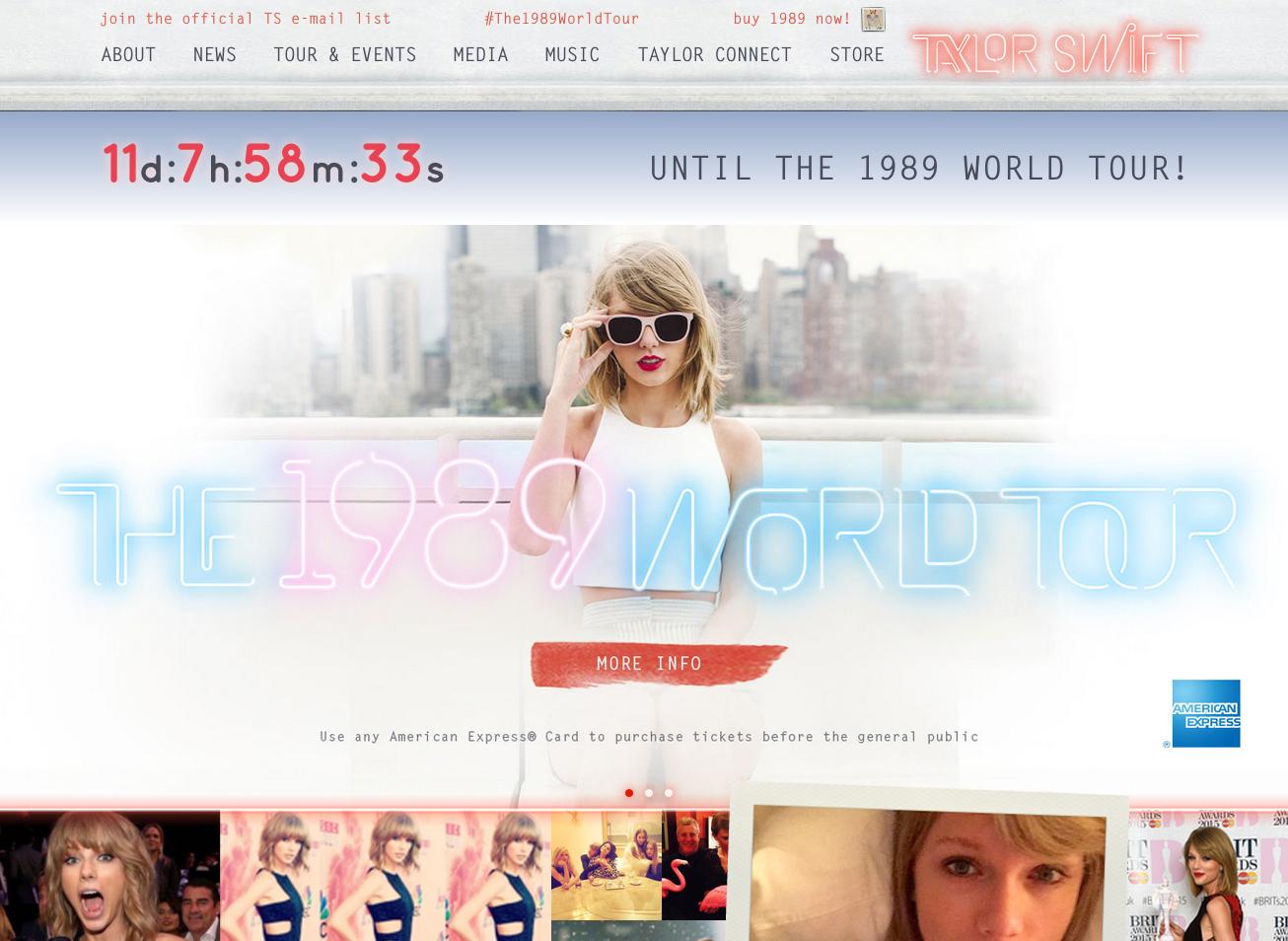
We have truly found wonderland in Taylor Swift’s latest site. You’ll be hard placed to find a blank space with an excellent mix of photography in screaming colour, type, and other imagery and textures. Its funky neon display type is so bright (but it never blinds us). You’ll have no bad blood with its font choices either — the use of Letter Gothic had us in the palm of its hand. Our love for Bell Centennial is alive back from the dead, with the use of both the Address and Name & Number variations.
Thanks to Typekit designer and superfan Jake Giltsoff for the lyric-packed description. It’s clear that Taylor’s site will never go out of style.
That’s it for this week; share sites you rock out to in the comments!
3 Responses
Comments are closed.
This is excellent! My brother and I, who are longtime Rush fans, have near front-row seats at their July 23rd concert in San Jose.
I would enjoy the trio even if they “sang” in comic sans MS.
Greg Veen has great taste in music and type.
Thanks for the inspiration! The Rush site is incredible and who can deny the amazing typography in the new Taylor Swift site.
Hopefully you’ll like ours too!