New on Typekit: Updated font family pages
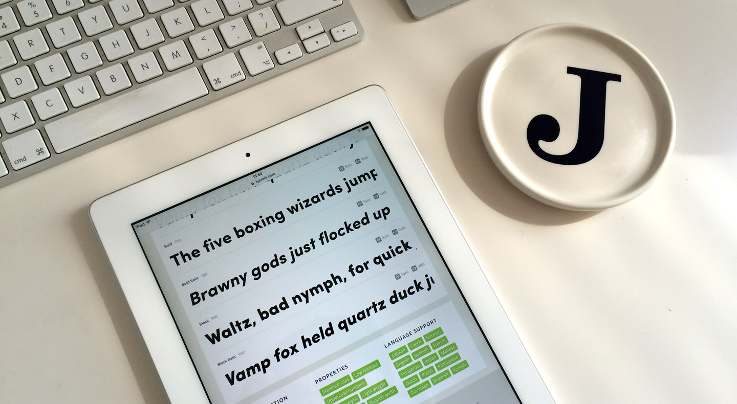
You may have noticed that some pages on our site look a little different today. We’ve just released a significant update to font family pages, along with a few others on Typekit. If you happen to be on a mobile device, you’re in for a treat as we’ve made them responsive.

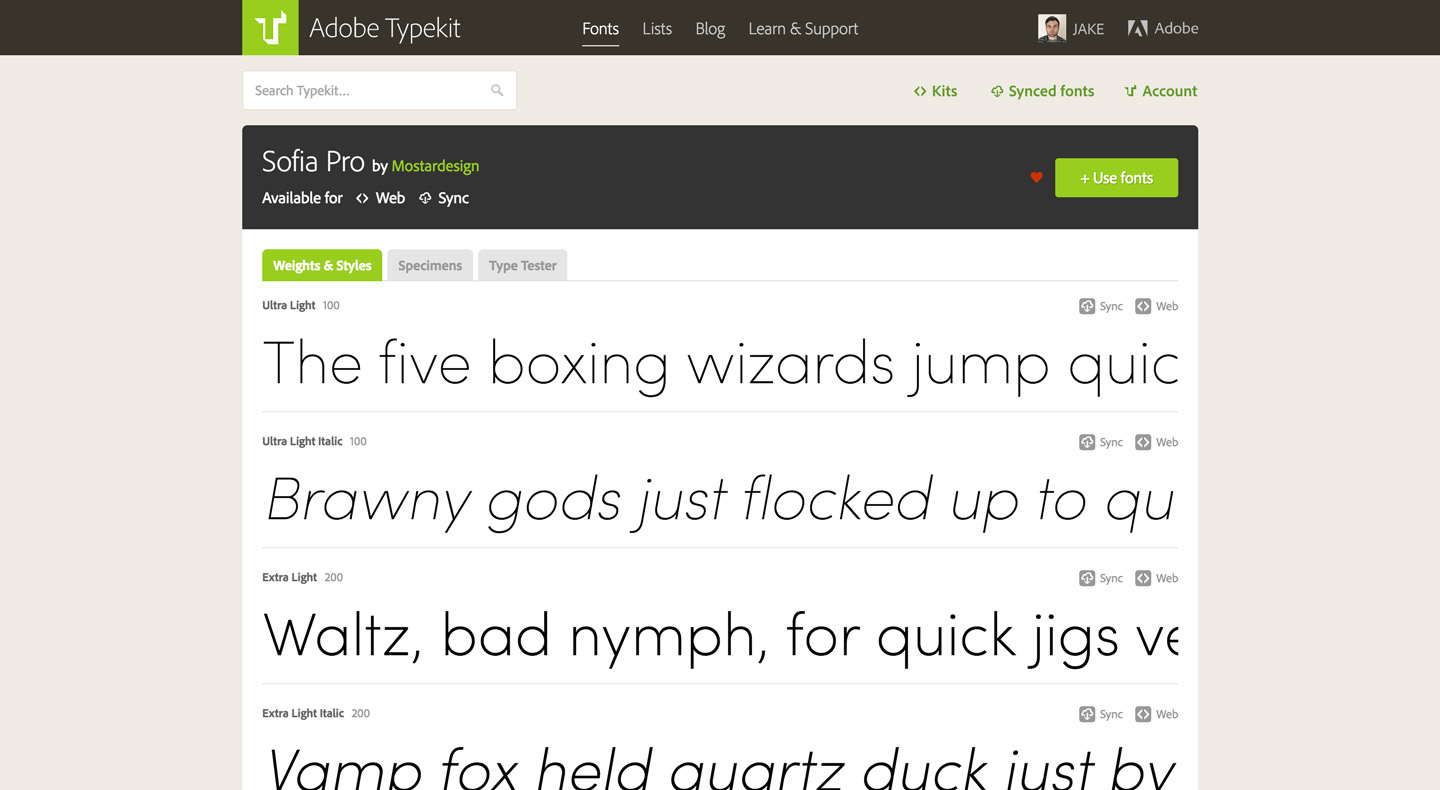
Font family pages are the place on Typekit for you to check out how a family looks and decide if it’s right for your project. These pages show all the weights and styles in a given family at a glance, with even more size and contrast detail available in the specimens. The type tester lets you set a sample of your own text in a given font, so you can quickly gauge how it suits your content.
Each family’s page also contains useful information about the family and the foundry that designed it, as well as recommendations for use, style properties, and language support. This information can often be just as important when trying to find the right font for the job.
Take a look at the updated page for Sofia Pro from Mostardesign — one of my favorite recent additions to the Typekit library.
Making the pages responsive
We shipped a responsive Typekit homepage last year, and these updates to the font family pages are our next step toward a more mobile-friendly site. Today’s responsive updates also include our Plans page and About page. We’ll be rolling out more updated pages slowly, aiming to improve the overall experience on the website for all devices.
These updates have been a long time in the making and we are super happy to launch them. There were a few challenges along the way — including making our existing header and footer responsive, and making the navigation work well no matter what size screen you are using it on. We didn’t want to break away from the current design, but instead make our existing experience more accessible and device-agnostic.
Our front-end code had been getting a little outdated, so the pages have been rebuilt from the ground up and are now using our updated front-end framework based on reusable modular styles. This will allow us to iterate on the website more easily and faster.

Retiring browser screenshots
You might have also noticed something missing from these new family pages: the browser screenshots for each family. For many users, our browser samples have served as an excellent guide to how specific fonts would render on different platforms — in particular, Mac users could rely on our screenshots to see how a given font would render on different Windows versions.
In recent years, as more and more PCs have included powerful graphics cards as standard equipment, and as hardware-accelerated graphics have become a requirement for the latest and best type rendering technology on Windows, we’ve found that our screenshots — which are taken using virtual machines, without hardware-accelerated graphics — are often not an accurate representation of how real users will see a given font.
After some internal debate, we’ve concluded no previews are better than inaccurate ones, and so we’ve decided to retire our browser screenshots.
All the typefaces we serve on the web go through quality control, and we regularly update them to their latest versions when available. If you browse by the “recommended for” categories, you will find fonts that have been hand-picked by us for their technical and aesthetic excellence. These fonts render excellently across all browsers and devices, including Windows.
What’s next?
This release is the first step in a series of updates we have planned for the font family pages. The more modular approach to the page allows us to add in even more useful information about the fonts, and to fine-tune the functionality to make viewing and choosing fonts a pleasure.
We want Typekit to be a great showcase for great type — take a look and let us know what you think! Leave us a note here, find us on Twitter, or email us at support@typekit.com.
One Response
Comments are closed.
Can you show web font sizes again? This was taken out when desktop fonts were added, and it’s super annoying having to add fonts to a kit just to see if they’re fat or slim.