Sites We Like: Jeni’s Ice Cream and Bruges Waffles & Frites
This week’s roundup of type in use is devoted to some of our favorite decadent snacks: ice cream, waffles, and french fries. If you aren’t hungry now, you will be soon.
Jeni’s Ice Cream
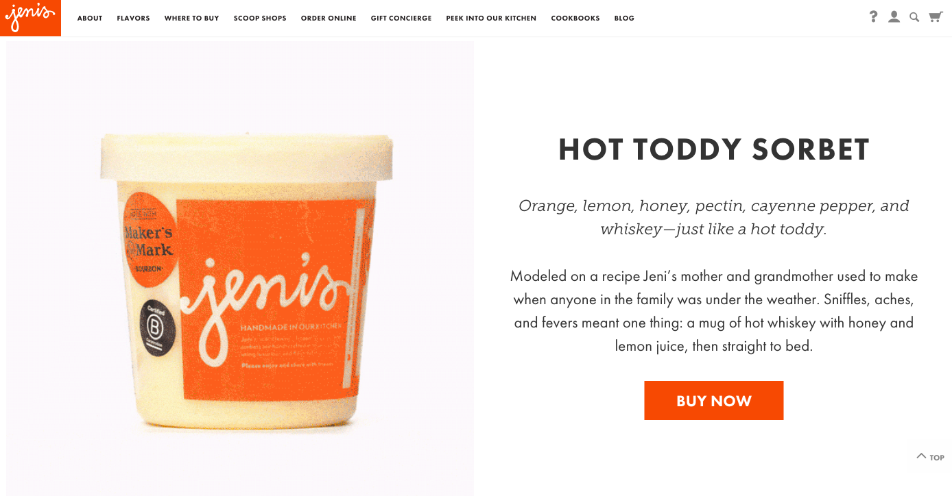
Even if you aren’t nearby enough to try any of Jeni’s ice cream in person, the thoughtful, photo-heavy flavor descriptions are pretty delightful to browse through. (Sweet Cream Biscuits & Peach Jam, anyone?) Headings and body text are in Futura PT — the lighter color and weight of the body text gives it an especially graceful personality there — and there are a few splashes of Museo Slab in there for a lovely serif contrast.
Bruges Waffles & Frites
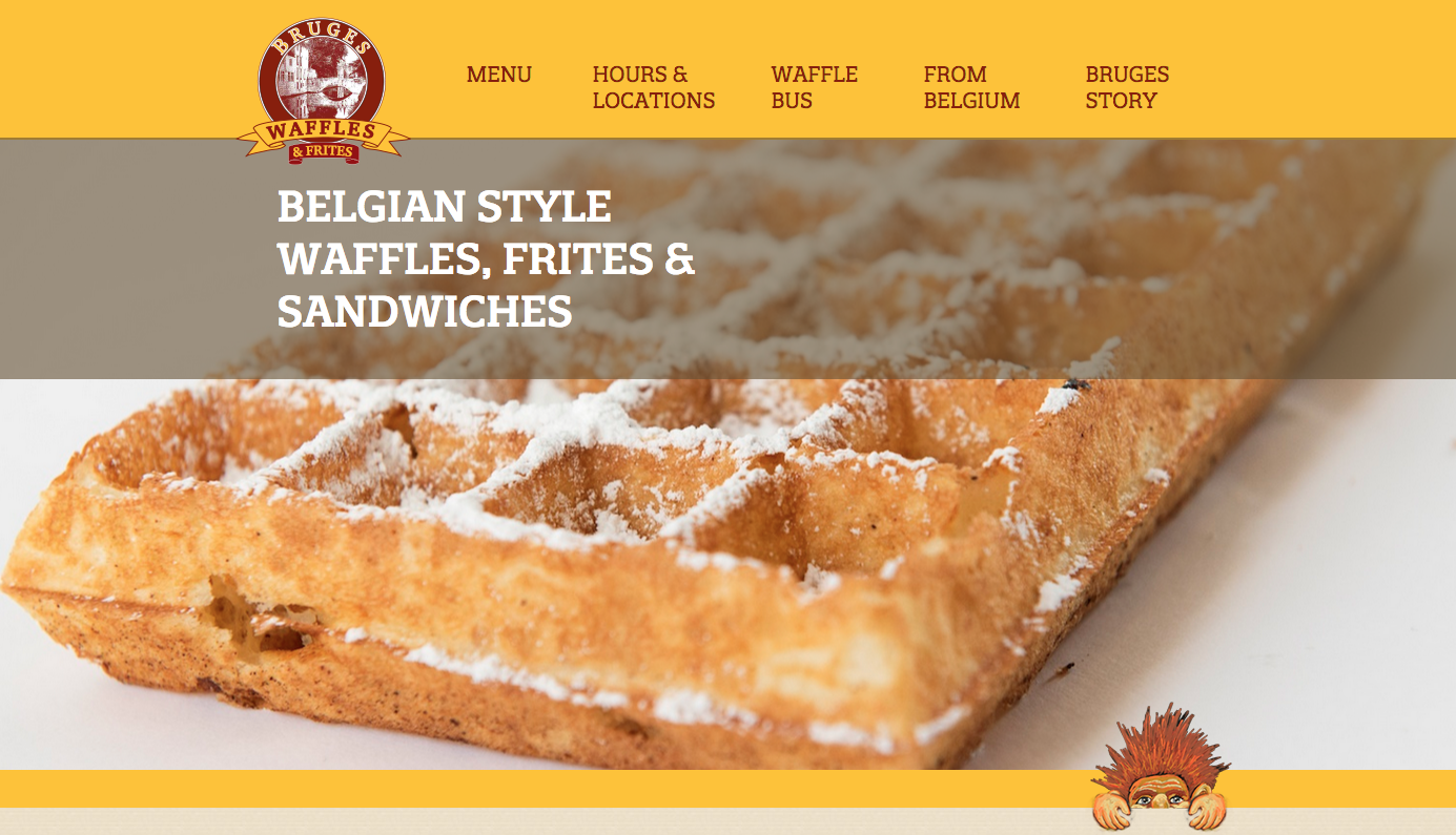
Bruges Waffles & Frites brings two of Belgium’s finest exports to the lucky people of Salt Lake City. Their all-caps headers and menu listings are in Quatro Slab, with the body text in Pragmatica.
That’s it for this week; share sites you like in the comments!