The Adobe Originals Silver Anniversary Story: Where are they now?
This is the tenth and final in a series of articles from Tamye Riggs, a longtime lover of type who is working with us to celebrate the twenty-fifth anniversary of the Adobe Originals type design program. After delving so deeply into the history of Adobe Type, we wanted to share what the original Originals team — Sumner Stone, Robert Slimbach, Carol Twombly, Fred Brady, and Jim Wasco — is up to these days.
[This series] has offered me the opportunity to think back on some of the perceptions that we had at that time and what we were really up to. I was thinking that John Warnock was the one who really was the visionary. He really had a much broader fantasy about what could happen than anybody else. And most of it came true.
— Sumner Stone, Adobe’s first Director of Typography
It doesn’t really matter what you do, but if you bring that kind of quality to it, it’s going to uplift you and whoever else comes in contact with it. So why not spend the extra time, if you can, to make it really beautiful, even for your own spirit? You know, most companies don’t feel that. I always feel like Adobe still had a tiny bit of that kernel, and that’s what made it worth working there.
— Carol Twombly, former Adobe type designer
Every day, I look at stuff. Every day, I think about type. Some days, I am so glad I don’t have to get into that detail. If you watch Rob [Slimbach] go through the process, it takes a unique kind of human being to consistently do that kind of work. Rob is incredible; dozens of families and nurture done; tons of work on other people’s fonts. He’s a machine. He’s a keeper. Rob is grandfathered in.
— Fred Brady, former Manager of New Type Development for Adobe
Although a quarter-century is a blink of the eye compared to how long people have been communicating via the printed word, the past 25 years have seen enormous innovations over a relatively brief timeframe. New technologies emerge, and are adopted — and sometimes discarded — at a startling pace. Today’s type designer must be a constant student, learning new tools, programming languages, and world scripts while diving deep into the historical and cultural aspects of type design and typography. The learning curve will only grow steeper as the path of innovation continues.
The Adobe Originals program, originally conceived by Sumner Stone and company as a means to legitimize digital type and promote PostScript, became so much more than a marketing tool. Adobe Type and the Originals team employed some of the world’s finest artists and scientists in setting the highest standards for type design and typographic technologies. The makeup of the team has evolved over the years, with people coming and going — that’s business as usual for any large company. A handful of members of the Adobe Type team have been in it for the long haul; some have moved on to other companies in the type world. Still others left Adobe to pursue non-typographic ventures. Whether or not they’re still with Adobe, they are part of a shared history, an incredible legacy, that changed their lives, and the lives of those who make type and use typography to express their ideas.
Sumner Stone
Then: Director of Typography for Adobe
Now: Proprietor, Stone Type Foundry
Sumner Stone joined Adobe in the summer of 1984; his last day was New Year’s Day 1990. He brought type designers Robert Slimbach and Carol Twombly on board, and with them, drove the Adobe Originals program to heady success. He now operates Stone Type Foundry from his Alphabet Farm in Northern California’s Capay Valley, surrounded by orchards, hills, and serenity. His body of work includes the ITC Stone superfamily, Magma, Basalt, and Arepo. He art directed the ITC Bodoni project for International Typeface Corporation, overseeing a team of five other designers working on a family based on Giambattista Bodoni’s original types. Stone writes and lectures on type extensively, and serves as a core instructor for the Type@Cooper post-graduate type design program at New York City’s Cooper Union.
“I was employee number 25. We were in those little offices in Palo Alto. Even when we moved to Mountain View, I always rode my bicycle to work,” Stone said. “It really was a wonderful time. It was one of the most exciting times of my life as far as the business of creative and stuff I’ve done. I think it was the same for most of the people who participated — it was really exciting and it was really fun. I think everybody felt we were doing something that was really going to have an impact. You don’t get that chance too often.”
Carol Twombly
Then: Type Designer, Adobe Type
Now: Independent Artist
Carol Twombly joined Adobe in 1988 and remained with the company for nearly a dozen years. Her typefaces include Charlemagne, Chaparral, Lithos, Trajan, Adobe Caslon, and Myriad (with Robert Slimbach), and she directed the Adobe Wood Type revivals. Twombly now lives in a charming home built in 1870, in a tiny town nestled in the foothills of Northern California’s Sierra Nevada Mountains. She works out of her home-based studio, lately creating calligraphically-inspired paintings as well as percussion instruments and sculptural art from natural elements like gourds and Manzanita wood.
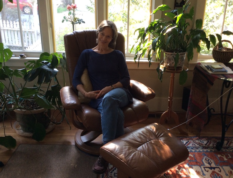
Carol Twombly at home. Photo by Tamye Riggs.
“My singing teacher said a great thing the other day. She said, ‘words are the connective tissue between people.’ So whether they’re printed or spoken, she’s speaking very much of a connective thing,” Twombly said. “You can’t hear without feeling. Hearing goes directly to your heart if you’re really listening. And I think words have that ability, too, even if they’re printed. And you don’t know why they go right there, but sometimes the typeface is why it goes there.”
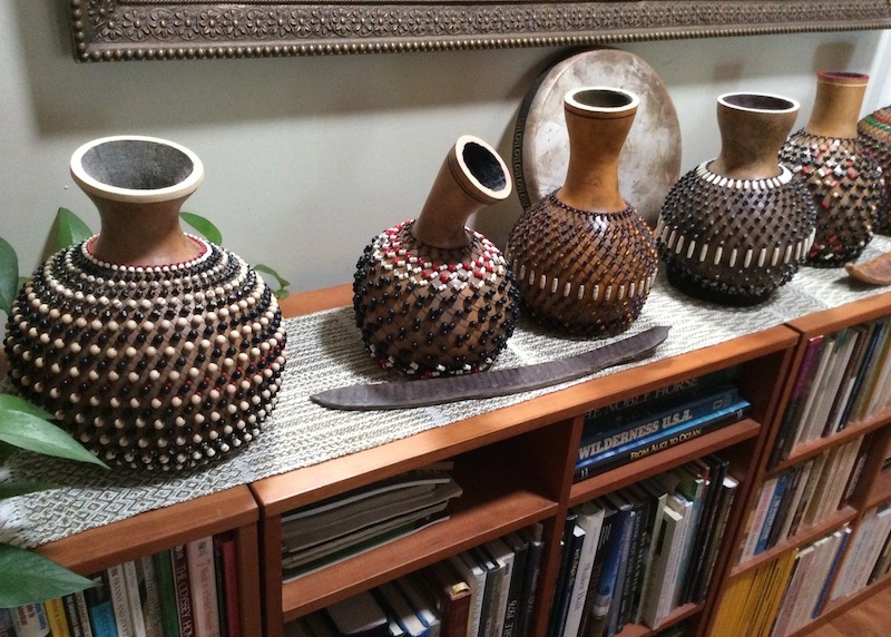
Carol Twombly’s hand-beaded percussion instruments made from gourds. Photo by Tamye Riggs.
Fred Brady
Then: Manager of New Type Development for Adobe
Now: Independent Artist
Fred Brady joined the Adobe Type team in 1987 and left in 2001. A creative collaborator and business manager for the Adobe Type group, he was also a tireless promoter of the Originals, speaking at dozens of conferences. He traveled with Slimbach to the Plantin-Moretus Museum in Antwerp, Belgium, to research the types that would inspire the Adobe Garamond and Garamond Premier revivals. Brady now lives on a five-acre walnut farm in central California, focusing on sculptural art and utilitarian pieces of wood, stone, and glass.
“[My work is] all about positive and negative space, figure-ground relationship, details, whether a font or a chair,” Brady said. “Fonts are utilitarian. My partner says, ‘why are you being so careful with that curve?’ Because I’m crazy and I worked on too many fonts to let a curve go out like that.”
Jim Wasco
Then: Member, Adobe Typographic Staff
Now: Senior Type Designer, Monotype
A talented calligrapher who learned the art of sign painting from his father, Jim Wasco joined the Adobe Type team in the fall of 1989, and left in 2002. “I was like Robert’s helper,” he said. “I would do things like the ligatures for Waters Titling, or the small words.” In addition to assisting Slimbach, Wasco worked extensively on the design of Tekton Bold and the expansion of the family into Greek and Cyrillic. He developed Mythos with Min Wang, and worked on Adobe Sans and Adobe Serif, typefaces that were central to Acrobat’s inner workings. Since joining Monotype, Wasco has published Elegy and Harmonia Sans, in addition to developing many other custom and retail type families. He lectures and conducts workshops on type design and the lettering arts.
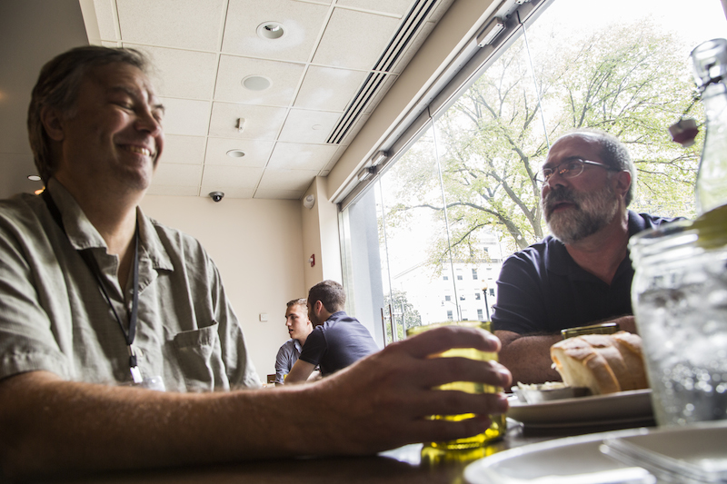
Julian Waters, left, designer of the Adobe Original typeface Waters Titling, with Jim Wasco. Washington, DC, August 2014. Photo by Helen Lysen.
“We were like a family. We had a lot of fun,” Wasco said. “He [Robert] was a gymnast. He’d be standing in the hall and do a backflip by jumping up in the air and landing on his feet. It’s so hard to do this type design work — there are not enough hours in the day to do them. You end up just glued to the mouse and the computer, and things come together eventually.”
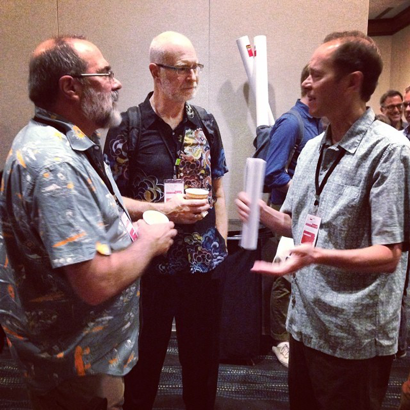
Pictured from left: Jim Wasco, Adobe Type’s David Lemon, and Mark Jamra (designer of the Adobe Original typeface Kinesis). TypeCon2014, Washington, DC, August 2014. Photo by Helen Lysen.
Robert Slimbach
Then: Type Designer, Adobe Type
Now: Principal Designer, Adobe
Since beginning his tenure with the Adobe Type team in the spring of 1987, Robert Slimbach has designed some of the world’s most widely-used typefaces. His body of work includes Adobe Garamond, Arno, Brioso, Kepler, Minion, Myriad (with Carol Twombly), Garamond Premier, Utopia, and Warnock. Slimbach now directs Adobe’s type design program, developing original typefaces while mentoring younger designers.
“You know, I want them to be learning the process, not just me saying, do this, do that. I always participate in a way where I’m sort of guiding — but in a very subtle way — to where they’re allowed to do whatever they want to do,” Slimbach said. “They appreciate my experience, because I’m not dictating to them; I’m giving my opinion all along the way while allowing them to choose within that opinion. I think that’s a good way to mentor. I know that’s the way I would like to get help. Ultimately, they need to be self-driven and self-guiding.”
Slimbach is determined to continue building on the tradition of typographic excellence and innovation he and the other founding members of the Adobe Originals team established 25 years ago.
David Lemon, senior manager of type development at Adobe, said more than 100 people have passed through Adobe Type, although not everyone was directly involved with the Originals. While it wasn’t possible to connect with everyone from the past, it has been incredible talking with so many of the talented people who have been part of the Adobe Originals program. In addition to commentary from the rock stars mentioned above, the reflections of Adobe Type alums Thomas Phinney (now vice president of FontLab), Christopher Slye (now licensing manager for Adobe Typekit), and Carl Crossgrove (now senior type designer with Monotype) were enlightening, as was the perspective of Roger Black (Font Bureau, Danilo Black), a key member of the Adobe Type Advisory Board assembled by Stone.
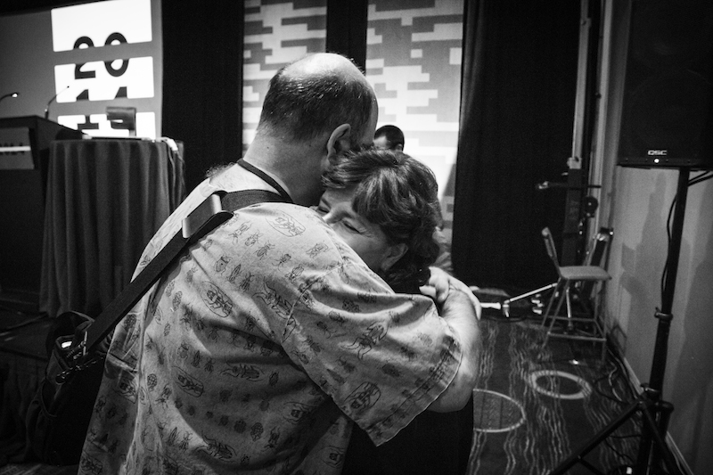
Thomas Phinney, Adobe Type alum and designer of the Adobe Original Hypatia Sans, celebrates with Fiona Ross, designer of several non-Latin Adobe Originals, when she was awarded the SOTA Typography Award at TypeCon2014 in Washington, DC. Photo by Helen Lysen.
Slye, who came to Adobe Type in 1997, was initially hired as a general member of the typographic staff to work on implementing the new OpenType format. Although he was not present for the birth of the Adobe Originals program, he has been through multiple evolutionary periods for the type team throughout his tenure, and envisions more in the future.
“The program succeeded in its mission to legitimize digital type and establish a long-lasting collection of typeface designs that work within, but also transcend, their digital medium,” Slye said. “Simply proving that was an invaluable contribution. Obviously, there are many others who have made important contributions in the last 25 years, but Adobe’s focus on that goal, in those early days especially, has been the most impactful, it seems to me. Using its unique and highly visible position as an innovator allowed Adobe to carry the typographic arts into a new era, and also helped create a really solid foundation on which others could build.
“I am probably as hopeful about the Adobe Originals program as anyone. Its mission is still relevant, and we have seen such good work coming from our younger designers like Paul Hunt and Frank Grießhammer — and continuing from Robert and others. All that’s needed is sustained support from Adobe, and, to be honest, that support has varied over the years. What I’m really pleased about now is that, with the addition of Typekit here, awareness of type around Adobe is very high. I will be doing my part to keep it that way.”
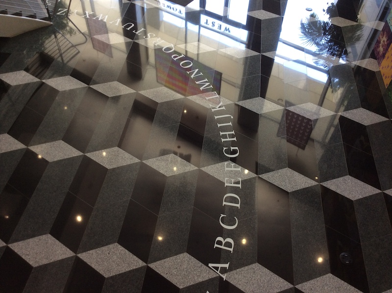
The Kepler alphabet on the lobby floor of the West Tower of Adobe’s San Jose headquarters serves as a constant reminder that type is part of the company’s foundation.
Thank you for joining us for the story of the Adobe Originals. We hope you’ve enjoyed hearing about the history of the program and the people who made it so special. In case you missed any posts, check out the rest of the series!
