The Adobe Originals Silver Anniversary Story: The Originals team kicks into high gear
This is the fourth in a series of articles from Tamye Riggs, a longtime lover of type who is working with us to celebrate the twenty-fifth anniversary of the Adobe Originals type design program. This post explores the rapid growth of the Originals library, driven by the early prolific output of type designers Carol Twombly and Robert Slimbach and their colleagues, and the outreach efforts of Sumner Stone domestically and in Japan.
I think they [Adobe Garamond and Adobe Caslon] were the thing that really convinced people that we had a program. There was just a big demand for revivals, genuine revivals of important typefaces. Everybody recognized they were new — they were copies of these typefaces, but very good ones. And then we got on the whole notion which came from the type board — we should do all the bells and whistles. I think all that helped give the idea we were really serious.
—Sumner Stone, Adobe’s first Director of Typography
Sumner and Chuck Bigelow and Don Knuth were a big part of getting this whole desktop publishing thing [that] Steve Jobs started, and they really instilled in us that this is a huge change in history, and we need to do a really good job here so that we’re hopefully seen as one of the forefronts of this revolution. And we really saw it as a revolution, talked about it that way. We were all really committed to doing whatever we could to prove that this new medium was going to be as good as the old ones. So we were pretty driven. And it felt good — it was like, yeah, we’re gonna do this thing.
—Carol Twombly, former Adobe type designer
We were pushing the boundaries from day one. I was giving it my all on my end, and we had good people on the tech side to deal with the tech hurdles, and we had a good marketing program. Adobe was very supportive — they believed in Sumner’s pitch and gave us the support we needed to make the releases successful.
—Robert Slimbach, Adobe’s first Principal Designer
“Everybody was really jazzed”
Riding a wave of enthusiasm generated by the major milestones of 1989 — the release of Utopia, Adobe Garamond, and the “Modern Ancients” of Lithos, Trajan, and Charlemagne, as well as the development of Adobe Caslon — the Adobe Type group continued to grow at a rapid pace. There were still thousands of existing typefaces from other foundries that needed to be digitized for PostScript. Adobe Type’s David Lemon recalled recruiting nonstop, managing a slew of people working on font production and editing.
“We had a group of people headed up by one of the people in the type group, Carol Toriumi-Lawrence,” said Sumner Stone, Adobe’s first director of typography. “All they did was make bitmap fonts in five sizes for every font we brought out as a commercial product. We got Macs, trained them — they were mostly calligraphers.”
“Some of the calligraphers liked it, and some didn’t last too long,” Stone said. “I think it was a different mode for them. To be a calligrapher, you have to be a person who is paying a great deal of attention to detail; [you have to be] patient, have to have an eye. [They are] visual people already.”
With the blessing of Adobe co-founders John Warnock and Chuck Geschke, Stone’s type design team was on a mission to create more top-quality original type families and exceptional revivals of historical typefaces — designs far superior to anything on the market.
“When we made up the name [Adobe Originals], my intention was to do truly original designs, but the revivals turned out to be ‘original’ in the sense that both Caslon and Garamond had been revived, but not very accurately,” Stone said. “In the case of Garamond, the existing versions that were popular in the US were based on the Jannon types, not actually on Garamond’s types.”

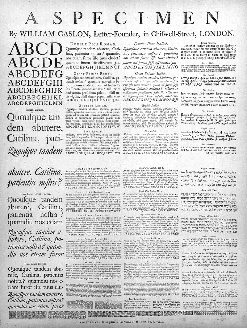
This 1734 broadside type specimen from William Caslon I’s London type foundry was one of the sources Carol Twombly worked with in designing Adobe Caslon. Wesley Tanner made a copy of this rare work available to Adobe throughout the development of Twombly’s revival.
“Our plan was to make some historical revivals of great faces—Garamond, Aldine, Jenson, Caslon—then new faces to provide a broad range of functionality to cover text composition to display fonts so professional designers could do things. We wanted to have it all at once,” said Fred Brady, former director of new type development at Adobe. “The first fonts were Adobe Garamond and Utopia — they were pretty well received by the professional design community. We seeded designers with fonts; in some cases, we actually gave [them] Macs and printers they could use in their own work. I think that helped start kicking off into the high-end market.”
Along with Carol Twombly, Robert Slimbach, and Brady, other Adobe Type team members were caught up in the spirit of the Originals movement.
“Everybody was really jazzed by that time,” Stone said. “There were a bunch of people who had spent their time mostly editing outlines from Linotype and ITC [International Typeface Corporation], but those people got really excited about us doing new typefaces. Lynne Garell — directly out of RIT [Rochester Institute of Technology] — did a typeface intended for use with mapmaking called Carta. Cleo Huggins did a font for musical notation setting called Sonata. [They] did it on their own because they were excited that we were making new stuff and it was an honor to participate.”
Under Stone, the heart of the Originals program in the late 1980s was made up of type design heavyweights Slimbach and Twombly, in close partnership with Brady.
“It was a true three-person team,” Brady said. “We would always look at everything really carefully. There were these schedules I was responsible for making. It was difficult to go into meetings and say, ‘I need another three months, but it’s looking great.’ Always changing, adding… Robert always wanted to add stuff. Sometimes it was hard, because I could understand that desire, working on something you really care about.”
“It was really great to have Robert and Fred (who’s got really good eyes), and myself and Sumner on the team. We’d have weekly meetings about how the projects were going,” Twombly said. “We were the Originals team. Yeah! And with Sumner’s leadership, it felt stable, comfortable… like we were going somewhere, like we knew where we were going.”
“Do you want to go to Japan?”
As Adobe Type became more popular, and the Adobe Originals more high profile, Stone found himself spending less time working on the creative side of type development, and more time in meetings and marketing activities.
“I didn’t originally start out thinking I was going to be involved in marketing type, because [when he was first hired], there was no plan to do retail sales,” Stone said. “It was all about developing type that would somehow get into the market or be added onto printers.” But when desktop publishing took off, it became evident that there was a real market for fonts within the graphic arts industry, and the design world was expectantly watching Adobe Type.
“People wanted to do stories about what we were doing,” Stone said. “We were doing new typefaces; had a creative scene going. All these publications wanted to interview me for stories about Adobe Type. [There was] a lot of press during that period.”
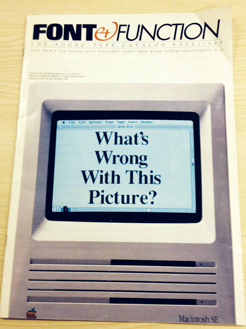
Adobe’s marketing team was hard at work generating buzz from within. One of their primary efforts was the publication of Font and Function, a popular magazine spearheaded by Liz Bond, a big fan of ITC and its acclaimed U&lc, with its artful combination of promotional and educational content for type lovers. Font and Function followed a similar model and was distributed via complimentary subscription, showcasing offerings from the Adobe type library while demonstrating the extensive capabilities of PostScript as a graphic design tool.

Fall 1989 issue of “Font and Function,” a publication which served as a marketing vehicle for the Adobe type library as well as featuring typographic design techniques and other educational content.
“The Font and Function guys would come to us with their layouts and ideas for the magazine, and I would comment and give feedback,” Stone said. “The whole presentation of the department as being [all about] craftsmanship in the electronic age — I said I thought that’s what we should emphasize, and I thought they did a very good job of doing that.”
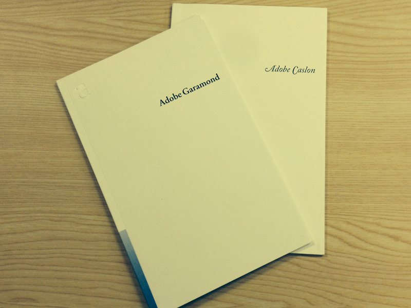
The type group also worked closely with the marketing team to publish beautifully designed specimen books, crafted with high production values, to accompany each of the Originals. “Everyone in the serious type world regards them as treasures,” Stone said. “Little gems.”

The specimen books for Adobe Garamond and Adobe Caslon contain a wealth of historical information about the source type designs, along with information about the process of developing each revival.
Stone also traveled frequently, giving lectures at a variety of venues to discuss type design and evangelize the Originals. “Of course, [I was at] every sort of big type event, but even beyond that, AIGA meetings and things like that all over the country,” he said.
Stone was also deeply involved in another venture on behalf of Adobe: the company’s expansion into the Japanese market.
“John Warnock came into my office one day and said, ‘Do you want to go to Japan?’ ‘Of course, I want to go to Japan!’ They decided they really wanted to go after the Japanese market, but they needed to license fonts to go into the printers,” Stone said. “The business early on was focused on this OEM [Original Equipment Manufacturer] business, where they would design the hardware that was an interpreter for PostScript to go in the laser printers, I think all of which were manufactured in Japan at that time. You could put this interpreter in your printer, and any PostScript file that came from your computer would print.”
Stone’s mission in Japan was to license typefaces. There were two type companies dominant in the Japanese market at the time: Sha-Ken and Morisawa. “Sha-Ken was not going to license their typefaces to anybody ever — that was their position,” Stone said.
But Morisawa was interested. Stone, along with other members of the Adobe team, made a number of trips to Japan to from 1987–1989, working toward a contract. “I spent a fair amount of time there,” Stone said. Time that, although fruitful and enjoyable, took him away from focusing on type design, his passion.

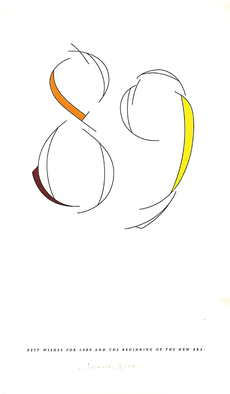
New Year’s 1989 greeting designed and lettered by Sumner Stone during his outreach efforts in Japan.
Back at Adobe headquarters, Twombly and Slimbach were furiously working on new type designs to build the Adobe Originals library. Twombly was leading other members of the type team in reviving a series of historic wood types. Another alumnus of the Stanford digital typography program, David Siegel, contributed Tekton, a design based on the hand lettering of architect Frank Ching. And Slimbach was developing Minion, another extensive family of text faces.
Stone initiated a collaborative type design project, the Myriad family, but wouldn’t stay to see it through.
“It’s been quite an accomplishment”
Stone had grown weary of his role as a manager superseding his role as a creative director and hands-on type designer. “I left at the end of 1989. I was gone right on New Year’s Day in 1990, then I started my own business called Stone Type Foundry.”
“I told myself various things about why I was leaving. The thing that I really got off on [was] the creative part of the process: making new designs, participating with other people making new designs,” Stone said. “I could see the writing on the wall. I was spending most of my day in meetings. Even when I was there doing the creative stuff, I was always involved in contract negotiations with people like ITC, Linotype, and other people we licensed fonts from; the business of holding onto software, opening up the whole font marketing thing.”
“Eventually everybody was selling everything,” Stone said. “I thought it was crazy, quite frankly. […] It really opened up the font world. [It was a] much different place than it would have been if we hadn’t revealed the mechanism to hint and edit fonts. Type 1 was at first a secret, copy protected.”
Fonts were downloaded to a printer, and couldn’t be used on another printer. “People [were] upset and complained,” Stone said. “We decided not to do that anymore—we decided to reveal the innards of Type 1 fonts. That was a big deal.” Stone recalled that, at the time, there was a lot of standing in people’s doorways, trying to predict what would happen. “John Warnock would come around and talk to people.”
“Those were big font things,” Stone said. “I just thought, if I stay at Adobe, what’s going to happen is I will get sucked up into the management world in a way that I don’t want to happen. I like the creative part. I have to say that I would be financially much better off if I had stayed, but I would have had a different life. I don’t regret it at all. I’m very happy I did what I did, and participated in font world in the way I have. It’s been gratifying.”
Although he left Adobe just five years in, Stone feels what he and his team did during his tenure made a tremendous impact on the world of typography and graphic design. “I’m quite proud we did the Adobe Originals,” he said. “It’s been quite an accomplishment. When I left, I told John Warnock we had raised the bar, and it’s true. We did.”

Sumner Stone doing the work he loves: drawing type.
Keep up with the Adobe Originals celebration via RSS by bookmarking this series. And, in case you missed any posts, check out the rest of the series!
5 Responses
Comments are closed.
So, what is wrong with that picture?
The wrong font?
There’s nothing wrong with the picture, and that’s the point. At the time the issue was printed, most people would have seen very jagged, pixelated type instead of the smooth letterforms on the cover. Adobe’s product Adobe Type Manager provided an early example of anti-aliasing that moved the screen representation dramatically closer to what would eventually be printed.
As John pointed out, the fonts on the screen are rendered with Adobe Type Manager (ATM), which was amazing at that time. Up to then, you relied on premade pixellated screen fonts (10pt, 12pt, 24pt, etc). ATM synced with the Postscript font files and rendered them in amazing detail (compared to what you had up to then). We take font rendering for granted now, but that was pretty big back then.
I remember that issue of Font & Function! I was in high school at the time, and was being introduced to the world of typography and design. The Adobe stuff was always refreshing, sophisticated and exciting to see in those early days. I remember the original Illustrator manual (1987) was a green hardcover with vellum chapter dividers.
Interestingly, well before that magazine was published, Acorn, over in the UK, having finished designing the original ARM chip now found in so many devices, had also already launched their own computer system that had anti-aliased, hinted, infinitely scalable onscreen fonts. Acorn computers were very widely distributed in British schools but of course were almost unknown in the US. It’s a shame they were never adequately able to capitalise on their software, although the core of the hardware eventually went on to become justifiably dominant.