Sites We Like: University of Oregon
We got a tip not long ago that the University of Oregon has some solid typography on some of their department pages. We took a look, and were delighted to see so many great web fonts in use. Go Ducks!
Music & Dance
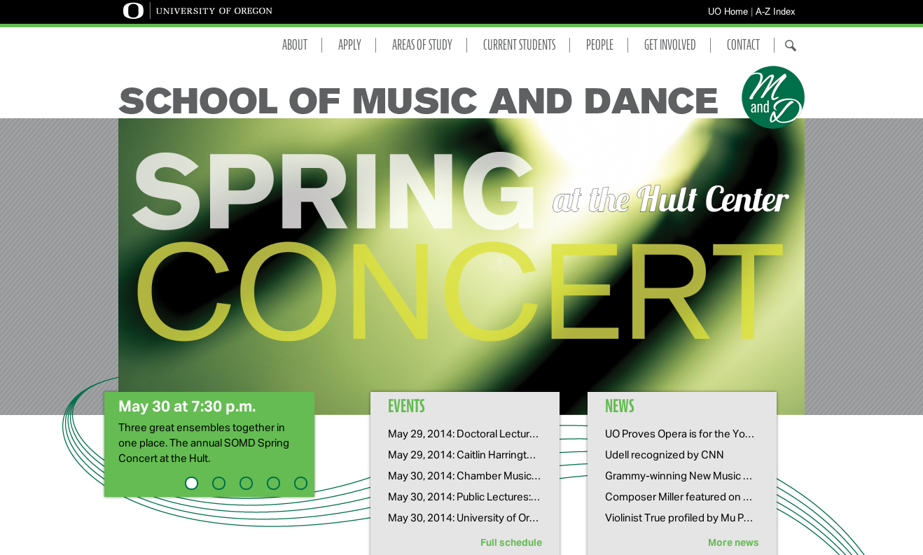
We love the color palette on the music department homepage, with green and blue accents tastefully balanced against the neutral white and gray background colors. Body text is set in Aktiv Grotesk, a sans-serif whose shape resembles a sturdier version of Helvetica. In the headers and subheads, JAF Bernina Sans Compressed works artfully as a complement, without sacrificing clarity.
Department of English
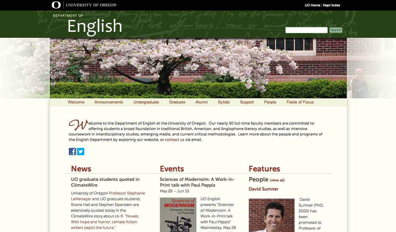
Leave it to the English department to appreciate a good drop cap! Leading with the handwritten flair of Nouvelle Vague, this group’s reverence for the written word feels pretty well ingrained. The body copy is set in Museo Sans, a reliable choice for readability.
Cinema Studies
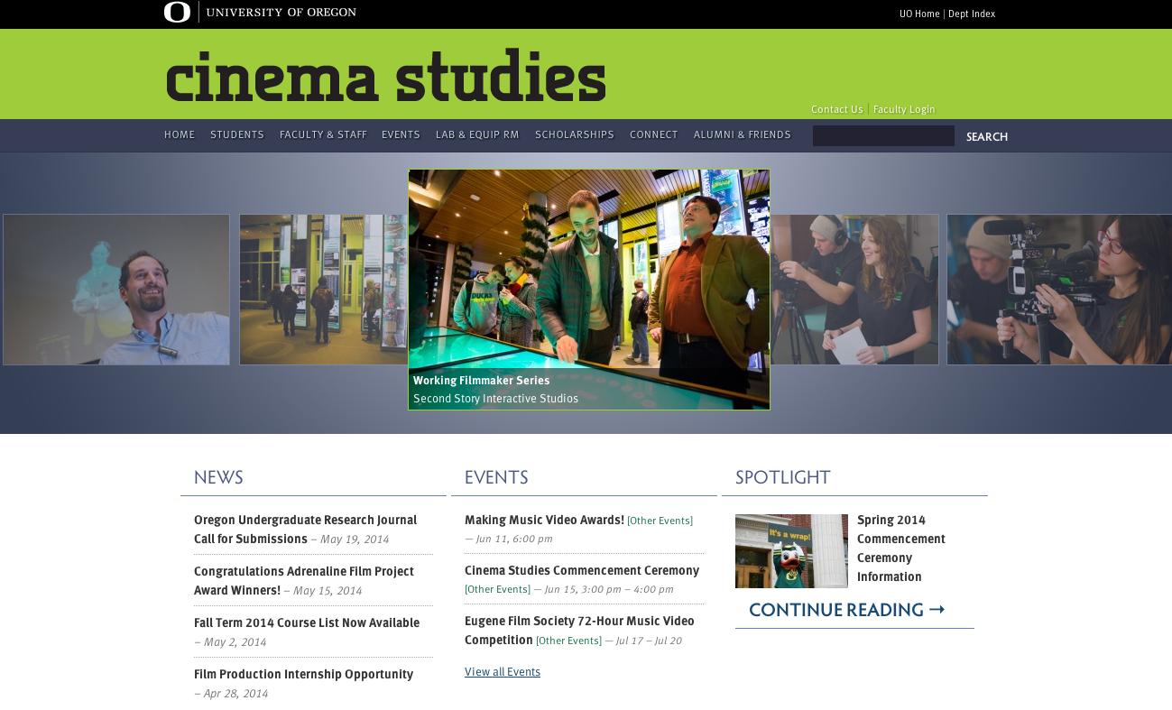
Finally, the Cinema Studies department makes some very respectable type choices for its vibrant homepage. FF Meta is used for the top navigation headers and all body text here, with varied weights and sizes giving the page a little more texture. For subheads, we see the graceful Hypatia Sans, which does a great job of drawing our attention down into the meat of the page.
That’s it for this week; thanks to @danielmundra for the heads-up about these on Twitter. Share sites you like in the comments!