The Adobe Originals Silver Anniversary Story: Sumner Stone paves the way for a renaissance in type design
This is the second in a series of articles from Tamye Riggs, a longtime lover of type who is working with us to celebrate the twenty-fifth anniversary of the Adobe Originals type program. This post takes us to the beginning of type at Adobe, when Sumner Stone began his work as the company’s first Director of Typography.
Type is always important. It has a significant position in the history of communication. There will always be people who understand that and those who don’t see it. I knew we’d take out Letraset and that Monotype and Linotype’s typesetting business would go down. But we had a responsibility to replace that with something better and to keep the values high.
—John Warnock (As quoted in “Inside the Publishing Revolution,” Pamela Pfiffner, Adobe Press, Berkeley, 2003.)
Adobe co-founders John Warnock and Charles “Chuck” Geschke knew PostScript had the potential to change the face of publishing forever. They also knew that, even though they had struck gold by getting a licensing deal to include Linotype’s Helvetica and Times Roman in the initial 13-font PostScript library, that collection had to grow—fast.
Publication designer and typographic consultant Roger Black remembers the early emergence of PostScript well. “Warnock came to realize that fonts were the secret sauce of page description languages; if he could have some good fonts, it would make all the difference in the world,” Black said.
“They learned something when they had the first LaserWriter with four fonts (Helvetica, Times Roman, Courier, and Symbol). The first Courier font at Adobe was a stroke font. It wasn’t an outline, and it was written longhand in PostScript because they didn’t yet have any tools to draw it (which is why it’s so bad). If they wanted a bold, they just stroked it more.”
Growing the world of PostScript type—and driving quality standards—meant bringing in some serious typographic muscle. When Warnock and Geschke brought Sumner Stone on board as Adobe’s first director of typography in the summer of 1984, a critical piece of the changing publishing puzzle fell into place.
Stone, after studying calligraphy with Lloyd Reynolds at Reed College in Portland, Oregon, had quietly been making a name for himself as a lettering artist and typographer. He spent two years at Hallmark Cards in Kansas City, Missouri, before becoming director of typographic development at Autologic in Thousand Oaks, California.
Stone says Autologic was really the first company to develop a successful digital typesetting machine, which was sold primarily to large newspaper dailies and chains.
“I went there and organized their font production situation so that they could try to sell their machines in the commercial marketplace to a much larger audience. I was there about five years [circa 1979–1983], remaking faces that already existed, always on a rush-rush schedule,” Stone said.
From Autologic, Stone made the cross-country move to Boston, Massachusetts, to serve as director of typography and design for Camex, a company which produced a machine for laying out newspaper ads. Stone had been with the startup for less than a year when John Warnock called him.
“[Warnock] said, ‘Would you like to come to California and interview? We are looking for someone to run our type program.’ I already knew a little from friends about what they were doing. I went out and spent a day interviewing. [At that time], everyone who would work with you got to talk to you,” Stone said. “At the end of the day, they offered me the job. I said, well, I’m very interested. I like the people, the whole situation. The only thing is, I don’t want to just grind everything up and spit it out again. I want to make new typefaces.”
The Adobe crew didn’t bat a collective eyelash, Stone said. “They came from research institutions; they thought innovation was very important. What I thought was going to be a sales job was actually really easy.”
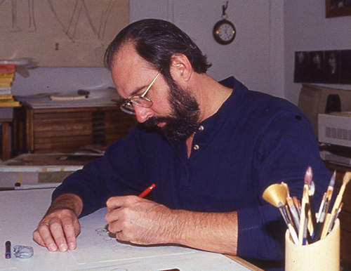
Stone accepted the job offer and returned to California. “On the second day I was at Adobe, I had them move a drawing table into my office, just to indicate that it wasn’t just on the computer that we design typefaces,” he said.

Sumner Stone at his drawing table
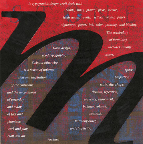
Stone began working on the first original type family developed at Adobe, one that would become his namesake masterwork. Stone Serif, Sans, and Informal, which would be released in 1987, made up the first type super-family designed for PostScript. (The Stone family was subsequently licensed back to ITC.) These faces were crafted to play to PostScript’s device independence, and tuned to work as beautifully at small sizes on low-resolution printers as they did on high-end imagesetters. But as passionate as Stone was about crafting his typographic opus, he wasn’t able to work on it full time—he was busy ramping up Adobe’s type department.

Designed by Min Wang, 1987
“At the time, Adobe had no retail sales,” Stone said. The core business was licensing PostScript and designing interpreters for output devices. Stone recalled that Linotype (then commonly known as Mergenthaler) made an imagesetter which sold 50 units in the first week, a quantity they had originally imagined might sell in an entire year. The first LaserWriter was a smashing success by anyone’s standards—even with its mind-blowing price point of just under $7k. (To put things in perspective, Adobe Type’s David Lemon pointed out that the first LaserWriter bore the same price tag as a new VW Beetle sold during the 1985 model year.)
“People were buying them like hotcakes,” Stone said. “The same thing with the imagesetter—they couldn’t make them fast enough. Money was flowing. People were excited. By the time the LaserWriter had come out [in January 1985], I had hired a couple of people, working on software for editing fonts, for hinting fonts.”
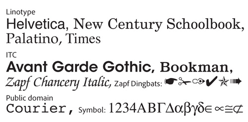
The growing Adobe type team was tasked with the expansion of the PostScript font library, which would include more Linotype faces as well as type designs licensed from ITC. The new 35-font base set, which would be resident in the next incarnation of the Apple LaserWriter (and later become available for the Macintosh and Windows operating systems), included four styles each of ITC Avant Garde Gothic, ITC Bookman, Courier, New Century Schoolbook, Palatino, and Times, along with eight styles of Helvetica, plus the singles: Symbol, ITC Zapf Chancery, and ITC Zapf Dingbats.

PostScript core font set: the “base 35”
“I don’t know how the ITC faces came to the list for Apple,” Black said. “I’ve always assumed that Steve Jobs was a fan of ITC since his days at Reed, when students were sent free subscriptions to U&lc.”
Stone was part of the group that would eventually decide on the PostScript standard font set, lending a voice of typographic reason when discussions veered too far off course. Lemon recalled that Cleo Huggins, an early member of Adobe’s typographic team, regaled the crew with stories about Jobs’ take on which faces to include in the expanded set. “She talked about Jobs wanting ITC Gorilla, and about people planning to use ITC American Typewriter for the monospaced family [instead of Courier]—it isn’t monospaced, of course,” Lemon said.
Sans Jobs’ quirky ITC Gorilla—Stone noted that Zapf Chancery and Dingbats were ultimately selected as the “fun” fonts—the bigger-and-better PostScript font set launched with Apple’s LaserWriter Plus, which debuted on New Year’s Day, 1986, and marked another turning point in the desktop publishing revolution.
“I think everyone knew what we were doing was going to be significant—it was already a hit and had just barely started,” Stone said. “In that atmosphere, first I hired Robert [Slimbach]. He immediately started working on original designs.”
The Adobe type team grew rapidly, with stellar talent continually added to the roster. Ads were placed in type and design publications, and the word about Adobe’s recruitment activities for typographic talent spread like wildfire. Lynne Garrell, Carol Toriumi-Lawrence, David Lemon, and Dan Mills had already joined Adobe by the time Slimbach came on board in March 1987. Fred Brady would sign on shortly thereafter. Carol Twombly joined the group in 1988, with Jim Wasco and Linnea Lundquist following in 1989 and 1990, respectively.
“Sumner had his own point of view about the type development,” Black said. “He had had some experience. He had read everything and had a very well-informed idea of the history of type and knew who [Monotype’s] Stanley Morison was and what his job was. I imagine that was his model—finding designers to work with that were really great.”
With the explosive growth of desktop publishing and the ensuing clamor for new PostScript fonts, Stone was more determined than ever to maintain quality and craftsmanship. Making a name for Adobe as a high-end type foundry was key to proving to serious typographers that digital type was a medium to embrace.
To that end, Stone formulated the concept of the Adobe Originals, embarking on an ambitious program of standard-setting type design that would far outshine anything on the market.

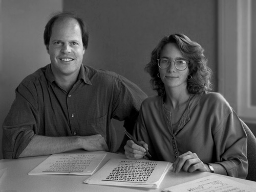
Robert Slimbach and Carol Twombly
Keep up with the Adobe Originals celebration via RSS by bookmarking this series.
2 Responses
Comments are closed.
Thanks for your sharing
I Love Adobe 🙂
I keep thinking how much easier our reading would have been if Sumner had designed the Stone type family earlier, and that had been the serif & sans-serif default fonts on the Laserwriter. Instead of adaptations of existing typefaces, we would have been using typefaces designed (very well) for the new medium. But that, i suppose, is an alternate history.