Sites We Like: Watsi, Bellstrike, & Rice Bowls
This week, we’re looking at a few sites who focus first on doing good in the world (and they also happen to look pretty good in the process).
Watsi

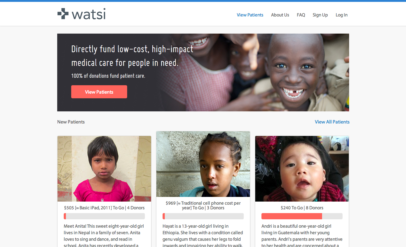
The mission of Watsi, named after the Costa Rican town where founder Chase Adam first thought of the idea, is to crowdfund life-changing medical care for people in need around the world. The site is well-organized and efficient, using minimal color alongside compelling black-and-white photography to describe their story. Text is set in clean Myriad, with headings in Bebas Neue.
Bellstrike

The people of Bellstrike pack a lot of fun into a page with a straightforward purpose: to make website creation less arduous for the already-overstretched nonprofits who need them, and to make donating online even easier to handle. Kulturista appears for most of the body text, an unconventional choice that works nicely here and looks a lot tamer than usual when paired with those big headings in Hellenic Wide. Museo Slab and Sans are used in headers and some navigation as well.
Rice Bowls

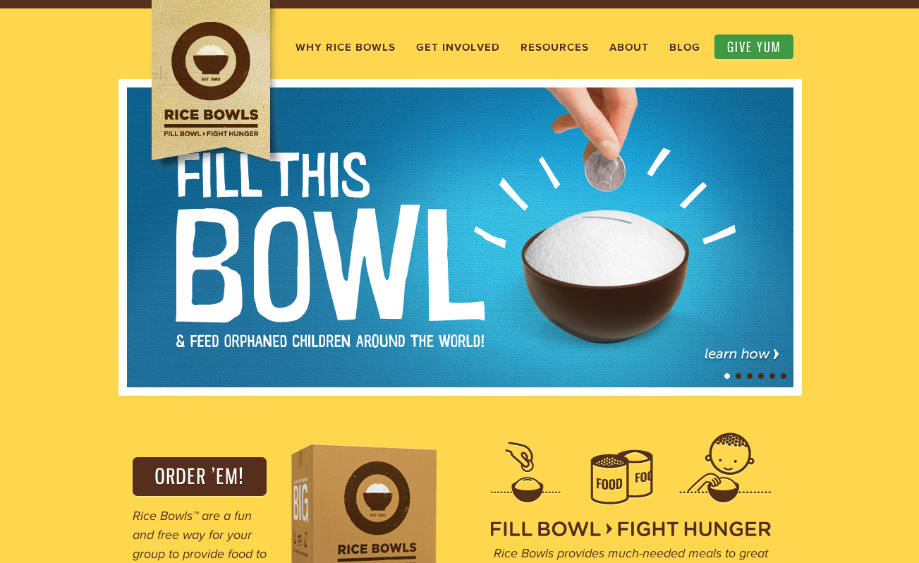
Got a lot of pennies clanking around in a random drawer compartment? Rice Bowls has a better idea: put that spare change towards feeding kids in orphanages around the world. Their website, bright with a cheerful yellow background, is easy to navigate, using sleek Gnuolane for headers and Proxima Nova for the body text.
That’s it for this week; share sites you like in the comments!